Join us at the 2025 Microsoft Fabric Community Conference
Microsoft Fabric Community Conference 2025, March 31 - April 2, Las Vegas, Nevada. Use code FABINSIDER for a $400 discount.
Register now- Power BI forums
- Get Help with Power BI
- Desktop
- Service
- Report Server
- Power Query
- Mobile Apps
- Developer
- DAX Commands and Tips
- Custom Visuals Development Discussion
- Health and Life Sciences
- Power BI Spanish forums
- Translated Spanish Desktop
- Training and Consulting
- Instructor Led Training
- Dashboard in a Day for Women, by Women
- Galleries
- Webinars and Video Gallery
- Data Stories Gallery
- Themes Gallery
- Power BI DataViz World Championships Gallery
- Quick Measures Gallery
- R Script Showcase
- COVID-19 Data Stories Gallery
- Community Connections & How-To Videos
- 2021 MSBizAppsSummit Gallery
- 2020 MSBizAppsSummit Gallery
- 2019 MSBizAppsSummit Gallery
- Events
- Ideas
- Custom Visuals Ideas
- Issues
- Issues
- Events
- Upcoming Events
The Power BI DataViz World Championships are on! With four chances to enter, you could win a spot in the LIVE Grand Finale in Las Vegas. Show off your skills.
- Power BI forums
- Forums
- Get Help with Power BI
- Desktop
- Re: Modify the legend order
- Subscribe to RSS Feed
- Mark Topic as New
- Mark Topic as Read
- Float this Topic for Current User
- Bookmark
- Subscribe
- Printer Friendly Page
- Mark as New
- Bookmark
- Subscribe
- Mute
- Subscribe to RSS Feed
- Permalink
- Report Inappropriate Content
Modify the legend order
Hi, PowerBI experts,
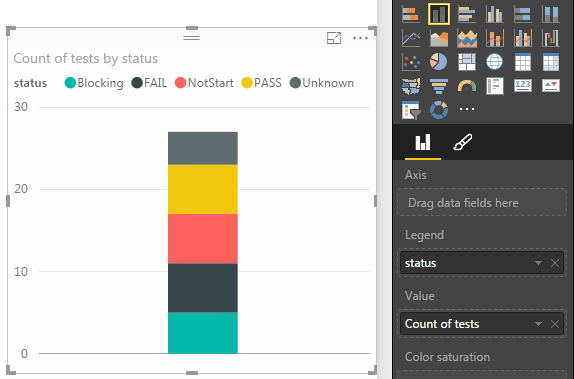
Now, I would like to summarize the count of a column named "tests" with a stacked column chart. And I also take the column "status" as the legend.
From the picture below, you can find that the "Blocking" part is at the bottom of the chart.
My question is: how to move the "Blocking" part to the top of the chart ?
In other words, how could we custom the display order of the legend ?
THANKS !
Kane
Solved! Go to Solution.
- Mark as New
- Bookmark
- Subscribe
- Mute
- Subscribe to RSS Feed
- Permalink
- Report Inappropriate Content
You have to create Measures for each type of Status
Then place each Measure in the Values area in the order you wish
I responded to a similar question but for a pie chart today - it works exactly the same way with a bar chart
http://community.powerbi.com/t5/Desktop/Rearrange-Pies-in-Pie-Chart/m-p/25218#U25218
- Mark as New
- Bookmark
- Subscribe
- Mute
- Subscribe to RSS Feed
- Permalink
- Report Inappropriate Content
In Tableau, you can literally click and drag the order of your items around. WHY IS SUCH A SIMPLE TASK SO CONVOLUTED IN POWER BI! Microsoft, fix your s$#%!
- Mark as New
- Bookmark
- Subscribe
- Mute
- Subscribe to RSS Feed
- Permalink
- Report Inappropriate Content
Totally agree with you.
- Mark as New
- Bookmark
- Subscribe
- Mute
- Subscribe to RSS Feed
- Permalink
- Report Inappropriate Content
Just a note that when you make a change by adding a ranking column or something like that, make sure you delete the field from the legend category in the visualization & add it back in again, for the changes to take effect. A little thing that caught me out!
- Mark as New
- Bookmark
- Subscribe
- Mute
- Subscribe to RSS Feed
- Permalink
- Report Inappropriate Content
The above solutions are valid, but I wanted to share my simple method. YMMV.
I have a table of change tickets, and I want to sort them by Risk Level. The values are Low, Medium, High, and Very High. I want to have a stacked column in this order. However, they list alphabetically and stack High, Low, Medium, Very High.
* Create new column called "Risk Sort Order"
RiskSortOrder = SWITCH('Change Tickets'[Risk Level], "Low", 1, "Medium", 2, "High", 3, "Very High", 4)
At this point, if you try to do "Sort By" on the Risk Level column by Risk Sort Order, you get the error that a column can not be sorted by a column it directly or indirectly affects (etc... didn't screen shot it).
* Create another new column called "Risk Level Push" which will be a direct copy of the original Risk Level column
RiskLevelPush = 'Change Tickets'[Risk Level]
* Select Risk Level Push column, Sort by Risk Sort Order
* Change Visual Legend to use Risk Level Push, rename at visual level "Risk Level"
And Viola! Stacks are now in order as desired - Low, Medium, High, Very High.
This method works great when you have a small, finite number of legend items that you can predictably assign values. Obviously, it's not going to work in a dynamic value situation.
- Mark as New
- Bookmark
- Subscribe
- Mute
- Subscribe to RSS Feed
- Permalink
- Report Inappropriate Content
Hi Folks,
find a another solution
https://community.powerbi.com/t5/Desktop/Custom-Sorting-in-PowerBI/m-p/128051#M54392
- Mark as New
- Bookmark
- Subscribe
- Mute
- Subscribe to RSS Feed
- Permalink
- Report Inappropriate Content
Hi!
I have a similar issue, where I have data from a Likert scaler (1-10) and the legend orders my values as: 1, 10, 2, 3, ...
Can you show me, step-by-step with sample formulae and pictures, what I need to do to order it as: 1, 2, 3, ...?
Thank you!
- Mark as New
- Bookmark
- Subscribe
- Mute
- Subscribe to RSS Feed
- Permalink
- Report Inappropriate Content
Hi @megm001,
There are a few options to explore here depending on your data, so I'll walk through these step by step. After my previous post in which I described using the Group feature to enable sorting by adding a numerical or alphabetical value ("A:", "B:", "C:" or "1:", "2:", "3:", etc.) to the front of each category, I've since started using the Sort by Column feature which I've found to be much cleaner since it doesn't force you to add some additional number or letter to the attribute values in your legend (which can be a bit distracting). It also passes through the sorting to all your visuals, so you don't have to worry about managing this at the visual level.
Let's look at an example.
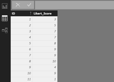
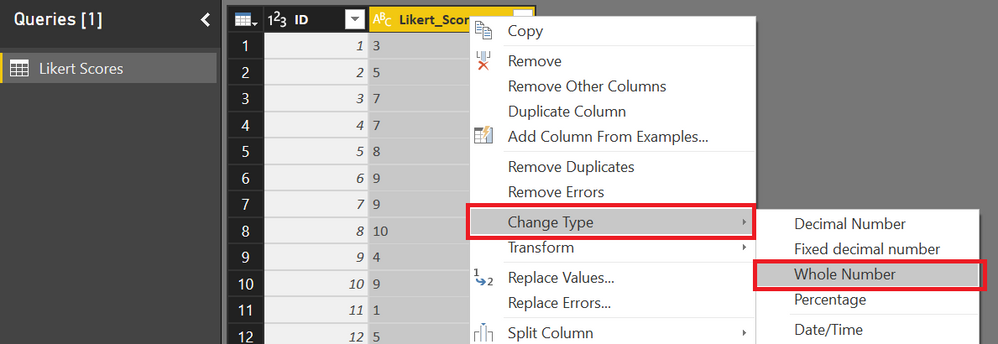
Suppose I have a very simple table with two columns, one an ID and the other a Likert score ranging from 1 to 10 inclusive (for this example, I created the table in Excel and connected to the workbook using Power BI). Here's what the table looks like.
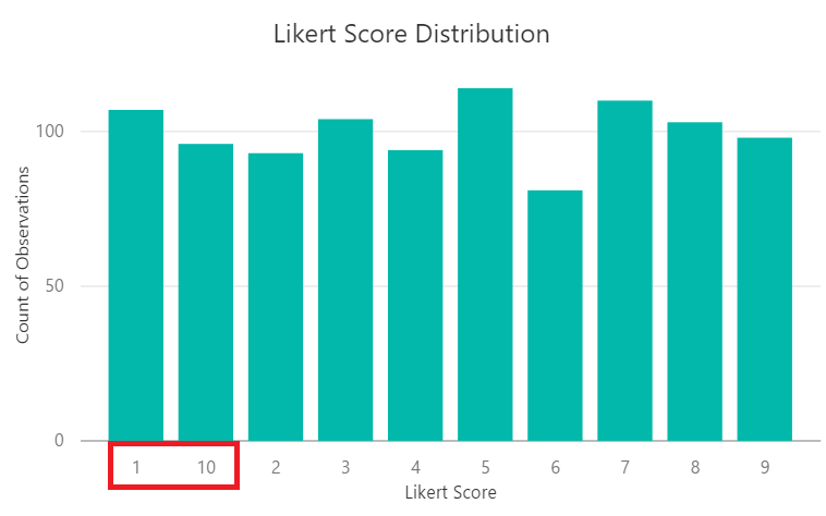
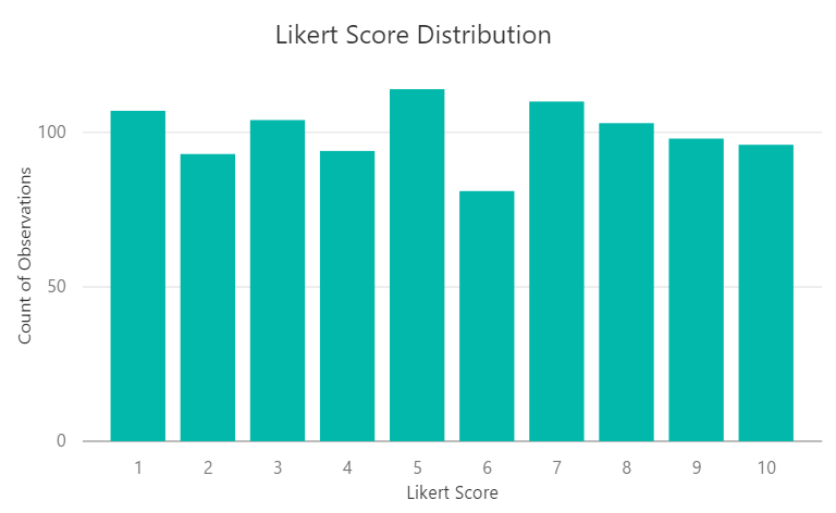
I then created a very simple column chart visual to show the distribution by score.
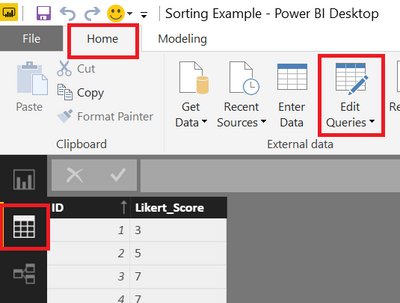
As in the issue you mentioned, 10 appears after 1 instead of appearing at the end after 9. In this example, all of the values stored in the Likert_Score column range from 1 to 10, so there is actually a very simple fix for the sorting issue. All you need to do is go to the query editor, right click on the Likert score column, and update the column data type from text to whole number. The sorting should then update automatically. See below.
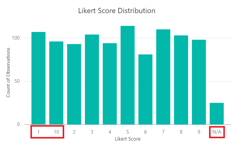
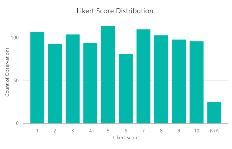
Fixed! There's only one problem. This approach requires converting the column to a numerical data type, but what if your column can't be converted from a text to numerical data type? For example, suppose your column contains "N/A" values (which would throw an error) or isn't even numerical in nature. Let's say for example you have a column with planet names in it and you want those planets to appear in order of increasing distance from the sun instead of alphabetically (i.e., Mercury, Venus, Earth, Mars, etc., instead of Earth, Jupiter, Mars, Mercury, etc.). The good news is there's an easy way to do this which involves setting up a very basic dimension table. Going back to the Likert example, let's say we have some observations that are "N/A", which gives us the following distribution.
Notice that N/A is showing up where we might want it to at the end, but 10 is back in the wrong spot and we can't fix that by changing the data type, because the column now contains non-numerical values. So, let's create a dim table that we can use for sorting. To do this, start by going to Home and selecing Enter Data.
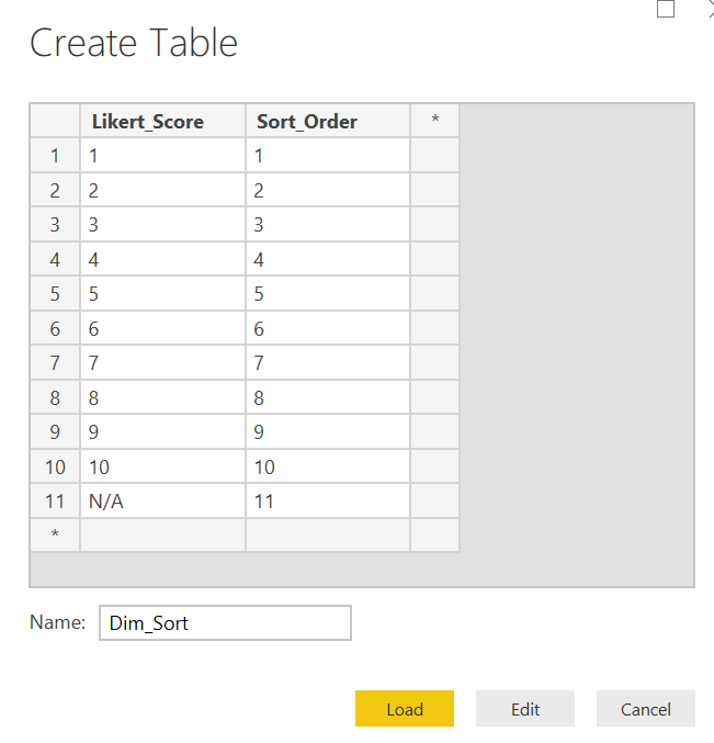
You can then key in a table with two columns, one containing a unique list of values appearing in the original Likert_Score column and another containing the order in which you want those values to appear in the visuals. Then give your table a name and click Load. Note that you could also create this table in a separate Excel workbook and connect to it from Power BI (which works just as well).
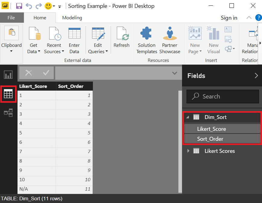
Once you select Load, your new Dim_Sort table should appear under the Data section.
Next, we need to set up a relationship between Dim_Sort and the original table containing our Likert scores.
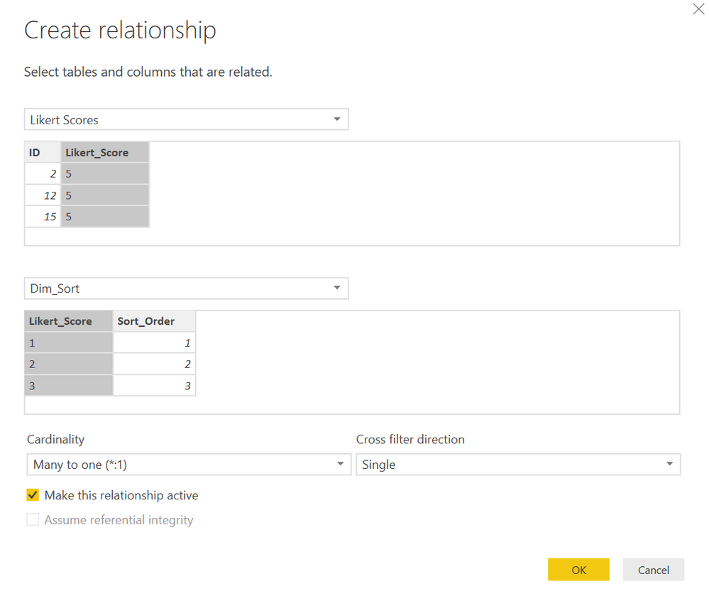
If you gave the column containing the unique list of Likert scores in your new Dim_Sort table the same name as the column containing the Likert scores in your original data table, Power BI should be able to automatically detect the relationship. Let's assume it doesn't though, and we have to set the relationship up manually. Here's what that would look like. Enter the information as shown below, and hit Load.
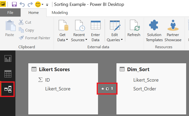
Once you establish the relationship, you should see it under the Relationships section as shown here.
Next, we need to join this new Sort_Order column to our Likert Scores table so we can use it for sorting the Likert_Score column. To do this, go to the Data section, then select the Likert Scores table, Modeling, and Add Column. Enter the DAX formula shown below (you'll need to update the table column names to reflect your actual data). Once you finish entering the formula, the sort order values from Dim_Sort should now appear as a new column in the original table containing your Likert scores.
Now, all we need to is sort the Likert_Score column by the new Sort_Order column. To do this, select the Likert_Score column, then go to Modeling, Sort by Column, and selec the Sort_Order column.
That's it! All your visuals should now reflect the correct sort order.
- Mark as New
- Bookmark
- Subscribe
- Mute
- Subscribe to RSS Feed
- Permalink
- Report Inappropriate Content
Thank you! This is perfect!
- Mark as New
- Bookmark
- Subscribe
- Mute
- Subscribe to RSS Feed
- Permalink
- Report Inappropriate Content
I came across another way to do this that doesn't require the creation of new measures. Here are the steps:
1) Select your visual.
2) In the Legend pane, select the arrow next to the field that you want to reorder.
3) Select New Group.
4) Create a name for your group (Power BI will populate one by default).
5) Use the group dialogue to create a separate group for each attribute value that you want to appear separately in the visual. You can group attribute values or keep them separate by creating a group for each one. There's also a handy "Include Other group" option that groups any remaining attribute values into an "Other" category if you don't need them broken out.
6) Since Power BI orders the legend alphabetically, if you rename the groups and place a number in front of each one indicating the order in which you want it to appear ("1)" or "1-" or "1:" for example), Power BI will display the groups in ascending order based on the leading digit.
Power BI also allows you to reuse the grouping you created in other visuals. It's a really handy way to reorder the attributes if you don't mind there being a number in front of each item in your legend.
- Mark as New
- Bookmark
- Subscribe
- Mute
- Subscribe to RSS Feed
- Permalink
- Report Inappropriate Content
Hi Stefan,
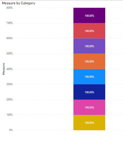
As per u i have created group but the problem is in the stacked column chart i am calculating the percentage of each category when compared to all categories.If i create a group as u mentioned i will get 100% for all the catgories.How to resolve this ?
- Mark as New
- Bookmark
- Subscribe
- Mute
- Subscribe to RSS Feed
- Permalink
- Report Inappropriate Content
Stephan's solution looks perfect to my situation, but I don't see the "New group" option if if select the arrow. I only see the options "Delete field", "Change name" and "Show items whithout data". Has the "New group" option been deleted or am I looking at the wrong place?
- Mark as New
- Bookmark
- Subscribe
- Mute
- Subscribe to RSS Feed
- Permalink
- Report Inappropriate Content
You need to add the field you need to create groups from to Legend field and then start creating groups.
One more thing I was struggiling: to rename the newly created groups, double click on the group name!!!
- Mark as New
- Bookmark
- Subscribe
- Mute
- Subscribe to RSS Feed
- Permalink
- Report Inappropriate Content
Despite the fact that Stefan answer was not tagged as the correct one, i think his is the most professional and accurate answer. Thanks!
- Mark as New
- Bookmark
- Subscribe
- Mute
- Subscribe to RSS Feed
- Permalink
- Report Inappropriate Content
Unable to Edit legend according to my criteria can you help me with it
- Mark as New
- Bookmark
- Subscribe
- Mute
- Subscribe to RSS Feed
- Permalink
- Report Inappropriate Content
You have to create Measures for each type of Status
Then place each Measure in the Values area in the order you wish
I responded to a similar question but for a pie chart today - it works exactly the same way with a bar chart
http://community.powerbi.com/t5/Desktop/Rearrange-Pies-in-Pie-Chart/m-p/25218#U25218
- Mark as New
- Bookmark
- Subscribe
- Mute
- Subscribe to RSS Feed
- Permalink
- Report Inappropriate Content
Can someone provide an example of this Measure?
- Mark as New
- Bookmark
- Subscribe
- Mute
- Subscribe to RSS Feed
- Permalink
- Report Inappropriate Content
Hi,
U can place only one measure in values area ,if you create 10 measures for each status how will you put this 10 measures in value ?
Please suggest
Thanks
- Mark as New
- Bookmark
- Subscribe
- Mute
- Subscribe to RSS Feed
- Permalink
- Report Inappropriate Content
I would like to offer other web visitors what I think is an even better invisble solution in some circumstances, which is to prefix your text with a number of unicode 'zero width space' characters (https://www.fileformat.info/info/unicode/char/200B/index.htm).
Each of these characters has a code, and PowerBI will honour it in its default sorting, but the characters are not visible. Therefore you can add as many as you like. The more you add, the earlier the string will sort.
In my case, I do this in the SQL view definition which is the source of data for PowerBI e.g.
SELECT CASE [somenvarcharfield] WHEN 'alpha' THEN NCHAR(8203)+'alpha' WHEN 'beta' THEN......
e.g. producing the following strings in SQL...
NCHAR(8203)+N'alpha'
NCHAR(8203)+NCHAR(8203)+N'beta'
NCHAR(8203)+NCHAR(8203)+NCHAR(8203)+N'gamma'
Will produce the visible sort order in PowerBI...
gamma
beta
alpha
It may be possible to inject these unicode characters straight into the PowerBI user interface but I haven't tested this - the above works well for me and I generally stick to doing as much work in the view (rather than in PowerBI) as possible.
I hope this helps someone else.
Tim
- Mark as New
- Bookmark
- Subscribe
- Mute
- Subscribe to RSS Feed
- Permalink
- Report Inappropriate Content
For a less scary variation of what @dapster105 suggested what you can do is:
1- Use the "Create groups" function to create a new group for each entry you want in your table.
2 - Hit the windows key and type "Character Map" and open Windows' inbuilt Character map window (you can't do any harm with this!).
3 - In the "Go to Unicode" box type "200C" (without the quotes). Click "Select" & "Copy".
4 - Go back into the groups you created and for each group, paste this character at the start of the group name. Then add a number of spaces, depending on where you want it to appear in the list (the more times you paste it, the higher it ranks)*
5 - Replace the original field with this group in at least one place on the visualisation.
6 - Make sure that you chose this field as the one to sort by, reversing the sort order if needed.
This is as much so I can find it in future as anything, but hope it will help others. It really shouldn't require this...
Matt
*So in the box for the group name the 1st character should be the U200C one, followed by a mnumber of space, followed by the actual title you want to appear.
- Mark as New
- Bookmark
- Subscribe
- Mute
- Subscribe to RSS Feed
- Permalink
- Report Inappropriate Content
Hi there, this seems like the perfect solution but unfortunately PowerBI doesn't seem to recognize the inserten U220C characters for me. Do you have an idea if the software changed at some point or does it still work for you?
Helpful resources

Join us at the Microsoft Fabric Community Conference
March 31 - April 2, 2025, in Las Vegas, Nevada. Use code MSCUST for a $150 discount!

Power BI Monthly Update - February 2025
Check out the February 2025 Power BI update to learn about new features.

Join our Community Sticker Challenge 2025
If you love stickers, then you will definitely want to check out our Community Sticker Challenge!

| User | Count |
|---|---|
| 84 | |
| 69 | |
| 68 | |
| 39 | |
| 37 |
