Fabric Data Days starts November 4th!
Advance your Data & AI career with 50 days of live learning, dataviz contests, hands-on challenges, study groups & certifications and more!
Get registered- Power BI forums
- Get Help with Power BI
- Desktop
- Service
- Report Server
- Power Query
- Mobile Apps
- Developer
- DAX Commands and Tips
- Custom Visuals Development Discussion
- Health and Life Sciences
- Power BI Spanish forums
- Translated Spanish Desktop
- Training and Consulting
- Instructor Led Training
- Dashboard in a Day for Women, by Women
- Galleries
- Data Stories Gallery
- Themes Gallery
- Contests Gallery
- QuickViz Gallery
- Quick Measures Gallery
- Visual Calculations Gallery
- Notebook Gallery
- Translytical Task Flow Gallery
- TMDL Gallery
- R Script Showcase
- Webinars and Video Gallery
- Ideas
- Custom Visuals Ideas (read-only)
- Issues
- Issues
- Events
- Upcoming Events
Get Fabric Certified for FREE during Fabric Data Days. Don't miss your chance! Request now
- Power BI forums
- Forums
- Get Help with Power BI
- Desktop
- Modeling for a relational column with line chart
- Subscribe to RSS Feed
- Mark Topic as New
- Mark Topic as Read
- Float this Topic for Current User
- Bookmark
- Subscribe
- Printer Friendly Page
- Mark as New
- Bookmark
- Subscribe
- Mute
- Subscribe to RSS Feed
- Permalink
- Report Inappropriate Content
Modeling for a relational column with line chart
Greetings all,
I need some suggestions on how to model a column w/line chart showing case status over given time periods (I just used months in the examples but have week and quarter breakouts in the data).
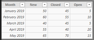
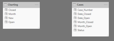
Tracking how many New, Closed, and Open (the line) cases occur in the period. Using the time intelligence functions I can get week/month/quarter designations from the case date stamp and can chart it in a separate table, however it is not relatable to the core case table. The function to calculate Open cases stems from an earlier post I made (Calculate(Count(),Filter)) and received help on.
One suggestion was to make additional rows for each case separating Open and Close dates, assign values (1/-1), and count those, however I would like to avoid duplicating the data size.
I have some functions in place to fill in a future "Close" date so as not to have blanks in the actual data. Then just leave that future date out of the charting.
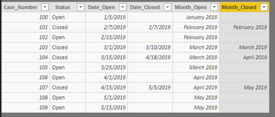
Making the Chart(Month) relate to Case(Month_Open or Month_Close) doesn't work.
Suggestions on how to structure that to make the Column/Line chart relational to the primary case table? How would you accomplish it?
I created some sample data for reference.


Edit: Guess I should indicate that I want it relational so that if I filter by the Case Owner (or other columns not shown in the Case Table sample) that the chart filters appropriately with it.
- Mark as New
- Bookmark
- Subscribe
- Mute
- Subscribe to RSS Feed
- Permalink
- Report Inappropriate Content
This was solved by creating a date table instead of the columns within the Data table itself. Sam from Enterprise DNA posted a blog about handling multiple dates within data tables that help me model it. Some other DAX work around that additional logic (and making the date table inactive relationships per Sam) allowed me to get the dynamic charting I was looking to achieve.
I recommend checking out Sam's blog and videos about it.
Thank you to those offering me suggestions on this endeavor!
TrentS
- Mark as New
- Bookmark
- Subscribe
- Mute
- Subscribe to RSS Feed
- Permalink
- Report Inappropriate Content
- Mark as New
- Bookmark
- Subscribe
- Mute
- Subscribe to RSS Feed
- Permalink
- Report Inappropriate Content
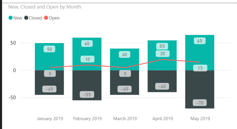
The result is a graph that looks like this but must be responsive to filters from the primary case table.
If there is a way to include those counts, perhaps via DAX measures or columns instead of a separate table and worrying about a relational issue, I am all for it!
The numbers on the Charting table itself come from DAX Calculate(Count(),Filter()) functions based on the data in the primary case table.
Helpful resources

Power BI Monthly Update - November 2025
Check out the November 2025 Power BI update to learn about new features.

Fabric Data Days
Advance your Data & AI career with 50 days of live learning, contests, hands-on challenges, study groups & certifications and more!

| User | Count |
|---|---|
| 97 | |
| 70 | |
| 50 | |
| 42 | |
| 40 |

