FabCon is coming to Atlanta
Join us at FabCon Atlanta from March 16 - 20, 2026, for the ultimate Fabric, Power BI, AI and SQL community-led event. Save $200 with code FABCOMM.
Register now!- Power BI forums
- Get Help with Power BI
- Desktop
- Service
- Report Server
- Power Query
- Mobile Apps
- Developer
- DAX Commands and Tips
- Custom Visuals Development Discussion
- Health and Life Sciences
- Power BI Spanish forums
- Translated Spanish Desktop
- Training and Consulting
- Instructor Led Training
- Dashboard in a Day for Women, by Women
- Galleries
- Data Stories Gallery
- Themes Gallery
- Contests Gallery
- QuickViz Gallery
- Quick Measures Gallery
- Visual Calculations Gallery
- Notebook Gallery
- Translytical Task Flow Gallery
- TMDL Gallery
- R Script Showcase
- Webinars and Video Gallery
- Ideas
- Custom Visuals Ideas (read-only)
- Issues
- Issues
- Events
- Upcoming Events
The Power BI Data Visualization World Championships is back! Get ahead of the game and start preparing now! Learn more
- Power BI forums
- Forums
- Get Help with Power BI
- Desktop
- Re: Missing Date Points
- Subscribe to RSS Feed
- Mark Topic as New
- Mark Topic as Read
- Float this Topic for Current User
- Bookmark
- Subscribe
- Printer Friendly Page
- Mark as New
- Bookmark
- Subscribe
- Mute
- Subscribe to RSS Feed
- Permalink
- Report Inappropriate Content
Missing Date Points
Guys,
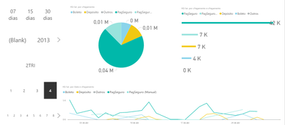
I'm from Brazil, and I have this report, and this shows me Sells by Date and Payment Method:
https://www.dropbox.com/s/mx8dxkusdztvd2m/REPORT.png?dl=0
To the left, some date filters (respective lastDays, year, quarter, month and day), that comes from a calendar table i've just tailored, relationed by date.
The point is that data actually comes from another database - my sells database.
This database drills into Date > Region > Payment Method > Values, and all the information is properly summarized (it was my last challenge, already completed).
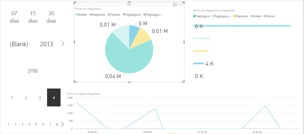
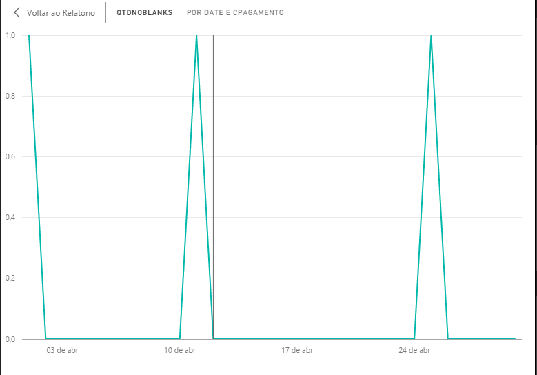
My issue is that when I drill into "apr 2014", on "Boleto" paymentMethod specifically, it shows me actual data with some missing points, because not all days we've sold to every region, nor by every paymentMethod available:
https://www.dropbox.com/s/n0wy0ih404ize75/REPORT_1.png?dl=0
I wish I could show all date-points, even where it misses the data, to analyze the behavior of the indicator along the days.
Since I've just tailored a calendar table (as stated before), I thought that it alone would solve this problem, since all the date-points in my desired range are in the table.
My old Excel database had auxiliar observations with dates from 20130101 to 20161231, for instance, and by that time, just to avoid leaving the paymentMethod column blank, I've put manually "Depósito".
I used to do this to avoid missing date-points in Excel.
When I migrated to Power BI, I started drilling data into a more detailed level.
That proxy indirectly solved the problem I described here in parts, because virtually, we have "Depósito" for all the days in the range:
https://www.dropbox.com/s/547d4c4i64vqzvj/REPORT_2.png?dl=0
I've mentally found a sollution to this problem - by tailoring a database with observations for each day between 20130101 to 20193112, and multiplying it by Region, and after by Payment Method. That could leave me with a database of:
2.922 (dates) X
8 (Regions) X
7 (Payment Methods)
Total: 163,632 observations X 3 columns
Since I don't believe that's the best way to do that, could you guys figure how could I do that?
Regards,
Michell Madeira
Solved! Go to Solution.
- Mark as New
- Bookmark
- Subscribe
- Mute
- Subscribe to RSS Feed
- Permalink
- Report Inappropriate Content
Would need sample data and your relationships and your formulas to really help you. What I can say is that whatever formula that you are using to calculate your sales or whatever, you should be able to wrap in an IF statement with an ISBLANK or something and return a "0" or something for that day so that it has some value for that day. Another trick is to add a column with the formula:
Column = 1
Just include that column in some way in your visualizations and now everything has a value so they do not get filtered out.
Again, these are general suggestions, I can't really give you specifics with the information that you have included.
Follow on LinkedIn
@ me in replies or I'll lose your thread!!!
Instead of a Kudo, please vote for this idea
Become an expert!: Enterprise DNA
External Tools: MSHGQM
YouTube Channel!: Microsoft Hates Greg
Latest book!: DAX For Humans
DAX is easy, CALCULATE makes DAX hard...
- Mark as New
- Bookmark
- Subscribe
- Mute
- Subscribe to RSS Feed
- Permalink
- Report Inappropriate Content
As a self learner, I have never got access to this function before.
It worked flawless:
About putting an extra auxiliar column, this is a technique that I often use, but in this case, maybe my filters would not make it work as we wanted.
Thank you very much, smoupre!
Regards,
Michell Madeira
Helpful resources

Power BI Dataviz World Championships
The Power BI Data Visualization World Championships is back! Get ahead of the game and start preparing now!

| User | Count |
|---|---|
| 39 | |
| 37 | |
| 33 | |
| 32 | |
| 29 |
| User | Count |
|---|---|
| 132 | |
| 88 | |
| 82 | |
| 68 | |
| 64 |


