FabCon is coming to Atlanta
Join us at FabCon Atlanta from March 16 - 20, 2026, for the ultimate Fabric, Power BI, AI and SQL community-led event. Save $200 with code FABCOMM.
Register now!- Power BI forums
- Get Help with Power BI
- Desktop
- Service
- Report Server
- Power Query
- Mobile Apps
- Developer
- DAX Commands and Tips
- Custom Visuals Development Discussion
- Health and Life Sciences
- Power BI Spanish forums
- Translated Spanish Desktop
- Training and Consulting
- Instructor Led Training
- Dashboard in a Day for Women, by Women
- Galleries
- Data Stories Gallery
- Themes Gallery
- Contests Gallery
- QuickViz Gallery
- Quick Measures Gallery
- Visual Calculations Gallery
- Notebook Gallery
- Translytical Task Flow Gallery
- TMDL Gallery
- R Script Showcase
- Webinars and Video Gallery
- Ideas
- Custom Visuals Ideas (read-only)
- Issues
- Issues
- Events
- Upcoming Events
The Power BI Data Visualization World Championships is back! Get ahead of the game and start preparing now! Learn more
- Power BI forums
- Forums
- Get Help with Power BI
- Desktop
- Median line in column chart
- Subscribe to RSS Feed
- Mark Topic as New
- Mark Topic as Read
- Float this Topic for Current User
- Bookmark
- Subscribe
- Printer Friendly Page
- Mark as New
- Bookmark
- Subscribe
- Mute
- Subscribe to RSS Feed
- Permalink
- Report Inappropriate Content
Median line in column chart
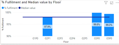
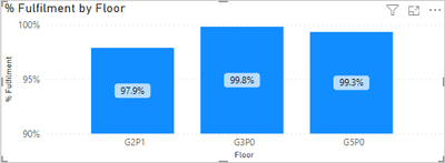
Hi, I have clusterd column chart.
I was trying to add medina line for 98%, but it wasnt working.
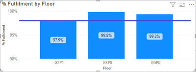
And I was hoping end result would look like this.
Unfortunatelly no measure does the job.
This is the measure of the data in the columns:

Anyone know what would be correct way to do this?
Thanks
Solved! Go to Solution.
- Mark as New
- Bookmark
- Subscribe
- Mute
- Subscribe to RSS Feed
- Permalink
- Report Inappropriate Content
Hi @Justas4478
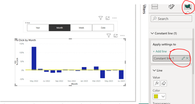
Just take your measure in line value under Analyses setting
like above image.
I hope I answered your question!
- Mark as New
- Bookmark
- Subscribe
- Mute
- Subscribe to RSS Feed
- Permalink
- Report Inappropriate Content
Hi @Justas4478
Just take your measure in line value under Analyses setting
like above image.
I hope I answered your question!
- Mark as New
- Bookmark
- Subscribe
- Mute
- Subscribe to RSS Feed
- Permalink
- Report Inappropriate Content
@Justas4478 This looks like a measure aggregation problem. See my blog article about that here: https://community.powerbi.com/t5/Community-Blog/Design-Pattern-Groups-and-Super-Groups/ba-p/138149
The pattern is:
MinScoreMeasure = MINX ( SUMMARIZE ( Table, Table[Group] , "Measure",[YourMeasure] ), [Measure])
MaxScoreMeasure = MAXX ( SUMMARIZE ( Table, Table[Group] , "Measure",[YourMeasure] ), [Measure])
AvgScoreMeasure = AVERAGEX ( SUMMARIZE ( Table, Table[Group] , "Measure",[YourMeasure] ), [Measure])
etc.
This might also help: To **bleep** With MEDIAN - Microsoft Fabric Community
Follow on LinkedIn
@ me in replies or I'll lose your thread!!!
Instead of a Kudo, please vote for this idea
Become an expert!: Enterprise DNA
External Tools: MSHGQM
YouTube Channel!: Microsoft Hates Greg
Latest book!: DAX For Humans
DAX is easy, CALCULATE makes DAX hard...
Helpful resources

Power BI Dataviz World Championships
The Power BI Data Visualization World Championships is back! Get ahead of the game and start preparing now!

| User | Count |
|---|---|
| 40 | |
| 38 | |
| 36 | |
| 29 | |
| 28 |
| User | Count |
|---|---|
| 127 | |
| 88 | |
| 78 | |
| 66 | |
| 65 |


