Join us at FabCon Vienna from September 15-18, 2025
The ultimate Fabric, Power BI, SQL, and AI community-led learning event. Save €200 with code FABCOMM.
Get registeredEnhance your career with this limited time 50% discount on Fabric and Power BI exams. Ends August 31st. Request your voucher.
- Power BI forums
- Forums
- Get Help with Power BI
- Desktop
- Re: Median line in column chart
- Subscribe to RSS Feed
- Mark Topic as New
- Mark Topic as Read
- Float this Topic for Current User
- Bookmark
- Subscribe
- Printer Friendly Page
- Mark as New
- Bookmark
- Subscribe
- Mute
- Subscribe to RSS Feed
- Permalink
- Report Inappropriate Content
Median line in column chart
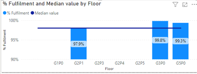
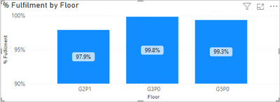
Hi, I have clusterd column chart.
I was trying to add medina line for 98%, but it wasnt working.
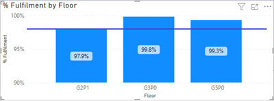
And I was hoping end result would look like this.
Unfortunatelly no measure does the job.
This is the measure of the data in the columns:

Anyone know what would be correct way to do this?
Thanks
Solved! Go to Solution.
- Mark as New
- Bookmark
- Subscribe
- Mute
- Subscribe to RSS Feed
- Permalink
- Report Inappropriate Content
Hi @Justas4478
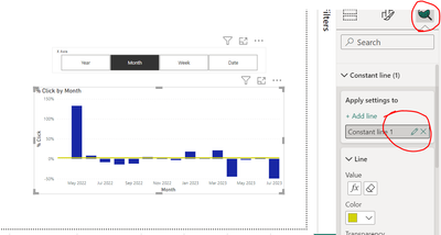
Just take your measure in line value under Analyses setting
like above image.
I hope I answered your question!
- Mark as New
- Bookmark
- Subscribe
- Mute
- Subscribe to RSS Feed
- Permalink
- Report Inappropriate Content
Hi @Justas4478
Just take your measure in line value under Analyses setting
like above image.
I hope I answered your question!
- Mark as New
- Bookmark
- Subscribe
- Mute
- Subscribe to RSS Feed
- Permalink
- Report Inappropriate Content
@Justas4478 This looks like a measure aggregation problem. See my blog article about that here: https://community.powerbi.com/t5/Community-Blog/Design-Pattern-Groups-and-Super-Groups/ba-p/138149
The pattern is:
MinScoreMeasure = MINX ( SUMMARIZE ( Table, Table[Group] , "Measure",[YourMeasure] ), [Measure])
MaxScoreMeasure = MAXX ( SUMMARIZE ( Table, Table[Group] , "Measure",[YourMeasure] ), [Measure])
AvgScoreMeasure = AVERAGEX ( SUMMARIZE ( Table, Table[Group] , "Measure",[YourMeasure] ), [Measure])
etc.
This might also help: To **bleep** With MEDIAN - Microsoft Fabric Community
Follow on LinkedIn
@ me in replies or I'll lose your thread!!!
Instead of a Kudo, please vote for this idea
Become an expert!: Enterprise DNA
External Tools: MSHGQM
YouTube Channel!: Microsoft Hates Greg
Latest book!: DAX For Humans
DAX is easy, CALCULATE makes DAX hard...
Helpful resources
| User | Count |
|---|---|
| 80 | |
| 74 | |
| 41 | |
| 30 | |
| 28 |
| User | Count |
|---|---|
| 107 | |
| 96 | |
| 53 | |
| 47 | |
| 47 |


