Get Fabric certified for FREE!
Don't miss your chance to take the Fabric Data Engineer (DP-700) exam on us!
Learn more- Power BI forums
- Get Help with Power BI
- Desktop
- Service
- Report Server
- Power Query
- Mobile Apps
- Developer
- DAX Commands and Tips
- Custom Visuals Development Discussion
- Health and Life Sciences
- Power BI Spanish forums
- Translated Spanish Desktop
- Training and Consulting
- Instructor Led Training
- Dashboard in a Day for Women, by Women
- Galleries
- Data Stories Gallery
- Themes Gallery
- Contests Gallery
- QuickViz Gallery
- Quick Measures Gallery
- Visual Calculations Gallery
- Notebook Gallery
- Translytical Task Flow Gallery
- TMDL Gallery
- R Script Showcase
- Webinars and Video Gallery
- Ideas
- Custom Visuals Ideas (read-only)
- Issues
- Issues
- Events
- Upcoming Events
The FabCon + SQLCon recap series starts April 14th at 8am Pacific. If you’re tracking where AI is going inside Fabric, this first session is a can't miss. Register now
- Power BI forums
- Forums
- Get Help with Power BI
- Desktop
- Re: Matrix visual with tabular data
- Subscribe to RSS Feed
- Mark Topic as New
- Mark Topic as Read
- Float this Topic for Current User
- Bookmark
- Subscribe
- Printer Friendly Page
- Mark as New
- Bookmark
- Subscribe
- Mute
- Subscribe to RSS Feed
- Permalink
- Report Inappropriate Content
Matrix visual with tabular data
Hello,
I have a tabular data that is stored in the form of a matrix with multiple hierarchies. I want to show this data in the form of a matrix with both expand and collapse option. However, the issue here is that the values in that hierarchy are to be shown without any aggregation such as sum, max, min etc. However, in matrix this is not possible. It is always shown as aggregated value. Is it possible to customize matrix visual to show without any aggregation or is there any other visual, may be a custom one for the same purpose?
Thanks,
- Mark as New
- Bookmark
- Subscribe
- Mute
- Subscribe to RSS Feed
- Permalink
- Report Inappropriate Content
Hi @Anonymous ,
I have a few suggestions for you to see if they work.
Set the matrix visual format
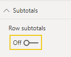
1 turn off the Row subtotals
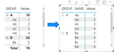
Result:
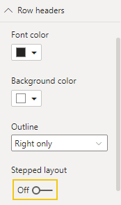
2 turn off the Stepped layout
Result:
Is this the result you want?
Best Regards
Community Support Team _ chenwu zhu
If this post helps, then please consider Accept it as the solution to help the other members find it more quickly.
- Mark as New
- Bookmark
- Subscribe
- Mute
- Subscribe to RSS Feed
- Permalink
- Report Inappropriate Content
Thanks for the comments but the values are still reported as aggregated when collapsed to the top level or in between. What I want is the actual values to be reported without any sum or min or max or avg. Seems like this is only supported in table but that visual misses out the +/- icons.
- Mark as New
- Bookmark
- Subscribe
- Mute
- Subscribe to RSS Feed
- Permalink
- Report Inappropriate Content
@Anonymous
In order to get the desired result, you can add an index column in the power query to your data table and use it in your matrix to show the level of granularity you need.
⭕ Subscribe and learn Power BI from these videos
⚪ Website ⚪ LinkedIn ⚪ PBI User Group
- Mark as New
- Bookmark
- Subscribe
- Mute
- Subscribe to RSS Feed
- Permalink
- Report Inappropriate Content
Thanks for the help. I did try using index column and it worked partially as I can see the actual values when all rows are expanded. However, when I collapsed to the top level, the total sum is again evaluated and the wrong values are reported on the columns. It seems that index does a trick but only when all the rows are expanded and without stepped layout. But this trick does misses out the sole purpose of navigating through +/- icons. Still better than the rest. And hence, looking for some other proper alternatives, otherwise I will close this post marking it as accepted.
Thanks again
Helpful resources

New to Fabric Survey
If you have recently started exploring Fabric, we'd love to hear how it's going. Your feedback can help with product improvements.

Power BI DataViz World Championships - June 2026
A new Power BI DataViz World Championship is coming this June! Don't miss out on submitting your entry.

Join our Fabric User Panel
Share feedback directly with Fabric product managers, participate in targeted research studies and influence the Fabric roadmap.

| User | Count |
|---|---|
| 53 | |
| 40 | |
| 38 | |
| 19 | |
| 18 |
| User | Count |
|---|---|
| 70 | |
| 69 | |
| 34 | |
| 33 | |
| 30 |


