FabCon is coming to Atlanta
Join us at FabCon Atlanta from March 16 - 20, 2026, for the ultimate Fabric, Power BI, AI and SQL community-led event. Save $200 with code FABCOMM.
Register now!- Power BI forums
- Get Help with Power BI
- Desktop
- Service
- Report Server
- Power Query
- Mobile Apps
- Developer
- DAX Commands and Tips
- Custom Visuals Development Discussion
- Health and Life Sciences
- Power BI Spanish forums
- Translated Spanish Desktop
- Training and Consulting
- Instructor Led Training
- Dashboard in a Day for Women, by Women
- Galleries
- Data Stories Gallery
- Themes Gallery
- Contests Gallery
- QuickViz Gallery
- Quick Measures Gallery
- Visual Calculations Gallery
- Notebook Gallery
- Translytical Task Flow Gallery
- TMDL Gallery
- R Script Showcase
- Webinars and Video Gallery
- Ideas
- Custom Visuals Ideas (read-only)
- Issues
- Issues
- Events
- Upcoming Events
View all the Fabric Data Days sessions on demand. View schedule
- Power BI forums
- Forums
- Get Help with Power BI
- Desktop
- Re: Matrix visual - Measure to be shown only in to...
- Subscribe to RSS Feed
- Mark Topic as New
- Mark Topic as Read
- Float this Topic for Current User
- Bookmark
- Subscribe
- Printer Friendly Page
- Mark as New
- Bookmark
- Subscribe
- Mute
- Subscribe to RSS Feed
- Permalink
- Report Inappropriate Content
Matrix visual - Measure to be shown only in total's part of visual
Hey guys,
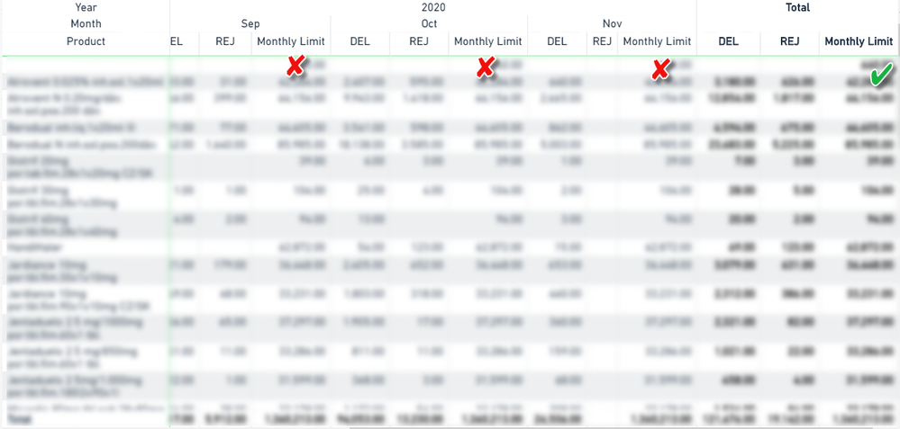
I have been struggling with setting up my Matrix visual. What I want to do is to have 3 measures in my Matrix. However, the first two (called DEL and REJ) should be shown normally in a grid section together with totals, but the Monthly Limit measure (which shows Limits for last month) I want to have only in the total's section. Or just standing most on the right side let's say.
For better understanding see the picture below:
Do you have some idea on how to implement it?
Thanks in advance.
Pavel
Solved! Go to Solution.
- Mark as New
- Bookmark
- Subscribe
- Mute
- Subscribe to RSS Feed
- Permalink
- Report Inappropriate Content
Hi @AlB ,
thanks for your reply and tip, however, this is not a much convenient workaround. I would have to reduce column width with every new month and even when I do it the formating is quite bad = lines in the grid do not align, and every row is huge in terms of height due to the reduced columns with values.
I will go on with my workaround - report page tooltips.
Thanks.
Pavel
- Mark as New
- Bookmark
- Subscribe
- Mute
- Subscribe to RSS Feed
- Permalink
- Report Inappropriate Content
Hi @PavelR
A workaround would be:
1. Select the column you want to hide.
2. In the visualization menu, go to Format--> Column headers and set both Auto-size column width and Word wrap to Off
3. In the visual, reduce the width of the column until it disappears completely. This way it will be still there, but completely hidden
Please mark the question solved when done and consider giving a thumbs up if posts are helpful.
Contact me privately for support with any larger-scale BI needs, tutoring, etc.
Cheers
- Mark as New
- Bookmark
- Subscribe
- Mute
- Subscribe to RSS Feed
- Permalink
- Report Inappropriate Content
Hi @AlB ,
thanks for your reply and tip, however, this is not a much convenient workaround. I would have to reduce column width with every new month and even when I do it the formating is quite bad = lines in the grid do not align, and every row is huge in terms of height due to the reduced columns with values.
I will go on with my workaround - report page tooltips.
Thanks.
Pavel
- Mark as New
- Bookmark
- Subscribe
- Mute
- Subscribe to RSS Feed
- Permalink
- Report Inappropriate Content
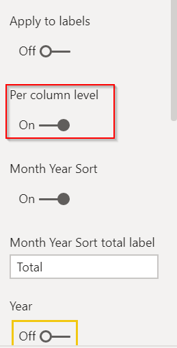
You can turn them off @PavelR - just go into the settings for the matrix, Subtotals, and turn on Per Column setting, then disable the subtotals you don't want.
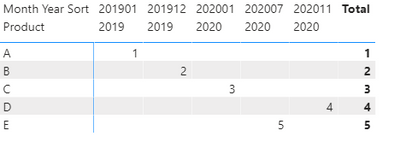
You can see in my mocked up data the subtotals fo the YearMonth are off, but for the grand total it stays visible.
Did I answer your question? Mark my post as a solution!
Did my answers help arrive at a solution? Give it a kudos by clicking the Thumbs Up!
DAX is for Analysis. Power Query is for Data Modeling
Proud to be a Super User!
MCSA: BI Reporting- Mark as New
- Bookmark
- Subscribe
- Mute
- Subscribe to RSS Feed
- Permalink
- Report Inappropriate Content
You can make those columns return blank, but you can't remove them completely. To make them blank, you can use
NewMeasure = IF(HASONEVALUE(Table[Month]), BLANK(), [Your Expression])
Regards,
Pat
Did I answer your question? Mark my post as a solution! Kudos are also appreciated!
To learn more about Power BI, follow me on Twitter or subscribe on YouTube.
@mahoneypa HoosierBI on YouTube
- Mark as New
- Bookmark
- Subscribe
- Mute
- Subscribe to RSS Feed
- Permalink
- Report Inappropriate Content
Hi @mahoneypat ,
thanks for your suggestion. I have already tried that, but it is unfortunately not the result that I want 😕
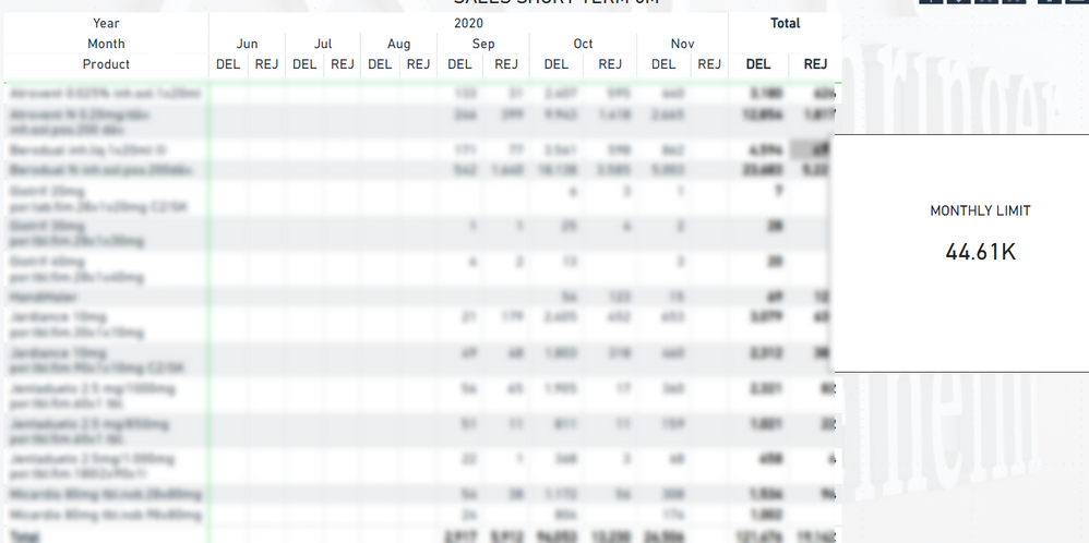
Another workaround has come up my mind and it is actually to use the Report page tooltip. I do not think that there would be anything better...
- Mark as New
- Bookmark
- Subscribe
- Mute
- Subscribe to RSS Feed
- Permalink
- Report Inappropriate Content
Hi Pavel,
Will Monthly_limit appear for each row or only one column for total report ?
Helpful resources

Power BI Monthly Update - November 2025
Check out the November 2025 Power BI update to learn about new features.

Fabric Data Days
Advance your Data & AI career with 50 days of live learning, contests, hands-on challenges, study groups & certifications and more!


