Get Fabric certified for FREE!
Don't miss your chance to take exam DP-600 or DP-700 on us!
Request now- Power BI forums
- Get Help with Power BI
- Desktop
- Service
- Report Server
- Power Query
- Mobile Apps
- Developer
- DAX Commands and Tips
- Custom Visuals Development Discussion
- Health and Life Sciences
- Power BI Spanish forums
- Translated Spanish Desktop
- Training and Consulting
- Instructor Led Training
- Dashboard in a Day for Women, by Women
- Galleries
- Data Stories Gallery
- Themes Gallery
- Contests Gallery
- QuickViz Gallery
- Quick Measures Gallery
- Visual Calculations Gallery
- Notebook Gallery
- Translytical Task Flow Gallery
- TMDL Gallery
- R Script Showcase
- Webinars and Video Gallery
- Ideas
- Custom Visuals Ideas (read-only)
- Issues
- Issues
- Events
- Upcoming Events
Learn from the best! Meet the four finalists headed to the FINALS of the Power BI Dataviz World Championships! Register now
- Power BI forums
- Forums
- Get Help with Power BI
- Desktop
- Re: Matrix table
- Subscribe to RSS Feed
- Mark Topic as New
- Mark Topic as Read
- Float this Topic for Current User
- Bookmark
- Subscribe
- Printer Friendly Page
- Mark as New
- Bookmark
- Subscribe
- Mute
- Subscribe to RSS Feed
- Permalink
- Report Inappropriate Content
Matrix table
Hi everyone,
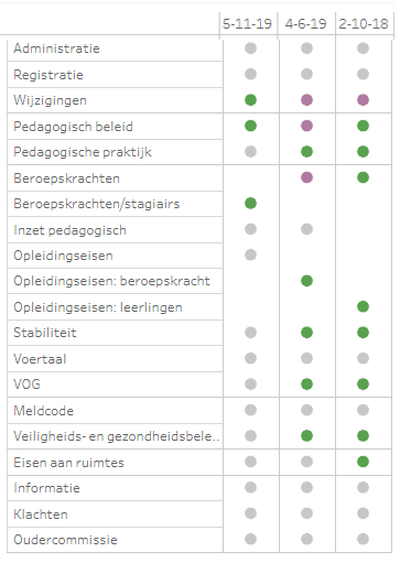
I want to create a matrix table, but it is more complex than usual. I want to assign colours for each value (and there are only three values: 1, -1 or the cell is empty. The result should be like this:
The value 1 is the colour green, -1 is purple en the empty cell is grey. The Excel-sheet looks like this:
https://docs.google.com/spreadsheets/d/1aI6ikWyc5-k1hnRSS9l061RYfxONcv5S7Q2auKtYO9U/edit?usp=sharing
Could someone help me with this, please?
Solved! Go to Solution.
- Mark as New
- Bookmark
- Subscribe
- Mute
- Subscribe to RSS Feed
- Permalink
- Report Inappropriate Content
Hello again @Anonymous ,
Yeah it's not that good the way you see it, I suppose you're using more value variables which will return a pretty ugly matrix is that it?
If you create a measure for each column you won't have that problem.
Let me know if that was it.
Best Regards
Duarte Raminhos
- Mark as New
- Bookmark
- Subscribe
- Mute
- Subscribe to RSS Feed
- Permalink
- Report Inappropriate Content
Hi @Anonymous ,
You use the matrix visual assign the rows and columns fields as you usually would.
To show colors instead of numbers I've been formating the values font to white so it's not seen, after that you have to use the "Conditional Formating" and assign each color to each value.
Let me know if it helped,
Best Regards,
Duarte Raminhos 😁
- Mark as New
- Bookmark
- Subscribe
- Mute
- Subscribe to RSS Feed
- Permalink
- Report Inappropriate Content
Hi @Anonymous ,
Thanks for your reply. It is a start, but it isn't sufficient.
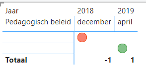
I made two screenshots. I used only one variable to simplify the example.
I am not satisfied with the visualisation; 'Pedagogisch beleid is shown above and the values (-1 and 1 which have a white font now) are shown in the rows. But it should be like this:
dec-2018 april-2019
Pedagogisch beleid red circle green circle
- Mark as New
- Bookmark
- Subscribe
- Mute
- Subscribe to RSS Feed
- Permalink
- Report Inappropriate Content
Hello again @Anonymous ,
Yeah it's not that good the way you see it, I suppose you're using more value variables which will return a pretty ugly matrix is that it?
If you create a measure for each column you won't have that problem.
Let me know if that was it.
Best Regards
Duarte Raminhos
- Mark as New
- Bookmark
- Subscribe
- Mute
- Subscribe to RSS Feed
- Permalink
- Report Inappropriate Content
Hi @Anonymous ,
You were right; I unpivot all the columns I needed, so that I retained one column.
I used the following measure for the colour system:
KPI light = IF(
Helpful resources

Join our Fabric User Panel
Share feedback directly with Fabric product managers, participate in targeted research studies and influence the Fabric roadmap.

Power BI Monthly Update - February 2026
Check out the February 2026 Power BI update to learn about new features.

| User | Count |
|---|---|
| 49 | |
| 40 | |
| 37 | |
| 14 | |
| 13 |
| User | Count |
|---|---|
| 85 | |
| 69 | |
| 37 | |
| 28 | |
| 27 |


