FabCon is coming to Atlanta
Join us at FabCon Atlanta from March 16 - 20, 2026, for the ultimate Fabric, Power BI, AI and SQL community-led event. Save $200 with code FABCOMM.
Register now!- Power BI forums
- Get Help with Power BI
- Desktop
- Service
- Report Server
- Power Query
- Mobile Apps
- Developer
- DAX Commands and Tips
- Custom Visuals Development Discussion
- Health and Life Sciences
- Power BI Spanish forums
- Translated Spanish Desktop
- Training and Consulting
- Instructor Led Training
- Dashboard in a Day for Women, by Women
- Galleries
- Data Stories Gallery
- Themes Gallery
- Contests Gallery
- Quick Measures Gallery
- Visual Calculations Gallery
- Notebook Gallery
- Translytical Task Flow Gallery
- TMDL Gallery
- R Script Showcase
- Webinars and Video Gallery
- Ideas
- Custom Visuals Ideas (read-only)
- Issues
- Issues
- Events
- Upcoming Events
Calling all Data Engineers! Fabric Data Engineer (Exam DP-700) live sessions are back! Starting October 16th. Sign up.
- Power BI forums
- Forums
- Get Help with Power BI
- Desktop
- Matrix Conditional Formatting correct in totals bu...
- Subscribe to RSS Feed
- Mark Topic as New
- Mark Topic as Read
- Float this Topic for Current User
- Bookmark
- Subscribe
- Printer Friendly Page
- Mark as New
- Bookmark
- Subscribe
- Mute
- Subscribe to RSS Feed
- Permalink
- Report Inappropriate Content
Matrix Conditional Formatting correct in totals but not values
Hi,
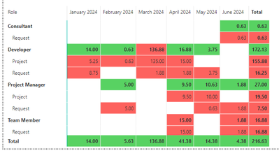
I am currently building a matrix that has 2 row values and one column. I have formatted this matrix to colour based on whether a role is over/under/within capacity for that month. The current table this is coming from is setup like this:
| Role | Month Year | Time Type | Hours |
| Consultant | January 2024 | Project | 30 |
| Consultant | January 2024 | Capacity | 40 |
| Consultant | January 2024 | Request | 15 |
The matrix currently looks like this:
Where the totals (e.g., developer) are correct but the project/request level and grand total on the bottom is incorrect. The values in the matrix are summing hours where time type = Request or Project, and is compared against a measure for Capacity where Time type = Capacity.
Is there anything I'm doing incorrectly? I thought it might be because the capacity measure isn't in the matrix, but then the totals shouldn't be correct either?
Many thanks
Solved! Go to Solution.
- Mark as New
- Bookmark
- Subscribe
- Mute
- Subscribe to RSS Feed
- Permalink
- Report Inappropriate Content
In case anyone is curious or has the same issue, I found that because my capacity was also marked within the time type column, it was filtering it out in the matrix (as I only added project and request types together). This measure solved the issue for me:
Helpful resources

FabCon Global Hackathon
Join the Fabric FabCon Global Hackathon—running virtually through Nov 3. Open to all skill levels. $10,000 in prizes!

Power BI Monthly Update - October 2025
Check out the October 2025 Power BI update to learn about new features.


