Get Fabric certified for FREE!
Don't miss your chance to take the Fabric Data Engineer (DP-600) exam for FREE! Find out how by attending the DP-600 session on April 23rd (pacific time), live or on-demand.
Learn more- Power BI forums
- Get Help with Power BI
- Desktop
- Service
- Report Server
- Power Query
- Mobile Apps
- Developer
- DAX Commands and Tips
- Custom Visuals Development Discussion
- Health and Life Sciences
- Power BI Spanish forums
- Translated Spanish Desktop
- Training and Consulting
- Instructor Led Training
- Dashboard in a Day for Women, by Women
- Galleries
- Data Stories Gallery
- Themes Gallery
- Contests Gallery
- QuickViz Gallery
- Quick Measures Gallery
- Visual Calculations Gallery
- Notebook Gallery
- Translytical Task Flow Gallery
- TMDL Gallery
- R Script Showcase
- Webinars and Video Gallery
- Ideas
- Custom Visuals Ideas (read-only)
- Issues
- Issues
- Events
- Upcoming Events
Next up in the FabCon + SQLCon recap series: The roadmap for Microsoft SQL and Maximizing Developer experiences in Fabric. All sessions are available on-demand after the live show. Register now
- Power BI forums
- Forums
- Get Help with Power BI
- Desktop
- Re: Mapbox heatmaps
- Subscribe to RSS Feed
- Mark Topic as New
- Mark Topic as Read
- Float this Topic for Current User
- Bookmark
- Subscribe
- Printer Friendly Page
- Mark as New
- Bookmark
- Subscribe
- Mute
- Subscribe to RSS Feed
- Permalink
- Report Inappropriate Content
Mapbox heatmaps
Hi Power BI community!
Can someone share a manual on how to create heatmaps using Mapbox custom visual. All I found online was these two articles:
However, I was unable to find how to indicate the weight of each data point (seems like 'size' is not what I am after)
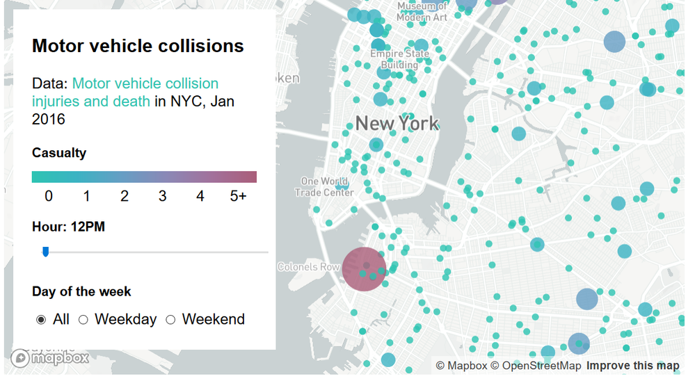
Ideally, I am after something like this (source https://www.mapbox.com/help/show-changes-over-time/ ) but in a "temperature"-heatmap format.
My aim is to display parking spaces that are being used at different times of the day at a certain suburb and highlight the areas that have most concentration of cars (i.e. areas with lots of cars would be "high temperature" - red, empty areas - "cold" - blue).
Currently I'm using Excel Power Maps to produce heatmap videos and then either embed the videos into Power BI dashboards. However, I am looking for a more interactive solution (i.e. being able to control time of the day using the slicer like in the screenshot above) , that can be easilty integrated into Power BI report.
Would really apprecaite if anyone could share their knowledge and help with this.
Thank you,
rigosakh
- Mark as New
- Bookmark
- Subscribe
- Mute
- Subscribe to RSS Feed
- Permalink
- Report Inappropriate Content
Hi
“Currently I'm using Excel Power Maps to produce heatmap videos and then either embed the videos into Power BI dashboards”, how are the heatmap videos embed, are they added to Power BI dashboard as a video like this or imported with the excel data using Get Data> excel?
It is not possible to obtain a visual the same as your example, there is a workaround to get a similar one.
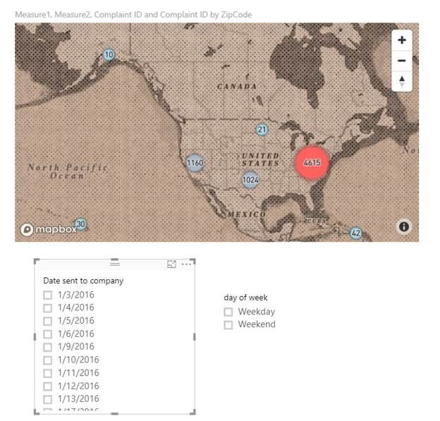
You can create a Mapbox visual with your dataset in power bi desktop and then add a slicer to filter the visual.
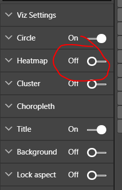
Per your requirement of the data point format, in Mapbox visual, you can select Cluster instead of Heatmap, then change the Max Color and Min Color to what you want.
What do you want to filter by the slicer?
For example , if you want to filter the Latitude and Longitude by the slicer
1.Before you need to define the day by creating calculated columns
day = WEEKDAY([Date sent to company],1)
day of week = IF([day]>1&&[day]<7,"Weekday","Weekend")
2.Then create measures for the one you want to change by selecting in the slicer, eg. Latitude and Longitude
Measure1 =
CALCULATE (
    MAX ( [Latitude] ),
    ALLSELECTED ( Complaints[Date sent to company] )
)
Measure2 =
CALCULATE (
MAX ( [Longitude] ),
ALLSELECTED ( Complaints[Date sent to company] )
)
3.Finally, add columns to slicers, for my example, these are columns ’date sent to company’ and ‘day of week’.
Best Regards
Maggie
- Mark as New
- Bookmark
- Subscribe
- Mute
- Subscribe to RSS Feed
- Permalink
- Report Inappropriate Content
Mapbox work with power BI emmbded or when I publish to web.
- Mark as New
- Bookmark
- Subscribe
- Mute
- Subscribe to RSS Feed
- Permalink
- Report Inappropriate Content
Hi Maggie,
Thank you for your reply. Unfortunately, clustering would not be a solution in my case, let me explain my desired output and how it is created using excel tools.
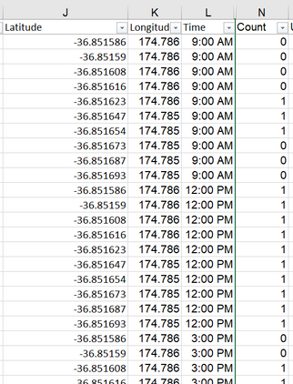
FIrst I capture lat/lon for all the required spaces in a certain area. Every space is assigned 1 or 0 at different hours of the day. Source data looks like this :
PowerMap addon converts this data into this :
A lot of clients find this format of presentation of data useful, I was hoping to that MapBox can produce something similar so I was specifically interested in some additional guidance around heatmap functionality of the visual
If I put count it Color or Size of visual and use the time slicer, for some reason it doesn't change.
Thank you,
rigosakh
Helpful resources

New to Fabric Survey
If you have recently started exploring Fabric, we'd love to hear how it's going. Your feedback can help with product improvements.

Power BI DataViz World Championships - June 2026
A new Power BI DataViz World Championship is coming this June! Don't miss out on submitting your entry.

FabCon &SQLCon Highlights
Experience the highlights from FabCon & SQLCon, available live and on-demand starting April 14th.

| User | Count |
|---|---|
| 47 | |
| 43 | |
| 40 | |
| 20 | |
| 15 |
| User | Count |
|---|---|
| 70 | |
| 67 | |
| 32 | |
| 27 | |
| 25 |


