FabCon is coming to Atlanta
Join us at FabCon Atlanta from March 16 - 20, 2026, for the ultimate Fabric, Power BI, AI and SQL community-led event. Save $200 with code FABCOMM.
Register now!- Power BI forums
- Get Help with Power BI
- Desktop
- Service
- Report Server
- Power Query
- Mobile Apps
- Developer
- DAX Commands and Tips
- Custom Visuals Development Discussion
- Health and Life Sciences
- Power BI Spanish forums
- Translated Spanish Desktop
- Training and Consulting
- Instructor Led Training
- Dashboard in a Day for Women, by Women
- Galleries
- Data Stories Gallery
- Themes Gallery
- Contests Gallery
- QuickViz Gallery
- Quick Measures Gallery
- Visual Calculations Gallery
- Notebook Gallery
- Translytical Task Flow Gallery
- TMDL Gallery
- R Script Showcase
- Webinars and Video Gallery
- Ideas
- Custom Visuals Ideas (read-only)
- Issues
- Issues
- Events
- Upcoming Events
The Power BI Data Visualization World Championships is back! Get ahead of the game and start preparing now! Learn more
- Power BI forums
- Forums
- Get Help with Power BI
- Desktop
- Map with shading per state and multiple data value...
- Subscribe to RSS Feed
- Mark Topic as New
- Mark Topic as Read
- Float this Topic for Current User
- Bookmark
- Subscribe
- Printer Friendly Page
- Mark as New
- Bookmark
- Subscribe
- Mute
- Subscribe to RSS Feed
- Permalink
- Report Inappropriate Content
Map with shading per state and multiple data values
Hi
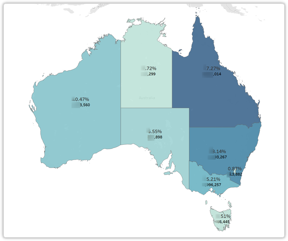
We seem to have many complex map options but nothing that simply shows each State's value with clean data points (as many as we need like we can for a tooltip) with full color shading of the State based on a data value.
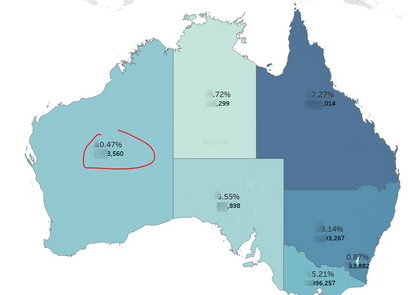
Is there anything that comes close to this example from Tableau that we're trying to migrate away from?
Thanks
Mike
- Mark as New
- Bookmark
- Subscribe
- Mute
- Subscribe to RSS Feed
- Permalink
- Report Inappropriate Content
Hi @MikeCDS ,
I may be oversimplifying this, but if you are always displaying the same country, could you not place transparent cards over the states displaying the measures you want? Could also use a multi-row card for multiple measures etc.
Obviously wouldn't work if you were zooming in on states but a starting point, no?
Pete
Now accepting Kudos! If my post helped you, why not give it a thumbs-up?
Proud to be a Datanaut!
- Mark as New
- Bookmark
- Subscribe
- Mute
- Subscribe to RSS Feed
- Permalink
- Report Inappropriate Content
Hi Pete
I actually thought of that earlier this morning using a Filled Map viz and thought I had a win but the problem is as soon as you click on the map, the KPI cards "move to back" and hide. So it's sort of a solution if one could pretend the user never clicked on anything but a bit clunky to release. Turns out we also have no options to "disable selection" or set "Always on top" which would overcome this "hiding" issue and we would be golden.
- Mark as New
- Bookmark
- Subscribe
- Mute
- Subscribe to RSS Feed
- Permalink
- Report Inappropriate Content
Hi @MikeCDS ,
It is impossible to achieve such an effect completely in current version(2.79.5768.663 64-bit (March 2020)) .
(Can't display values on the map.)
Best regards,
Lionel Chen
If this post helps, then please consider Accept it as the solution to help the other members find it more quickly.
- Mark as New
- Bookmark
- Subscribe
- Mute
- Subscribe to RSS Feed
- Permalink
- Report Inappropriate Content
@MikeCDS , there is an option for Color saturation in MAP. you should able to get these kinds of colors
- Mark as New
- Bookmark
- Subscribe
- Mute
- Subscribe to RSS Feed
- Permalink
- Report Inappropriate Content
Hi
Thanks but I know about that visual and it does not address my question, "shows each State's value with clean data points".
Helpful resources

Power BI Dataviz World Championships
The Power BI Data Visualization World Championships is back! Get ahead of the game and start preparing now!

| User | Count |
|---|---|
| 39 | |
| 37 | |
| 33 | |
| 32 | |
| 29 |
| User | Count |
|---|---|
| 132 | |
| 88 | |
| 82 | |
| 68 | |
| 64 |


