A new Data Days event is coming soon!
This time we’re going bigger than ever. Fabric, Power BI, SQL, AI and more. We're covering it all. You won't want to miss it.
Learn more- Power BI forums
- Get Help with Power BI
- Desktop
- Service
- Report Server
- Power Query
- Mobile Apps
- Developer
- DAX Commands and Tips
- Custom Visuals Development Discussion
- Health and Life Sciences
- Power BI Spanish forums
- Translated Spanish Desktop
- Training and Consulting
- Instructor Led Training
- Dashboard in a Day for Women, by Women
- Galleries
- Data Stories Gallery
- Themes Gallery
- Contests Gallery
- QuickViz Gallery
- Quick Measures Gallery
- Visual Calculations Gallery
- Notebook Gallery
- Translytical Task Flow Gallery
- TMDL Gallery
- R Script Showcase
- Webinars and Video Gallery
- Ideas
- Custom Visuals Ideas (read-only)
- Issues
- Issues
- Events
- Upcoming Events
Level up your Power BI skills this month - build one visual each week and tell better stories with data! Get started
- Power BI forums
- Forums
- Get Help with Power BI
- Desktop
- Re: Map multiple data sets on the same map
- Subscribe to RSS Feed
- Mark Topic as New
- Mark Topic as Read
- Float this Topic for Current User
- Bookmark
- Subscribe
- Printer Friendly Page
- Mark as New
- Bookmark
- Subscribe
- Mute
- Subscribe to RSS Feed
- Permalink
- Report Inappropriate Content
Map multiple data sets on the same map
I have 2 datasets:
Dataset 1 has a latitude and longitude value for every piece of equipment my company has working in remote locations.
Latitude
Longitude
EquipmentID
Dataset 2 has a latitiude and longitude value for every possible remote location that my company could be working, but does not currently have equipment. These locations would identify potential customers.
Latitude
Longitude
LocationID
CompanyName
On the same map I want to plot the locations where I am currently working, and also plot the locations where potential customers could be so I can see them together.
How could I accomplish this?
Solved! Go to Solution.
- Mark as New
- Bookmark
- Subscribe
- Mute
- Subscribe to RSS Feed
- Permalink
- Report Inappropriate Content
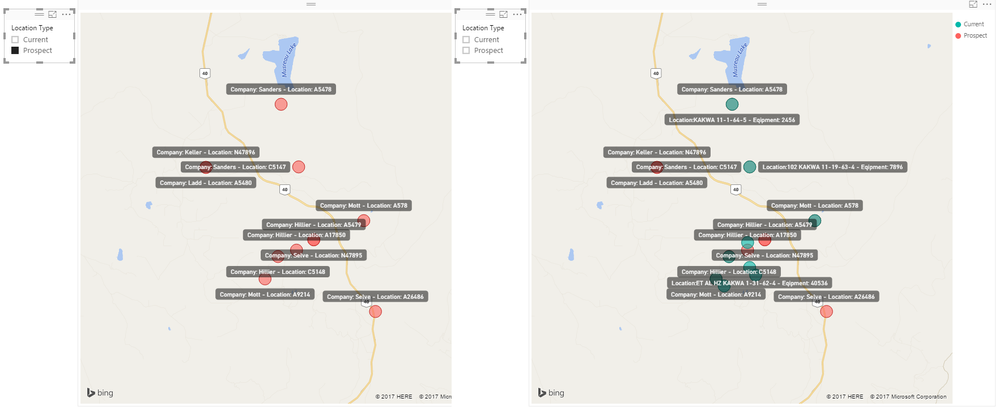
Yes do overlay here too!
That's why in the picture on the right those locations are neither red nor green because they are directly on top of each other!
And yes you can use a slicer(s) to turn on/off various elements such as Current or Prospect
Good Luck! ![]()
- Mark as New
- Bookmark
- Subscribe
- Mute
- Subscribe to RSS Feed
- Permalink
- Report Inappropriate Content
Hi, I've got a similar issue but I want the distance in figure and not to plot it on the map.
For example I want to know which of my cutomer travelled the longest distance to me.e.g 4miles, 7miles et.c
- Mark as New
- Bookmark
- Subscribe
- Mute
- Subscribe to RSS Feed
- Permalink
- Report Inappropriate Content
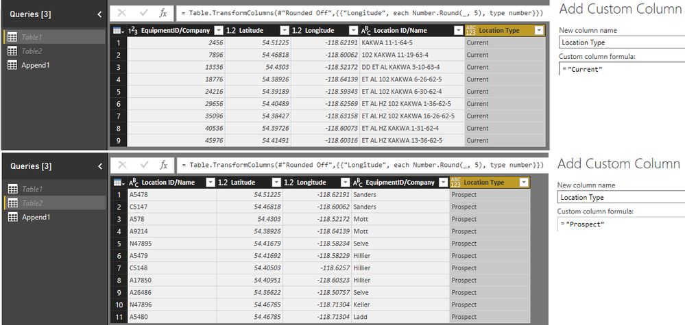
Merge the 2 datasets in the Query Editor (you can keep only the relevant columns)
Post some sample data...
You can create a conditional column say - if no EquipmentID - "prospect" else "current" so you can use this as a Legend
to easily identify current vs prospects...
its tough to say what the best option would be without seeing some sample data of the 2 datasets ![]()
- Mark as New
- Bookmark
- Subscribe
- Mute
- Subscribe to RSS Feed
- Permalink
- Report Inappropriate Content
Sean,
I have similar situation.. the two datasets cannot be merged since they dont have same zipcodes for example.. so if i want to map two datasets containing different sets of zipcodes then how do i do this?
If i append both datasets into one then i can see all zipcodes but i want ability to filter zipcodes from first dataset and always see zipcodes from second dataset.
- Mark as New
- Bookmark
- Subscribe
- Mute
- Subscribe to RSS Feed
- Permalink
- Report Inappropriate Content
Post some sample data of all columns involved in both data sets
- Mark as New
- Bookmark
- Subscribe
- Mute
- Subscribe to RSS Feed
- Permalink
- Report Inappropriate Content
Here is a sample from each dataset.
Note: there may be similar lat and long in each set, but this will not always be the case. So it can't be assumed that this ties the datasets together as there could be situations where lat and long never matches.
In a perfect world I could control visiblity of each dataset independent of the other on the map, and quickly see areas where my work is concentrated relative to all areas that have work taking place. I have used another product that allowed me to select datasets to be visable without the requirement for the datasets being joined. Hoping this is possible and thanks for your help.
Data Set 1
| MXXEquipmentID | Latitude | Longitude | LocationName |
| 2456 | 54.51225 | -118.62191 | KAKWA 11-1-64-5 |
| 7896 | 54.46818 | -118.60062 | 102 KAKWA 11-19-63-4 |
| 13336 | 54.4303 | -118.52172 | DD ET AL KAKWA 3-10-63-4 |
| 18776 | 54.38926 | -118.64139 | ET AL 102 KAKWA 6-26-62-5 |
| 24216 | 54.39189 | -118.59343 | ET AL 102 KAKWA 6-30-62-4 |
| 29656 | 54.40489 | -118.62569 | ET AL HZ 102 KAKWA 1-36-62-5 |
| 35096 | 54.38427 | -118.63158 | ET AL HZ 102 KAKWA 16-26-62-5 |
| 40536 | 54.39726 | -118.60073 | ET AL HZ KAKWA 1-31-62-4 |
| 45976 | 54.41491 | -118.60316 | ET AL HZ KAKWA 13-36-62-5 |
Dataset 2
| LocationID | Latitude | Longitude | CompanyName |
| A5478 | 54.51225 | -118.62191 | Sanders |
| C5147 | 54.46818 | -118.60062 | Sanders |
| A578 | 54.4303 | -118.52172 | Mott |
| A9214 | 54.38926 | -118.64139 | Mott |
| N47895 | 54.41679 | -118.58234 | Selve |
| A5479 | 54.41692 | -118.58229 | Hillier |
| C5148 | 54.40503 | -118.6257 | Hillier |
| A17850 | 54.40951 | -118.60323 | Hillier |
| A26486 | 54.36622 | -118.50757 | Selve |
| N47896 | 54.46785 | -118.71304 | Keller |
| A5480 | 54.46785 | -118.71304 | Ladd |
- Mark as New
- Bookmark
- Subscribe
- Mute
- Subscribe to RSS Feed
- Permalink
- Report Inappropriate Content
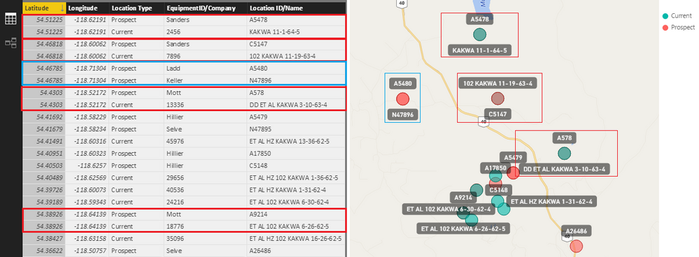
You have Identical Locations (to 5 decimal places) that can be both Prospect and Current
or can be 2 different Prospects at the same exact Location
How did you handle these with the other software?
EDIT: Oh and I meant - Append the 2 tables (see picture)
- Mark as New
- Bookmark
- Subscribe
- Mute
- Subscribe to RSS Feed
- Permalink
- Report Inappropriate Content
If you want to filter out a specific current prospect and also look at the future prospects around the current prospect then how do u do this?
- Mark as New
- Bookmark
- Subscribe
- Mute
- Subscribe to RSS Feed
- Permalink
- Report Inappropriate Content
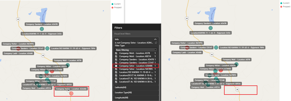
The Column that is the Location Field - includes all Locations
Therefore you can either create a
1) SLICER (same as below - select all and uncheck the ones you don't want)
OR
2) Go to the Visual Level Filters - open the Location Field Column - Basic Filtering - Select All - Uncheck only the ones you don't want
There are other ways too by creating additional conditional column to Include and Exclude...
But option 2 is probably the fastest/easiest way to do this! ![]()
- Mark as New
- Bookmark
- Subscribe
- Mute
- Subscribe to RSS Feed
- Permalink
- Report Inappropriate Content
Yes, some lat and longs are identical but this can not be guaranteed in my data.
This approach may work. Other software I used was Saleforce with Geopointe add-in for mapping. For mapping I could add many datasets and not have to merge them in order to display. I could have many lat longs at exact same location (in different data sets)and it would just visually overlay them, and i could selectively turn an entire data set on or off.
I will try your approach as it should work for what I am trying to accomplish.
Thanks!!!
- Mark as New
- Bookmark
- Subscribe
- Mute
- Subscribe to RSS Feed
- Permalink
- Report Inappropriate Content
Yes do overlay here too!
That's why in the picture on the right those locations are neither red nor green because they are directly on top of each other!
And yes you can use a slicer(s) to turn on/off various elements such as Current or Prospect
Good Luck! ![]()
- Mark as New
- Bookmark
- Subscribe
- Mute
- Subscribe to RSS Feed
- Permalink
- Report Inappropriate Content
Hello! Can you provide a step by step process on how to do this? I can't seem to be able to do this
- Mark as New
- Bookmark
- Subscribe
- Mute
- Subscribe to RSS Feed
- Permalink
- Report Inappropriate Content
Hi Sean,
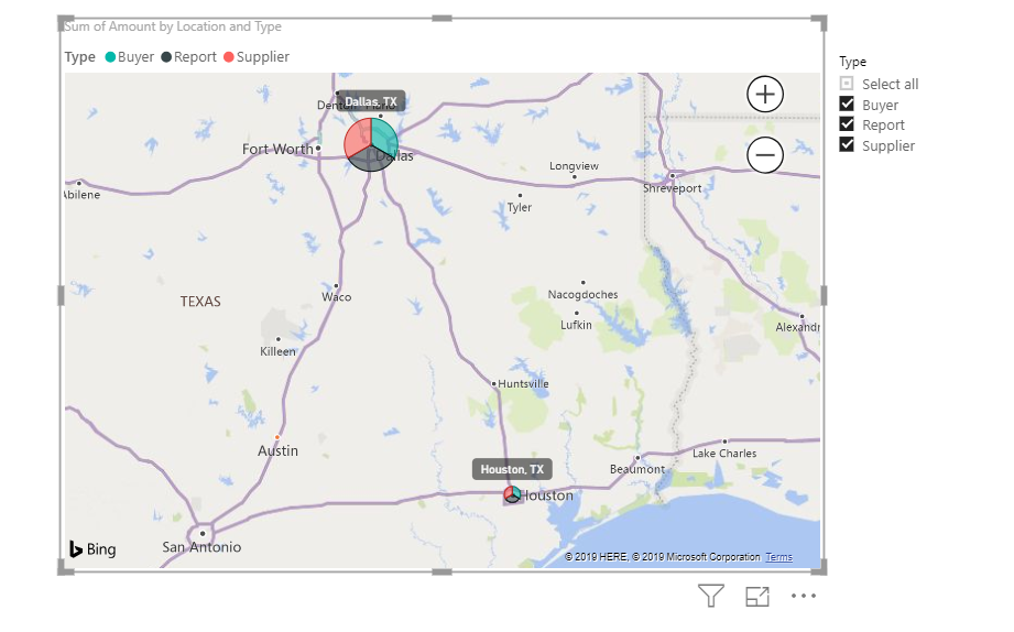
I have 3 type of location: buyer, supplier, and report, so I have samiliar approach with Type as slicer.
But when a city has multiple types of location, it shows as pie chart. Instead of pie chart, we just want overlap in the same location, how can I achieve that?
Thanks!
- Mark as New
- Bookmark
- Subscribe
- Mute
- Subscribe to RSS Feed
- Permalink
- Report Inappropriate Content
Thanks for the reply ,Fenglar. I believe what I am looking for is to calculate distance between 2 log and latitude rather than showing this points on a map. I want result like 4Miles to seller, 3 miles etc. I hope this is clearer now.@flengar
- Mark as New
- Bookmark
- Subscribe
- Mute
- Subscribe to RSS Feed
- Permalink
- Report Inappropriate Content
how do you do an overlay? Thanks!
- Mark as New
- Bookmark
- Subscribe
- Mute
- Subscribe to RSS Feed
- Permalink
- Report Inappropriate Content
ok.. i dont see an option to upload an excel file here so i am pasting tables here itself..
Here is "my locations" table which i would like to see on map.. its canadian... thats straight forward when i use postal code as location.
| Primary_City | Primary_State | postal_code |
| Blumenort | MB | R0A 0C0 |
| Kleefeld | MB | R0A 0V0 |
| Landmark | MB | R0A 0X0 |
| New Bothwell | MB | R0A 1C0 |
| St Laurent | MB | R0C 2S0 |
| Teulon | MB | R0C 3B0 |
| Warren | MB | R0C 3E0 |
| Beausejour | MB | R0E 0C0 |
| Carman | MB | R0G 0J0 |
| Manitou | MB | R0G 1G0 |
| St Claude | MB | R0G 1Z0 |
| Sanford | MB | R0G 2J0 |
| Neepawa | MB | R0J 1H0 |
| Sandy Lake | MB | R0J 1X0 |
| Baldur | MB | R0K 0B0 |
| Brookdale | MB | R0K 0G0 |
| Cartwright | MB | R0K 0L0 |
| Killarney | MB | R0K 1G0 |
| Souris | MB | R0K 2C0 |
| Roblin | MB | R0L 1P0 |
My second table has "supply locations" which has different set of postal codes..
| Primary_City | Primary_State | postal_code |
| Brandon | MB | R7A 7M5 |
| Neepawa | MB | R0J 1H0 |
| Winnipeg | MB | R2J 0T9 |
| Blumenort | MB | R0A 0C0 |
| Neepawa | MB | R0J 1H0 |
| Winnipeg | MB | R2J 3V9 |
| Winnipeg | MB | R2J 3V9 |
| Teulon | MB | R0C 3B0 |
| Winnipeg | MB | R2J 0S3 |
| Winnipeg | MB | R2W 2Z3 |
| Winkler | MB | R6W 4A8 |
| Winnipeg | MB | R3Y 1G6 |
| St Laurent | MB | R0C 2S0 |
| Souris | MB | R0K 2C0 |
| Winnipeg | MB | R2X 1G4 |
| Springfield | MB | R2C 2Z2 |
| Winnipeg | MB | R2C 4G5 |
| Winnipeg | MB | R2J 3S1 |
| Blumenort | MB | R0A 0C0 |
| Beausejour | MB | R0E 0C0 |
| Portage La Prairie | MB | R1N 3B2 |
| Winnipeg | MB | R2L 0X5 |
| Winnipeg | MB | R3E 2V2 |
| Swan River | MB | R0L 1Z0 |
| New Bothwell | MB | R0A 1C0 |
| Warren | MB | R0C 3E0 |
| Melita | MB | R0M 1L0 |
| Schanzenfeld | MB | R6W 1K5 |
I would like to always see the "supply locations" in my map.
Idea is that by filtering one of "my locations" i need ability to see my "supply locations"
Helpful resources

Power BI Monthly Update - April 2026
Check out the April 2026 Power BI update to learn about new features.

Data Days 2026 coming soon!
Sign up to receive a private message when registration opens and key events begin.

New to Fabric Survey
If you have recently started exploring Fabric, we'd love to hear how it's going. Your feedback can help with product improvements.

| User | Count |
|---|---|
| 35 | |
| 32 | |
| 25 | |
| 22 | |
| 18 |
| User | Count |
|---|---|
| 65 | |
| 35 | |
| 32 | |
| 25 | |
| 23 |
