Join the Fabric User Panel to shape the future of Fabric.
Share feedback directly with Fabric product managers, participate in targeted research studies and influence the Fabric roadmap.
Sign up now- Power BI forums
- Get Help with Power BI
- Desktop
- Service
- Report Server
- Power Query
- Mobile Apps
- Developer
- DAX Commands and Tips
- Custom Visuals Development Discussion
- Health and Life Sciences
- Power BI Spanish forums
- Translated Spanish Desktop
- Training and Consulting
- Instructor Led Training
- Dashboard in a Day for Women, by Women
- Galleries
- Data Stories Gallery
- Themes Gallery
- Contests Gallery
- QuickViz Gallery
- Quick Measures Gallery
- Visual Calculations Gallery
- Notebook Gallery
- Translytical Task Flow Gallery
- TMDL Gallery
- R Script Showcase
- Webinars and Video Gallery
- Ideas
- Custom Visuals Ideas (read-only)
- Issues
- Issues
- Events
- Upcoming Events
Get Fabric certified for FREE! Don't miss your chance! Learn more
- Power BI forums
- Forums
- Get Help with Power BI
- Desktop
- Re: Map & Display problem
- Subscribe to RSS Feed
- Mark Topic as New
- Mark Topic as Read
- Float this Topic for Current User
- Bookmark
- Subscribe
- Printer Friendly Page
- Mark as New
- Bookmark
- Subscribe
- Mute
- Subscribe to RSS Feed
- Permalink
- Report Inappropriate Content
Map & Display problem
Hi,
I'm a new beginner on power bi, and have two questions on power bi desktop.
First, I use the default filled map as in the red mark. But I cannot find size/color saturation on the grey pane. So the map looks only one color.
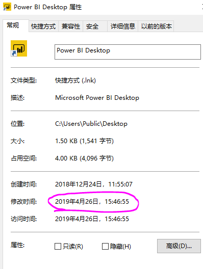
Second, when I studied in youtube, I found the youtuber's display of power bi is pretty good like you see in the following. But in the picture above which is my power bi desktop, in the pink mark I made, you can see it's totally different from the youtuber's.
Thanks for your help!
Yun
Solved! Go to Solution.
- Mark as New
- Bookmark
- Subscribe
- Mute
- Subscribe to RSS Feed
- Permalink
- Report Inappropriate Content
@YunJ ,
Yes, in the latest version, color saturation has been upgraded to conditional formatting. Please refer to announcement below:
We’ve upgraded all the generally available visuals that previously used color saturation to have the same conditional formatting experience as table and matrix currently has. This means you’ll have access to all three types of formatting currently available: Color by color scales, Color by rules, and Color by field. As mentioned, this change impacts all visuals which previously had color saturation which includes:
- All variants of column and bar charts
- Funnel chart
- Bubble & filled maps
- Treemap
- Scatter chart
Community Support Team _ Jimmy Tao
If this post helps, then please consider Accept it as the solution to help the other members find it more quickly.
- Mark as New
- Bookmark
- Subscribe
- Mute
- Subscribe to RSS Feed
- Permalink
- Report Inappropriate Content
@YunJ ,
In the new version of power bi desktop, color saturation has been upgraded to conditional formatting, please refer to this announcement:
Community Support Team _ Jimmy Tao
If this post helps, then please consider Accept it as the solution to help the other members find it more quickly.
- Mark as New
- Bookmark
- Subscribe
- Mute
- Subscribe to RSS Feed
- Permalink
- Report Inappropriate Content
Hi, but I think my power bi is already the latest version.
- Mark as New
- Bookmark
- Subscribe
- Mute
- Subscribe to RSS Feed
- Permalink
- Report Inappropriate Content
@YunJ ,
Yes, in the latest version, color saturation has been upgraded to conditional formatting. Please refer to announcement below:
We’ve upgraded all the generally available visuals that previously used color saturation to have the same conditional formatting experience as table and matrix currently has. This means you’ll have access to all three types of formatting currently available: Color by color scales, Color by rules, and Color by field. As mentioned, this change impacts all visuals which previously had color saturation which includes:
- All variants of column and bar charts
- Funnel chart
- Bubble & filled maps
- Treemap
- Scatter chart
Community Support Team _ Jimmy Tao
If this post helps, then please consider Accept it as the solution to help the other members find it more quickly.
Helpful resources

Join our Community Sticker Challenge 2026
If you love stickers, then you will definitely want to check out our Community Sticker Challenge!

Power BI Monthly Update - January 2026
Check out the January 2026 Power BI update to learn about new features.

| User | Count |
|---|---|
| 61 | |
| 58 | |
| 45 | |
| 21 | |
| 18 |
| User | Count |
|---|---|
| 122 | |
| 119 | |
| 37 | |
| 35 | |
| 29 |

