Join us at FabCon Vienna from September 15-18, 2025
The ultimate Fabric, Power BI, SQL, and AI community-led learning event. Save €200 with code FABCOMM.
Get registered- Power BI forums
- Get Help with Power BI
- Desktop
- Service
- Report Server
- Power Query
- Mobile Apps
- Developer
- DAX Commands and Tips
- Custom Visuals Development Discussion
- Health and Life Sciences
- Power BI Spanish forums
- Translated Spanish Desktop
- Training and Consulting
- Instructor Led Training
- Dashboard in a Day for Women, by Women
- Galleries
- Data Stories Gallery
- Themes Gallery
- Contests Gallery
- Quick Measures Gallery
- Notebook Gallery
- Translytical Task Flow Gallery
- TMDL Gallery
- R Script Showcase
- Webinars and Video Gallery
- Ideas
- Custom Visuals Ideas (read-only)
- Issues
- Issues
- Events
- Upcoming Events
Enhance your career with this limited time 50% discount on Fabric and Power BI exams. Ends August 31st. Request your voucher.
- Power BI forums
- Forums
- Get Help with Power BI
- Desktop
- Re: Map Coloring Based on Slicer Selection
- Subscribe to RSS Feed
- Mark Topic as New
- Mark Topic as Read
- Float this Topic for Current User
- Bookmark
- Subscribe
- Printer Friendly Page
- Mark as New
- Bookmark
- Subscribe
- Mute
- Subscribe to RSS Feed
- Permalink
- Report Inappropriate Content
Map Coloring Based on Slicer Selection
Hello,
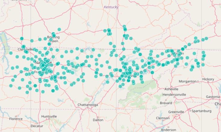
I'm looking for a way to color a map based on a slicer selection. If the map below represented customer locations, I would like the bubble for the selected customer to be colored differently while keeping all other locations on the map. I have adjusted the interaction from the slicer to the map to none, which I believe should keep all locations on the map.
Is it possible to color the selected customer's location using SELECTEDVALUE or some similar function?
Thanks.
Solved! Go to Solution.
- Mark as New
- Bookmark
- Subscribe
- Mute
- Subscribe to RSS Feed
- Permalink
- Report Inappropriate Content
Hi @edt4444
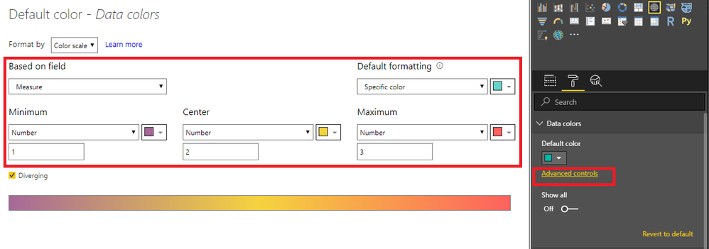
You may create a slicer table and use below measure.Attached sample file for your reference.
Measure =
IF (
    SELECTEDVALUE ( Slicer[Country] ) = MAX ( Table1[Country] ),
    SELECTEDVALUE ( Slicer[Value] )
)

If this post helps, then please consider Accept it as the solution to help the other members find it more quickly.
- Mark as New
- Bookmark
- Subscribe
- Mute
- Subscribe to RSS Feed
- Permalink
- Report Inappropriate Content
Hi @edt4444
You may create a slicer table and use below measure.Attached sample file for your reference.
Measure =
IF (
    SELECTEDVALUE ( Slicer[Country] ) = MAX ( Table1[Country] ),
    SELECTEDVALUE ( Slicer[Value] )
)

If this post helps, then please consider Accept it as the solution to help the other members find it more quickly.
- Mark as New
- Bookmark
- Subscribe
- Mute
- Subscribe to RSS Feed
- Permalink
- Report Inappropriate Content
Is it possible to use this with the ArcGIS Maps visual? The map visual you used is not working well with the large amount of data I have.


