FabCon is coming to Atlanta
Join us at FabCon Atlanta from March 16 - 20, 2026, for the ultimate Fabric, Power BI, AI and SQL community-led event. Save $200 with code FABCOMM.
Register now!- Power BI forums
- Get Help with Power BI
- Desktop
- Service
- Report Server
- Power Query
- Mobile Apps
- Developer
- DAX Commands and Tips
- Custom Visuals Development Discussion
- Health and Life Sciences
- Power BI Spanish forums
- Translated Spanish Desktop
- Training and Consulting
- Instructor Led Training
- Dashboard in a Day for Women, by Women
- Galleries
- Data Stories Gallery
- Themes Gallery
- Contests Gallery
- QuickViz Gallery
- Quick Measures Gallery
- Visual Calculations Gallery
- Notebook Gallery
- Translytical Task Flow Gallery
- TMDL Gallery
- R Script Showcase
- Webinars and Video Gallery
- Ideas
- Custom Visuals Ideas (read-only)
- Issues
- Issues
- Events
- Upcoming Events
View all the Fabric Data Days sessions on demand. View schedule
- Power BI forums
- Forums
- Get Help with Power BI
- Desktop
- Re: Making a table selection (visualisation) chang...
- Subscribe to RSS Feed
- Mark Topic as New
- Mark Topic as Read
- Float this Topic for Current User
- Bookmark
- Subscribe
- Printer Friendly Page
- Mark as New
- Bookmark
- Subscribe
- Mute
- Subscribe to RSS Feed
- Permalink
- Report Inappropriate Content
Making a table selection (visualisation) change a pie charts title
Hi,
I'm trying to change the name of a pie chart based off of which value is selected in my table (visualisation). I've seen a video that shows how you can do this for a slicer by using SELECTEDVALUE() but this doesn't work if i click a row in my table. https://www.youtube.com/watch?v=TYLKDPcvgK8&feature=youtu.be
E.g I have a table with
Name USD Spend
XXXX $500
YYYY $600
and when I select XXXX in the table visualisation, i'd need the pie chart title to change to USD Spend for XXXX.
Thanks!
Solved! Go to Solution.
- Mark as New
- Bookmark
- Subscribe
- Mute
- Subscribe to RSS Feed
- Permalink
- Report Inappropriate Content
Hi @Anonymous ,
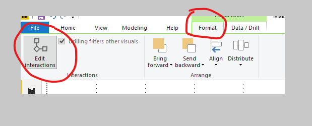
Sorry for my mistake, I didn’t notice that you wanna realize the function in a table visualization. Table visualization is a bit different from slicer, when you use slicer, the interactions between 2 visuals only work as “filter”, but when you use “table”, there are 2 options for the interaction, ”highlight ”and “filter”. You can change the interaction way by the following steps:
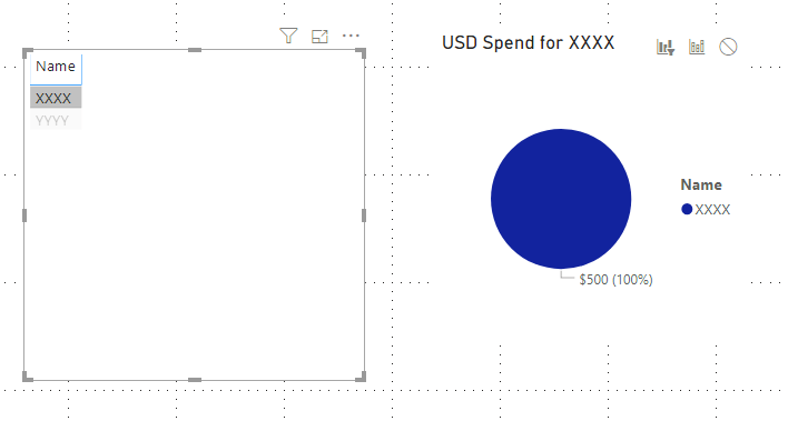
click an empty area of the table visual, then go to the menu bar of desktop, click “format” and choose “edit interactions” ,then you will find that on the right top of the pie chart, there are three options: “highlight”, ”filter” and “none” , choose “filter” and it will show as you requested.
Finally you will see as below:
Sorry again and hope this time would help.
Best Regards,
Kelly
- Mark as New
- Bookmark
- Subscribe
- Mute
- Subscribe to RSS Feed
- Permalink
- Report Inappropriate Content
Hi @Anonymous ,
As is shown in the video, you can use a measure to realize the title modification automatically, the measure is as below:
Selected name = "USD Spend for "&SELECTEDVALUE(selection[Name],"Name")
Then what you need is to select the pie chart , expand the title selection and change it to “conditional formatting” and select the measure:


Finally you will see the chart title changed as below:

For more details about formatting titles, you can turn to the URL below:
https://docs.microsoft.com/en-us/power-bi/desktop-conditional-format-visual-titles
The related .pbix file you can turn to URL:
Hope this would help.
Best Regards,
Kelly
- Mark as New
- Bookmark
- Subscribe
- Mute
- Subscribe to RSS Feed
- Permalink
- Report Inappropriate Content
Hi Kelly,
Yes, that works correctly for a SLICER but i'm trying to use a table (visualisation) to change the pie chart name when I select a row. I think i've narrowed down the issue. It seems that because my 'edit interactions' only highlights the value in the pie chart, it doesn't filter it - meaning that the name of the pie chart doesn't change. Any way to get around this?
- Mark as New
- Bookmark
- Subscribe
- Mute
- Subscribe to RSS Feed
- Permalink
- Report Inappropriate Content
I've found a hacky way of solving this by creating a card that covers the pie chart title and shows the value of the table row that I have picked!
- Mark as New
- Bookmark
- Subscribe
- Mute
- Subscribe to RSS Feed
- Permalink
- Report Inappropriate Content
Hi @Anonymous ,
If your problem has been solved, could you please mark the reply as Answered? If not, pls let me know.
Many thanks.
Best Regards,
Kelly
- Mark as New
- Bookmark
- Subscribe
- Mute
- Subscribe to RSS Feed
- Permalink
- Report Inappropriate Content
Hi @Anonymous ,
Sorry for my mistake, I didn’t notice that you wanna realize the function in a table visualization. Table visualization is a bit different from slicer, when you use slicer, the interactions between 2 visuals only work as “filter”, but when you use “table”, there are 2 options for the interaction, ”highlight ”and “filter”. You can change the interaction way by the following steps:
click an empty area of the table visual, then go to the menu bar of desktop, click “format” and choose “edit interactions” ,then you will find that on the right top of the pie chart, there are three options: “highlight”, ”filter” and “none” , choose “filter” and it will show as you requested.
Finally you will see as below:
Sorry again and hope this time would help.
Best Regards,
Kelly
Helpful resources

Power BI Monthly Update - November 2025
Check out the November 2025 Power BI update to learn about new features.

Fabric Data Days
Advance your Data & AI career with 50 days of live learning, contests, hands-on challenges, study groups & certifications and more!


