Join us at FabCon Vienna from September 15-18, 2025
The ultimate Fabric, Power BI, SQL, and AI community-led learning event. Save €200 with code FABCOMM.
Get registeredGo To
- Power BI forums
- Get Help with Power BI
- Desktop
- Service
- Report Server
- Power Query
- Mobile Apps
- Developer
- DAX Commands and Tips
- Custom Visuals Development Discussion
- Health and Life Sciences
- Power BI Spanish forums
- Translated Spanish Desktop
- Training and Consulting
- Instructor Led Training
- Dashboard in a Day for Women, by Women
- Galleries
- Data Stories Gallery
- Themes Gallery
- Contests Gallery
- Quick Measures Gallery
- Notebook Gallery
- Translytical Task Flow Gallery
- TMDL Gallery
- R Script Showcase
- Webinars and Video Gallery
- Ideas
- Custom Visuals Ideas (read-only)
- Issues
- Issues
- Events
- Upcoming Events
Turn on suggestions
Auto-suggest helps you quickly narrow down your search results by suggesting possible matches as you type.
Showing results for
Compete to become Power BI Data Viz World Champion! First round ends August 18th. Get started.
- Power BI forums
- Forums
- Get Help with Power BI
- Desktop
- Making a line chart without a horizontal bar, how ...
Reply
Topic Options
- Subscribe to RSS Feed
- Mark Topic as New
- Mark Topic as Read
- Float this Topic for Current User
- Bookmark
- Subscribe
- Printer Friendly Page
- Mark as New
- Bookmark
- Subscribe
- Mute
- Subscribe to RSS Feed
- Permalink
- Report Inappropriate Content
Making a line chart without a horizontal bar, how to automatically scale?
04-21-2021
01:08 AM
Hello,
I was wondering if it's possible to make a line chart without a horizontal bar (see picture below).
I want to present all weeks of the year. But 53 weeks doesn't fit!
Is it possible to scale automatically? At the moment i'm using the standard PBI line chart.
Solved! Go to Solution.
2 ACCEPTED SOLUTIONS
- Mark as New
- Bookmark
- Subscribe
- Mute
- Subscribe to RSS Feed
- Permalink
- Report Inappropriate Content
04-21-2021
01:15 AM
Hi @N1ckk ,
There are 2 things to this:
- If you want all the x-axis values to be visible from Week 1 to Week 53, then either increase size of your chart by increasing width or increase the page size.
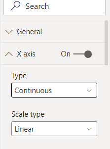
- If seeing all the x-axis values is not important, then try to make the X-Axis CONTINUOUS type under the formatting settings of your chart. You will get something as below:
Thanks,
Pragati
- Mark as New
- Bookmark
- Subscribe
- Mute
- Subscribe to RSS Feed
- Permalink
- Report Inappropriate Content
04-21-2021
01:17 AM
pl. change the x-axis to continnuouns instead of categorial like below
Did I answer your question? Mark my post as a solution!
Appreciate your Kudos
Proud to be a Super User!
Follow me on linkedin
2 REPLIES 2
- Mark as New
- Bookmark
- Subscribe
- Mute
- Subscribe to RSS Feed
- Permalink
- Report Inappropriate Content
- Mark as New
- Bookmark
- Subscribe
- Mute
- Subscribe to RSS Feed
- Permalink
- Report Inappropriate Content
04-21-2021
01:15 AM
Hi @N1ckk ,
There are 2 things to this:
- If you want all the x-axis values to be visible from Week 1 to Week 53, then either increase size of your chart by increasing width or increase the page size.
- If seeing all the x-axis values is not important, then try to make the X-Axis CONTINUOUS type under the formatting settings of your chart. You will get something as below:
Thanks,
Pragati


