FabCon is coming to Atlanta
Join us at FabCon Atlanta from March 16 - 20, 2026, for the ultimate Fabric, Power BI, AI and SQL community-led event. Save $200 with code FABCOMM.
Register now!- Power BI forums
- Get Help with Power BI
- Desktop
- Service
- Report Server
- Power Query
- Mobile Apps
- Developer
- DAX Commands and Tips
- Custom Visuals Development Discussion
- Health and Life Sciences
- Power BI Spanish forums
- Translated Spanish Desktop
- Training and Consulting
- Instructor Led Training
- Dashboard in a Day for Women, by Women
- Galleries
- Data Stories Gallery
- Themes Gallery
- Contests Gallery
- QuickViz Gallery
- Quick Measures Gallery
- Visual Calculations Gallery
- Notebook Gallery
- Translytical Task Flow Gallery
- TMDL Gallery
- R Script Showcase
- Webinars and Video Gallery
- Ideas
- Custom Visuals Ideas (read-only)
- Issues
- Issues
- Events
- Upcoming Events
The Power BI Data Visualization World Championships is back! Get ahead of the game and start preparing now! Learn more
- Power BI forums
- Forums
- Get Help with Power BI
- Desktop
- Looking for a Visual
- Subscribe to RSS Feed
- Mark Topic as New
- Mark Topic as Read
- Float this Topic for Current User
- Bookmark
- Subscribe
- Printer Friendly Page
- Mark as New
- Bookmark
- Subscribe
- Mute
- Subscribe to RSS Feed
- Permalink
- Report Inappropriate Content
Looking for a Visual
Hi all,
Looking for a simple visual to add to a dashboard. Basically a picture (that the user can choose from wherever), a title and a card. We have developed our own, but would appreciate knowing if it's possible to either find a visual that's available or develop our own (I'm not really a coder but if it's easy enough I might be able to have a shot at it).
What we are using across a range of dashboards is like this:
It would be good if we could just choose a picture (either from the web or from our Marketing folder), choose the items in the card and add a title. Currently, reformatting them when a client would like an extra piece of info is quite laborious to re-size perhaps 10 of the same trio and then ensure they all line up.
Thanks in anticipation.
- Mark as New
- Bookmark
- Subscribe
- Mute
- Subscribe to RSS Feed
- Permalink
- Report Inappropriate Content
@Anonymous Huh, seems like the stock multi-card visual or even a table visual with a bit of formatting to remove the lines. I mean, you Data Category an image url as an image url and it shows up as an image in a table.
Follow on LinkedIn
@ me in replies or I'll lose your thread!!!
Instead of a Kudo, please vote for this idea
Become an expert!: Enterprise DNA
External Tools: MSHGQM
YouTube Channel!: Microsoft Hates Greg
Latest book!: DAX For Humans
DAX is easy, CALCULATE makes DAX hard...
- Mark as New
- Bookmark
- Subscribe
- Mute
- Subscribe to RSS Feed
- Permalink
- Report Inappropriate Content
Some of the measures are from different tables (we have an application status table and an application funding table, for instance). Would this work for multi cards?
- Mark as New
- Bookmark
- Subscribe
- Mute
- Subscribe to RSS Feed
- Permalink
- Report Inappropriate Content
@Anonymous Not 100% regarding multi-card but almost certainly a table. That's just a measure with a SWITCH statement where you figure out what "row" you are in and return teh right measure. Might be similar to multi-card, should be, but specifics of your situation are lacking.
Follow on LinkedIn
@ me in replies or I'll lose your thread!!!
Instead of a Kudo, please vote for this idea
Become an expert!: Enterprise DNA
External Tools: MSHGQM
YouTube Channel!: Microsoft Hates Greg
Latest book!: DAX For Humans
DAX is easy, CALCULATE makes DAX hard...
- Mark as New
- Bookmark
- Subscribe
- Mute
- Subscribe to RSS Feed
- Permalink
- Report Inappropriate Content
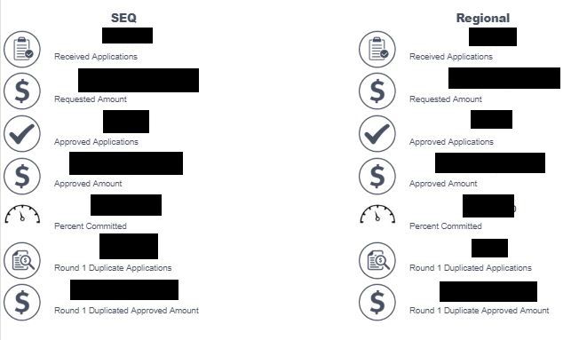
Sorry, trying not to display confidential information. We have a program running with the following dashboard (numbers blanked out):
Some of the numbers are just a stratigh row count, some are calculations (e.g. $ requested as a percentage of budget allocated) and not all are even stored in a table. So it's not like we're listing something from the same table by category.
I was just looking for a visual that's like a card, but with a picture, a display and a title:
Haven't been able to find anything. If I were to have a visual with these three elements and be able to modify them, yet have the same format across them, I'd be happy. We basically have an image file, a standard card and a text box, that we have duplicated 14 times on a dashboard, and spent 3 hours re-sizing everything last week when the client requested a change from 12 measures to 14. Would be great if we could have just re-sized 12 visuals and added 2 more. Hoping to make this our standard dashboard, but it's a pain to get the visuals changed and re-positioned for different client needs,
- Mark as New
- Bookmark
- Subscribe
- Mute
- Subscribe to RSS Feed
- Permalink
- Report Inappropriate Content
Helpful resources

Power BI Dataviz World Championships
The Power BI Data Visualization World Championships is back! Get ahead of the game and start preparing now!

| User | Count |
|---|---|
| 38 | |
| 36 | |
| 33 | |
| 32 | |
| 29 |
| User | Count |
|---|---|
| 129 | |
| 88 | |
| 79 | |
| 68 | |
| 63 |


