Huge last-minute discounts for FabCon Vienna from September 15-18, 2025
Supplies are limited. Contact info@espc.tech right away to save your spot before the conference sells out.
Get your discount- Power BI forums
- Get Help with Power BI
- Desktop
- Service
- Report Server
- Power Query
- Mobile Apps
- Developer
- DAX Commands and Tips
- Custom Visuals Development Discussion
- Health and Life Sciences
- Power BI Spanish forums
- Translated Spanish Desktop
- Training and Consulting
- Instructor Led Training
- Dashboard in a Day for Women, by Women
- Galleries
- Data Stories Gallery
- Themes Gallery
- Contests Gallery
- Quick Measures Gallery
- Notebook Gallery
- Translytical Task Flow Gallery
- TMDL Gallery
- R Script Showcase
- Webinars and Video Gallery
- Ideas
- Custom Visuals Ideas (read-only)
- Issues
- Issues
- Events
- Upcoming Events
Score big with last-minute savings on the final tickets to FabCon Vienna. Secure your discount
- Power BI forums
- Forums
- Get Help with Power BI
- Desktop
- Re: Local Custom Visual interactivity with KPI Mat...
- Subscribe to RSS Feed
- Mark Topic as New
- Mark Topic as Read
- Float this Topic for Current User
- Bookmark
- Subscribe
- Printer Friendly Page
- Mark as New
- Bookmark
- Subscribe
- Mute
- Subscribe to RSS Feed
- Permalink
- Report Inappropriate Content
Local Custom Visual interactivity with KPI Matrix and Table visualization
Hello Team.
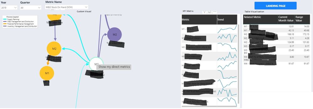
I have a powerbi report that contains 3 kind of visualizations (local custom visual, kpi matrix, table).
In my local custom visual I have an svg with a menu option in the circle to show only direct metrics or to show all metrics. The KPI Matrix and Table visualization are showing always the complete list of metrics, If I click on “Show my direct metrics” option only the custom visual is refreshed accordingly.
Do you have any suggestion to apply this behavior to kpi matrix and table visualization? Those visualizations only refresh the data If I select another option in the slicers.
Please help me and let me know your comment. Thank You.
Solved! Go to Solution.
- Mark as New
- Bookmark
- Subscribe
- Mute
- Subscribe to RSS Feed
- Permalink
- Report Inappropriate Content
I have not built custom visuals yet, but I think you will have to add code to "push" your selection out to the rest of the report.
This post seems to be on that topic, maybe it will help
Did this post answer your question? Mark it as a solution so others can find it!
Help when you know. Ask when you don't!
Join the conversation at We Talk BI find out more about me at Slow BI
- Mark as New
- Bookmark
- Subscribe
- Mute
- Subscribe to RSS Feed
- Permalink
- Report Inappropriate Content
- Mark as New
- Bookmark
- Subscribe
- Mute
- Subscribe to RSS Feed
- Permalink
- Report Inappropriate Content
When you say "local custom visual", do you mean that it is a visual you added to the standard power bi visuals ? What is the name of the visual ? Maybe the visual documentation will help us out by letting us know if the visual has a setting that allows it to influence the page it is in.
I'm a personal Power Bi Trainer I learn something every time I answer a question. I blog at http://powerbithehardparts.com/
The Golden Rules for Power BI
- Use a Calendar table. A custom Date tables is preferable to using the automatic date/time handling capabilities of Power BI. https://www.youtube.com/watch?v=FxiAYGbCfAQ
- Build your data model as a Star Schema. Creating a star schema in Power BI is the best practice to improve performance and more importantly, to ensure accurate results! https://www.youtube.com/watch?v=1Kilya6aUQw
- Use a small set up sample data when developing. When building your measures and calculated columns always use a small amount of sample data so that it will be easier to confirm that you are getting the right numbers.
- Store all your intermediate calculations in VARs when you’re writing measures. You can return these intermediate VARs instead of your final result to check on your steps along the way.
Did this post answer your question? Mark it as a solution so others can find it!
Help when you know. Ask when you don't!
Join the conversation at We Talk BI find out more about me at Slow BI
- Mark as New
- Bookmark
- Subscribe
- Mute
- Subscribe to RSS Feed
- Permalink
- Report Inappropriate Content
First of all Thanks for the time to review my question kentyler
When I say "local custom visual" It's a custom visual that I develop, I started this custom visual in a node.js solution from scratch.
The name is "VCT Custom Relationship" basically I use d3 svg to add some nodes and links, right now I'm trying to click in a svg circle to refresh the data and keep synchronzed the data between the custom visual itelf, a kpi matrix and a table.
Please let me know if you need more detail. Thank You.
- Mark as New
- Bookmark
- Subscribe
- Mute
- Subscribe to RSS Feed
- Permalink
- Report Inappropriate Content
I have not built custom visuals yet, but I think you will have to add code to "push" your selection out to the rest of the report.
This post seems to be on that topic, maybe it will help
Did this post answer your question? Mark it as a solution so others can find it!
Help when you know. Ask when you don't!
Join the conversation at We Talk BI find out more about me at Slow BI
- Mark as New
- Bookmark
- Subscribe
- Mute
- Subscribe to RSS Feed
- Permalink
- Report Inappropriate Content
Thank You for your help ApplyJsonFilters works.


