FabCon is coming to Atlanta
Join us at FabCon Atlanta from March 16 - 20, 2026, for the ultimate Fabric, Power BI, AI and SQL community-led event. Save $200 with code FABCOMM.
Register now!- Power BI forums
- Get Help with Power BI
- Desktop
- Service
- Report Server
- Power Query
- Mobile Apps
- Developer
- DAX Commands and Tips
- Custom Visuals Development Discussion
- Health and Life Sciences
- Power BI Spanish forums
- Translated Spanish Desktop
- Training and Consulting
- Instructor Led Training
- Dashboard in a Day for Women, by Women
- Galleries
- Data Stories Gallery
- Themes Gallery
- Contests Gallery
- QuickViz Gallery
- Quick Measures Gallery
- Visual Calculations Gallery
- Notebook Gallery
- Translytical Task Flow Gallery
- TMDL Gallery
- R Script Showcase
- Webinars and Video Gallery
- Ideas
- Custom Visuals Ideas (read-only)
- Issues
- Issues
- Events
- Upcoming Events
Get Fabric Certified for FREE during Fabric Data Days. Don't miss your chance! Request now
- Power BI forums
- Forums
- Get Help with Power BI
- Desktop
- Link a Visual to a Selection and Default Selection...
- Subscribe to RSS Feed
- Mark Topic as New
- Mark Topic as Read
- Float this Topic for Current User
- Bookmark
- Subscribe
- Printer Friendly Page
- Mark as New
- Bookmark
- Subscribe
- Mute
- Subscribe to RSS Feed
- Permalink
- Report Inappropriate Content
Link a Visual to a Selection and Default Selection from a Visual
Hi there!
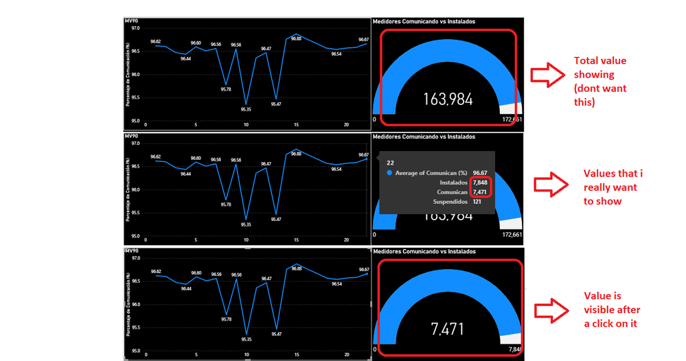
I would like to know how to relate a visual to the selection of another visual, for example, I have a visual line that shows the performance of a group of computers installed over a month, as a tooltip the amount of computers installed and running every day.
On the other hand I have a visual Gauge that shows how many computers are working as a value and how many are installed in a day as a maximum value.
My problem is that, with the configuration that I have just said, the visual gauge shows me the sum of the computers running every day as a value and the sum of all the computers installed as a maximum value, which is not a relevant data seen from that way.
I have tried relative date filters but these alter the line graph and focus it on a single day.
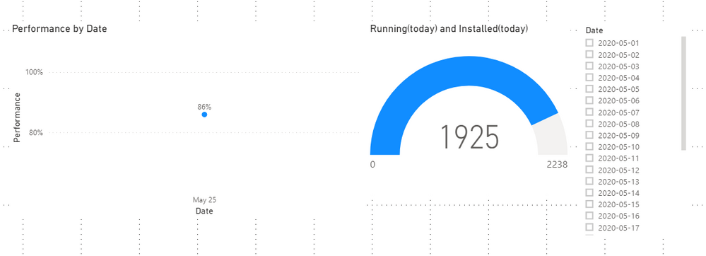
What I want is, to be able to have my line visual showing the performance of the computers every day of the month and that the last day is selected by default (today for example)
and also that the visual Gauge is updated with any day you select in the line visual.
Please watch the attached image.
I understand that it could be solved if the last available day was selected by default in the line graph but that the graph continues showing the rest of the month and not a single day.
Solved! Go to Solution.
- Mark as New
- Bookmark
- Subscribe
- Mute
- Subscribe to RSS Feed
- Permalink
- Report Inappropriate Content
Hi,
Please check my attached pbix file.
Hope this is what you want:
Best Regards,
Giotto
- Mark as New
- Bookmark
- Subscribe
- Mute
- Subscribe to RSS Feed
- Permalink
- Report Inappropriate Content
- Mark as New
- Bookmark
- Subscribe
- Mute
- Subscribe to RSS Feed
- Permalink
- Report Inappropriate Content
Perhaps use the relative date filters but Edit Interactions to not impact the line visual or just implement on the gauge visual. It is hard to tell but should be possible.
Follow on LinkedIn
@ me in replies or I'll lose your thread!!!
Instead of a Kudo, please vote for this idea
Become an expert!: Enterprise DNA
External Tools: MSHGQM
YouTube Channel!: Microsoft Hates Greg
Latest book!: DAX For Humans
DAX is easy, CALCULATE makes DAX hard...
- Mark as New
- Bookmark
- Subscribe
- Mute
- Subscribe to RSS Feed
- Permalink
- Report Inappropriate Content
- Mark as New
- Bookmark
- Subscribe
- Mute
- Subscribe to RSS Feed
- Permalink
- Report Inappropriate Content
First result from: https://www.bing.com/search?q=power+bi+edit+interactions&form=ANNTH1&refig=c7063f31be3d4514824b47391...
is this article:
https://docs.microsoft.com/en-us/power-bi/create-reports/service-reports-visual-interactions
https://docs.microsoft.com/en-us/power-bi/consumer/end-user-interactions
Follow on LinkedIn
@ me in replies or I'll lose your thread!!!
Instead of a Kudo, please vote for this idea
Become an expert!: Enterprise DNA
External Tools: MSHGQM
YouTube Channel!: Microsoft Hates Greg
Latest book!: DAX For Humans
DAX is easy, CALCULATE makes DAX hard...
Helpful resources

Power BI Monthly Update - November 2025
Check out the November 2025 Power BI update to learn about new features.

Fabric Data Days
Advance your Data & AI career with 50 days of live learning, contests, hands-on challenges, study groups & certifications and more!


