Fabric Data Days starts November 4th!
Advance your Data & AI career with 50 days of live learning, dataviz contests, hands-on challenges, study groups & certifications and more!
Get registered- Power BI forums
- Get Help with Power BI
- Desktop
- Service
- Report Server
- Power Query
- Mobile Apps
- Developer
- DAX Commands and Tips
- Custom Visuals Development Discussion
- Health and Life Sciences
- Power BI Spanish forums
- Translated Spanish Desktop
- Training and Consulting
- Instructor Led Training
- Dashboard in a Day for Women, by Women
- Galleries
- Data Stories Gallery
- Themes Gallery
- Contests Gallery
- QuickViz Gallery
- Quick Measures Gallery
- Visual Calculations Gallery
- Notebook Gallery
- Translytical Task Flow Gallery
- TMDL Gallery
- R Script Showcase
- Webinars and Video Gallery
- Ideas
- Custom Visuals Ideas (read-only)
- Issues
- Issues
- Events
- Upcoming Events
Get Fabric Certified for FREE during Fabric Data Days. Don't miss your chance! Request now
- Power BI forums
- Forums
- Get Help with Power BI
- Desktop
- Re: Line plot with categorical x-axis is too wide
- Subscribe to RSS Feed
- Mark Topic as New
- Mark Topic as Read
- Float this Topic for Current User
- Bookmark
- Subscribe
- Printer Friendly Page
- Mark as New
- Bookmark
- Subscribe
- Mute
- Subscribe to RSS Feed
- Permalink
- Report Inappropriate Content
Line plot with categorical x-axis is too wide
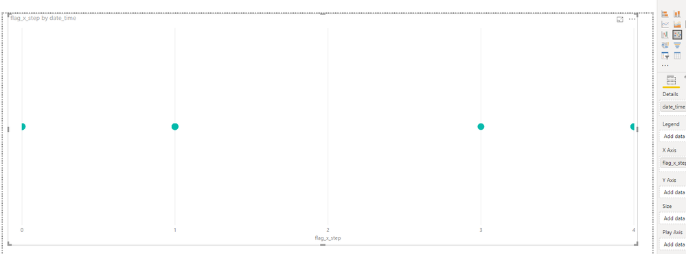
I need a scatter plot where the x-axis is a datetime and the y-axis takes values from 0 to 4.
If I choose "scatter chart" in visualization, the datetime is taken as "linear" and I get a scatter plot of only 5 points, one for each of the y-axis categories. I am not given the option to set datetime as "categorical" in this case.
I found a workaround by choosing the "line chart", that allows me to set the x-axis as categorical. If I set stroke to 0, the line chart becomes the scatter chart that I am looking for. However, the separation between the points is really large. I would like them to be closer to each other even if the name of all categories (my datetimes) are not shown, because I would like to see a bigger datetime span (ideally a whole day). Is that possible?


Solved! Go to Solution.
- Mark as New
- Bookmark
- Subscribe
- Mute
- Subscribe to RSS Feed
- Permalink
- Report Inappropriate Content
thanks a lot for your help, that is not a good option for me, because actually all the data point come from a single day. I really need to show all points, not aggregated at any level.
What I have done at the end is converting the time into a numerical continuous value. This allows me to use the scatter plot and I get the result that I need.
Thanks in any case
- Mark as New
- Bookmark
- Subscribe
- Mute
- Subscribe to RSS Feed
- Permalink
- Report Inappropriate Content
Hi @Anonymous
You may add a column to get the date column like below in query editor.Then use the date column as x-axis in line chart.
Regards,
If this post helps, then please consider Accept it as the solution to help the other members find it more quickly.
- Mark as New
- Bookmark
- Subscribe
- Mute
- Subscribe to RSS Feed
- Permalink
- Report Inappropriate Content
thanks a lot for your help, that is not a good option for me, because actually all the data point come from a single day. I really need to show all points, not aggregated at any level.
What I have done at the end is converting the time into a numerical continuous value. This allows me to use the scatter plot and I get the result that I need.
Thanks in any case
- Mark as New
- Bookmark
- Subscribe
- Mute
- Subscribe to RSS Feed
- Permalink
- Report Inappropriate Content
Hi @Anonymous
Glad to hear you've solved it, please accept your reply as solution, that way, other community members will easily find the solution when they get same issue.
Regards,
If this post helps, then please consider Accept it as the solution to help the other members find it more quickly.
Helpful resources

Fabric Data Days
Advance your Data & AI career with 50 days of live learning, contests, hands-on challenges, study groups & certifications and more!

Power BI Monthly Update - October 2025
Check out the October 2025 Power BI update to learn about new features.


