FabCon is coming to Atlanta
Join us at FabCon Atlanta from March 16 - 20, 2026, for the ultimate Fabric, Power BI, AI and SQL community-led event. Save $200 with code FABCOMM.
Register now!- Power BI forums
- Get Help with Power BI
- Desktop
- Service
- Report Server
- Power Query
- Mobile Apps
- Developer
- DAX Commands and Tips
- Custom Visuals Development Discussion
- Health and Life Sciences
- Power BI Spanish forums
- Translated Spanish Desktop
- Training and Consulting
- Instructor Led Training
- Dashboard in a Day for Women, by Women
- Galleries
- Data Stories Gallery
- Themes Gallery
- Contests Gallery
- QuickViz Gallery
- Quick Measures Gallery
- Visual Calculations Gallery
- Notebook Gallery
- Translytical Task Flow Gallery
- TMDL Gallery
- R Script Showcase
- Webinars and Video Gallery
- Ideas
- Custom Visuals Ideas (read-only)
- Issues
- Issues
- Events
- Upcoming Events
Get Fabric Certified for FREE during Fabric Data Days. Don't miss your chance! Request now
- Power BI forums
- Forums
- Get Help with Power BI
- Desktop
- Re: Line graph with dots/markers and no line
- Subscribe to RSS Feed
- Mark Topic as New
- Mark Topic as Read
- Float this Topic for Current User
- Bookmark
- Subscribe
- Printer Friendly Page
- Mark as New
- Bookmark
- Subscribe
- Mute
- Subscribe to RSS Feed
- Permalink
- Report Inappropriate Content
Line graph with dots/markers and no line
Hi,
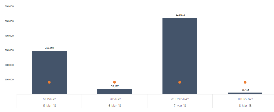
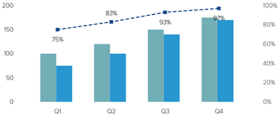
I'm hoping to recreate a graph similar to the below in power bi? It was created in excel by adding 'markers' to the line graph and removing the actual line.
anyone able to help?
Solved! Go to Solution.
- Mark as New
- Bookmark
- Subscribe
- Mute
- Subscribe to RSS Feed
- Permalink
- Report Inappropriate Content
Hi SoniaL,
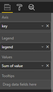
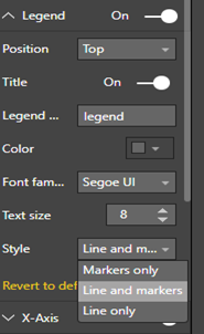
To change marker and line style, please drag a column to “legend” and switch to format->legend->style like below:
Best Regards,
Jimmy Tao
- Mark as New
- Bookmark
- Subscribe
- Mute
- Subscribe to RSS Feed
- Permalink
- Report Inappropriate Content
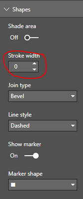
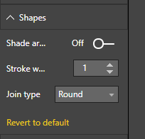
Go to Chart Format options >> Shapes, then set Stroke Width to 0 (Zero)
- Mark as New
- Bookmark
- Subscribe
- Mute
- Subscribe to RSS Feed
- Permalink
- Report Inappropriate Content
is it somehting like this`?
Looking for a powerbi visualization that can perform the above
br David
- Mark as New
- Bookmark
- Subscribe
- Mute
- Subscribe to RSS Feed
- Permalink
- Report Inappropriate Content
Another thing to check if you have no line and all of the answers above are not working:
If one of your values is NaN (not a number), then the line will not generate. I forgot to filter out one column with no data in it, and I got no line at all. Once I remember to filter out that bogus column, the line could then appear.
- Mark as New
- Bookmark
- Subscribe
- Mute
- Subscribe to RSS Feed
- Permalink
- Report Inappropriate Content
@Anonymous
I Believe, you are using Line and Stacked Column Chart.
1. Go to Chart Format options, Go to Data color then Select the Color to white (Hiding the line)
2. Now, just below , there is a section called Shapes, Just Select Show Marker. That's it.
- Mark as New
- Bookmark
- Subscribe
- Mute
- Subscribe to RSS Feed
- Permalink
- Report Inappropriate Content
I am actually having the same issue to solve. Changing line color to white does not help as it actually is white and if that overlaps with columns, then you can see white lines.
- Mark as New
- Bookmark
- Subscribe
- Mute
- Subscribe to RSS Feed
- Permalink
- Report Inappropriate Content
Hi @rocky09,
I can't see a 'show marker' option under shapes...
Also, in some cases, the line goes over the columns, so you can see the white ... there's no way to turn the line off completely?
Thanks again,
Sonia
- Mark as New
- Bookmark
- Subscribe
- Mute
- Subscribe to RSS Feed
- Permalink
- Report Inappropriate Content
Ignore that, i released my x axis had to be on 'categorical'!
Ideally i can change the line to transperant, but I'm not sure there's an option for that...
Thanks for your help!
- Mark as New
- Bookmark
- Subscribe
- Mute
- Subscribe to RSS Feed
- Permalink
- Report Inappropriate Content
Hi SoniaL,
To change marker and line style, please drag a column to “legend” and switch to format->legend->style like below:
Best Regards,
Jimmy Tao
- Mark as New
- Bookmark
- Subscribe
- Mute
- Subscribe to RSS Feed
- Permalink
- Report Inappropriate Content
Hi @v-yuta-msft,
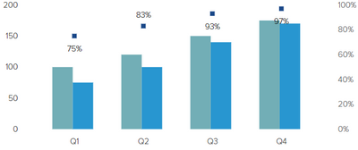
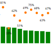
This does not solve my problem. I am not trying to modify the look of the legend but I want to show a value using columns and another using markers only.
Like this:
How can I do it?
Thanks!
- Mark as New
- Bookmark
- Subscribe
- Mute
- Subscribe to RSS Feed
- Permalink
- Report Inappropriate Content


Go to Chart Format options >> Shapes, then set Stroke Width to 0 (Zero)
- Mark as New
- Bookmark
- Subscribe
- Mute
- Subscribe to RSS Feed
- Permalink
- Report Inappropriate Content
Finally, someone understood the problem. This should be the accepted answer. Thanks.
- Mark as New
- Bookmark
- Subscribe
- Mute
- Subscribe to RSS Feed
- Permalink
- Report Inappropriate Content
@mykbitz Looks like show marker is no longer available in power BI? When I change the stroke to 0 I lose everything.
Sorry about that I found the answer now, need to make x-axis categorical first.
- Mark as New
- Bookmark
- Subscribe
- Mute
- Subscribe to RSS Feed
- Permalink
- Report Inappropriate Content
- Mark as New
- Bookmark
- Subscribe
- Mute
- Subscribe to RSS Feed
- Permalink
- Report Inappropriate Content
Unbelievable.
So much time spent searching for this, so many help threads, and such a simple solution.... Good job Microsoft 😞
- Mark as New
- Bookmark
- Subscribe
- Mute
- Subscribe to RSS Feed
- Permalink
- Report Inappropriate Content
This should be a very new functionality as I am sure I have tried to put it to 0 and did not work earlier. Now it works fine! Thank you!
- Mark as New
- Bookmark
- Subscribe
- Mute
- Subscribe to RSS Feed
- Permalink
- Report Inappropriate Content
I don't seem to have that option to show only markers. I am on March 2018 version - shouldn't it work there also?
Helpful resources

Power BI Monthly Update - November 2025
Check out the November 2025 Power BI update to learn about new features.

Fabric Data Days
Advance your Data & AI career with 50 days of live learning, contests, hands-on challenges, study groups & certifications and more!

| User | Count |
|---|---|
| 104 | |
| 82 | |
| 72 | |
| 46 | |
| 35 |
