Join us at the 2025 Microsoft Fabric Community Conference
Microsoft Fabric Community Conference 2025, March 31 - April 2, Las Vegas, Nevada. Use code FABINSIDER for a $400 discount.
Register now- Power BI forums
- Get Help with Power BI
- Desktop
- Service
- Report Server
- Power Query
- Mobile Apps
- Developer
- DAX Commands and Tips
- Custom Visuals Development Discussion
- Health and Life Sciences
- Power BI Spanish forums
- Translated Spanish Desktop
- Training and Consulting
- Instructor Led Training
- Dashboard in a Day for Women, by Women
- Galleries
- Webinars and Video Gallery
- Data Stories Gallery
- Themes Gallery
- Power BI DataViz World Championships Gallery
- Quick Measures Gallery
- R Script Showcase
- COVID-19 Data Stories Gallery
- Community Connections & How-To Videos
- 2021 MSBizAppsSummit Gallery
- 2020 MSBizAppsSummit Gallery
- 2019 MSBizAppsSummit Gallery
- Events
- Ideas
- Custom Visuals Ideas
- Issues
- Issues
- Events
- Upcoming Events
The Power BI DataViz World Championships are on! With four chances to enter, you could win a spot in the LIVE Grand Finale in Las Vegas. Show off your skills.
- Power BI forums
- Forums
- Get Help with Power BI
- Desktop
- Re: Line graph of student grade over the last year
- Subscribe to RSS Feed
- Mark Topic as New
- Mark Topic as Read
- Float this Topic for Current User
- Bookmark
- Subscribe
- Printer Friendly Page
- Mark as New
- Bookmark
- Subscribe
- Mute
- Subscribe to RSS Feed
- Permalink
- Report Inappropriate Content
Line graph of student grade over the last year
Help me please:
| Name | 19-20 maths | 19-20 french | 20-21 math | 20-21 french | 21-22 math | 21-22 french |
| John | 85 | 76 | 68 | 84 | 54 | 45 |
| Bob | 75 | 87 | 74 | 80 | 76 | 85 |
| Roger | 55 | 92 | 68 | 90 | 75 | 88 |
This is the data I have right now.
I want to be able to show in a line graph the year progression of a selected subject for a specific student selected with a filter.
Exemple of the X axis wanted : 19-20 math, 20-21 math, 21-22 math.
Example of Y axis wanted : result 1 to 100.
I am a pBI beginner.
Thanks.
Solved! Go to Solution.
- Mark as New
- Bookmark
- Subscribe
- Mute
- Subscribe to RSS Feed
- Permalink
- Report Inappropriate Content
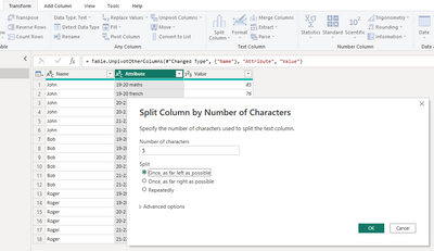
You will want to change your table structure a bit! In the Power Query Editor click the transform tab and select your Name column. Next, select the unpivot columns dropdown > click 'Unpivot other columns'
Next, we can split out the year and the subject from 1 field into 2. This will help with filtering and such later (or if you wanted to see an average for the year for a student without a specific subject).
Under the transform tab, select your 'Attribute' column (this should be your year/subject). Click the split column > by number of characters and set your parameters as shown in this screenshot.
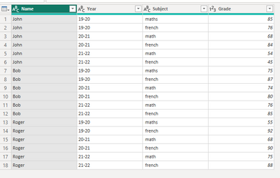
You can rename your columns to reflect what they mean. You should be left with something like this:
*side note, this data has multiple math variations.. You can find/replace with whichever math(s) you want to use in the subject column. Right click column > Replace values
Click the home tab > close and apply.
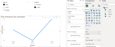
To create your line graph as detailed in your post. Click the line chart, add in your year and subject to the x-axis. Grade in the y-axis, and create filters for your students and subjects. You should be left with something like this:
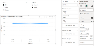
If you want to edit your axis range, click the format visual button (in the visualizations pane) > expand y-axis > set your min and max to 1 and 100. You'll have your final graph!
Mark this post as a solution if it helps and reply to this if you have further questions!
- Mark as New
- Bookmark
- Subscribe
- Mute
- Subscribe to RSS Feed
- Permalink
- Report Inappropriate Content
Thanks, it works perfectly, very easy to understand.
So simple yet I was so far of achieving it.
Helpful resources

Join us at the Microsoft Fabric Community Conference
March 31 - April 2, 2025, in Las Vegas, Nevada. Use code MSCUST for a $150 discount!

Power BI Monthly Update - February 2025
Check out the February 2025 Power BI update to learn about new features.

Join our Community Sticker Challenge 2025
If you love stickers, then you will definitely want to check out our Community Sticker Challenge!

| User | Count |
|---|---|
| 84 | |
| 69 | |
| 68 | |
| 39 | |
| 37 |


