New Offer! Become a Certified Fabric Data Engineer
Check your eligibility for this 50% exam voucher offer and join us for free live learning sessions to get prepared for Exam DP-700.
Get Started- Power BI forums
- Get Help with Power BI
- Desktop
- Service
- Report Server
- Power Query
- Mobile Apps
- Developer
- DAX Commands and Tips
- Custom Visuals Development Discussion
- Health and Life Sciences
- Power BI Spanish forums
- Translated Spanish Desktop
- Training and Consulting
- Instructor Led Training
- Dashboard in a Day for Women, by Women
- Galleries
- Community Connections & How-To Videos
- COVID-19 Data Stories Gallery
- Themes Gallery
- Data Stories Gallery
- R Script Showcase
- Webinars and Video Gallery
- Quick Measures Gallery
- 2021 MSBizAppsSummit Gallery
- 2020 MSBizAppsSummit Gallery
- 2019 MSBizAppsSummit Gallery
- Events
- Ideas
- Custom Visuals Ideas
- Issues
- Issues
- Events
- Upcoming Events
Don't miss out! 2025 Microsoft Fabric Community Conference, March 31 - April 2, Las Vegas, Nevada. Use code MSCUST for a $150 discount. Prices go up February 11th. Register now.
- Power BI forums
- Forums
- Get Help with Power BI
- Desktop
- Re: Line chart with total as a Legend
- Subscribe to RSS Feed
- Mark Topic as New
- Mark Topic as Read
- Float this Topic for Current User
- Bookmark
- Subscribe
- Printer Friendly Page
- Mark as New
- Bookmark
- Subscribe
- Mute
- Subscribe to RSS Feed
- Permalink
- Report Inappropriate Content
Line chart with total as a Legend
Hi,
Is it possible to show a total of sales as a legend in line chart?
I have got a dataset that contains Product(A,B,C), Date(2006,2007,2008) and Quantity(10,20,30) columns , Currenlty I'm getting a line per each product in line chart but I want to show a Total(Sum of all products) line.
I'm not sure whether it is possible or not in the power BI.
Any inputs would be much appriciated.
Thanks
- Mark as New
- Bookmark
- Subscribe
- Mute
- Subscribe to RSS Feed
- Permalink
- Report Inappropriate Content
Hello,
I found another workaround for this that might help:
Since as described here it is not possible to add multiple columns/measures to the Value Field:
"There is a limitation for this scenario. After draging column into the "Legend" field, we can only add one value into "Value" field. For your request, we can't add another column or measure about total values when we have put the "Product" column into "Legend" Field." -Xue Ding
What worked for me was to create two of the exact same line graphs on top of each other.
The top graph has its background set to 100% transparency.
Then drag your "total" measure/column into the graph on top and your original graph with the legend to the graph underneath.
For this to look properly, the axis of both graphs must be fixed to the max and min of your totals graph on top.
The color of your axis values of the underneath graph need to be set to white.
Finally one of the Graphs should have gridlines turned off.
There are more settings that can be adjusted but with this basic idea, the visual looks good to me.
The only drawback is that the Y-Axis is fixed and needs to be changed manually if the values change drastically.
Hope this helps.
- Mark as New
- Bookmark
- Subscribe
- Mute
- Subscribe to RSS Feed
- Permalink
- Report Inappropriate Content
I was looking for an answer to this and didn't find it - I did solve my own issue so I thought I'd share the answer here.
I have traffic/transport data so what I want to do is: see the volumes by direction but also the total volume as a line. E.g. southbound, northbound and total.
What I did: I created two quick measures, under calculation selected "filtered value", my base value is the traffic volume and the filter is a direction (so one measure is for south and one for north). Then add the two new quick measures as values in the chart as well as the unfiltered - and DONE 🙂
- Mark as New
- Bookmark
- Subscribe
- Mute
- Subscribe to RSS Feed
- Permalink
- Report Inappropriate Content
Hi @Anonymous ,
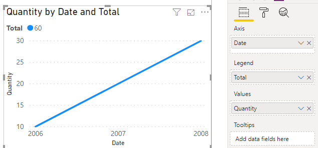
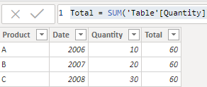
You could create a calculated column to as a legend, like this:
Total = SUM('Table'[Quantity])
You could add filters based on your actual data model.
Best Regards,
Xue Ding
If this post helps, then please consider Accept it as the solution to help the other members find it more quickly. Kudos are nice too.
Xue Ding
If this post helps, then please consider Accept it as the solution to help the other members find it more quickly.
- Mark as New
- Bookmark
- Subscribe
- Mute
- Subscribe to RSS Feed
- Permalink
- Report Inappropriate Content
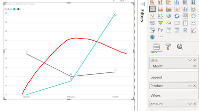
@v-xuding-msft , I want to have a total as a seperate line aloging with other category, plesae see the below fig: I draw the red line which i need to get in the chart.
Thank you,
- Mark as New
- Bookmark
- Subscribe
- Mute
- Subscribe to RSS Feed
- Permalink
- Report Inappropriate Content
Hi @Anonymous ,
Do you try the ways? Do they make sense? If the answer is helpful, please accept it as a solution. If you solved by yourself, welcome to share the solution. More people who have the same request will benefit here.
Best Regards,
Xue Ding
If this post helps, then please consider Accept it as the solution to help the other members find it more quickly.
Xue Ding
If this post helps, then please consider Accept it as the solution to help the other members find it more quickly.
- Mark as New
- Bookmark
- Subscribe
- Mute
- Subscribe to RSS Feed
- Permalink
- Report Inappropriate Content
@v-xuding-msft , This won't works for me, as all measures needs to be created manually, what if I have thousands of categories?
I want to have line per each product and totla line.
- Mark as New
- Bookmark
- Subscribe
- Mute
- Subscribe to RSS Feed
- Permalink
- Report Inappropriate Content
Hi @Anonymous ,
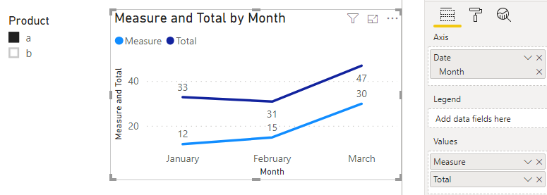
There is a limitation for this scenario. After draging column into the "Legend" field, we can only add one value into "Value" field. For your request, we can't add another column or measure about total values when we have put the "Product" column into "Legend" Field. There are two workarounds that you could try.
- If there are not many products in your table, you could create measures per products to show them.
a = CALCULATE(SUM('Table'[Amount]),FILTER('Table','Table'[Product] = "a"))
b = CALCULATE(SUM('Table'[Amount]),FILTER('Table','Table'[Product] = "b"))
Total = CALCULATE(SUM('Table'[Amount]),ALL('Table'[Product]))
- If there are many products, please try to use a slicer to filter per products
Measure = CALCULATE(SUM('Table'[Amount]),ALLSELECTED('Table'[Product]))
Total = CALCULATE(SUM('Table'[Amount]),ALL('Table'[Product]))
Best Regards,
Xue Ding
If this post helps, then please consider Accept it as the solution to help the other members find it more quickly.
Xue Ding
If this post helps, then please consider Accept it as the solution to help the other members find it more quickly.
Helpful resources

Join us at the Microsoft Fabric Community Conference
March 31 - April 2, 2025, in Las Vegas, Nevada. Use code MSCUST for a $150 discount! Prices go up Feb. 11th.

Power BI Monthly Update - January 2025
Check out the January 2025 Power BI update to learn about new features in Reporting, Modeling, and Data Connectivity.

| User | Count |
|---|---|
| 143 | |
| 85 | |
| 66 | |
| 51 | |
| 45 |
| User | Count |
|---|---|
| 216 | |
| 89 | |
| 82 | |
| 66 | |
| 57 |


