This time we’re going bigger than ever. Fabric, Power BI, SQL, AI and more. We're covering it all. You won't want to miss it.
Learn moreLevel up your Power BI skills this month - build one visual each week and tell better stories with data! Get started
Hi All,
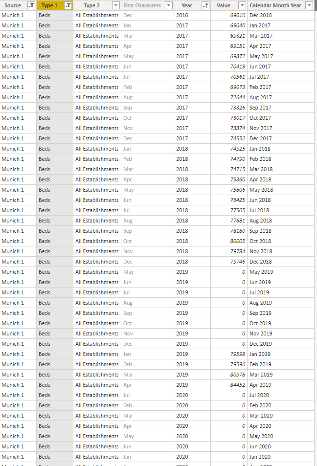
I have a file which includes data of a statistical office - beds numbers for hotels in Munich for each month.
I want to set up a line chart, which only displays the latest available value. Thus, in the example, december for 2007 to 2018, and may for 2019.
Obviously, also a chart with december 2007 to 2018 AND may 2018 and 2019 would be great, but for now the above would be already great to put together.
Thank you in advance for your help.
Stefan
Sorry, I forgot to mention that I have a separate date table linking the "Calendar Month Year" column, which functions as my time basis.
Dear all,
please find below the Power BI file I am currently working with.
https://drive.google.com/file/d/1MyQW9fDAWoB2zl85ipBv0JytkRGYBRs6/view?usp=sharing
Thank you and kind regards,
Stefan
Can you post sample data as text? Please see this post regarding How to Get Your Question Answered Quickly: https://community.powerbi.com/t5/Community-Blog/How-to-Get-Your-Question-Answered-Quickly/ba-p/38490
Check out the April 2026 Power BI update to learn about new features.
Sign up to receive a private message when registration opens and key events begin.
If you have recently started exploring Fabric, we'd love to hear how it's going. Your feedback can help with product improvements.
| User | Count |
|---|---|
| 31 | |
| 25 | |
| 21 | |
| 18 | |
| 17 |
| User | Count |
|---|---|
| 62 | |
| 35 | |
| 34 | |
| 24 | |
| 24 |