FabCon is coming to Atlanta
Join us at FabCon Atlanta from March 16 - 20, 2026, for the ultimate Fabric, Power BI, AI and SQL community-led event. Save $200 with code FABCOMM.
Register now!- Power BI forums
- Get Help with Power BI
- Desktop
- Service
- Report Server
- Power Query
- Mobile Apps
- Developer
- DAX Commands and Tips
- Custom Visuals Development Discussion
- Health and Life Sciences
- Power BI Spanish forums
- Translated Spanish Desktop
- Training and Consulting
- Instructor Led Training
- Dashboard in a Day for Women, by Women
- Galleries
- Data Stories Gallery
- Themes Gallery
- Contests Gallery
- QuickViz Gallery
- Quick Measures Gallery
- Visual Calculations Gallery
- Notebook Gallery
- Translytical Task Flow Gallery
- TMDL Gallery
- R Script Showcase
- Webinars and Video Gallery
- Ideas
- Custom Visuals Ideas (read-only)
- Issues
- Issues
- Events
- Upcoming Events
The Power BI Data Visualization World Championships is back! Get ahead of the game and start preparing now! Learn more
- Power BI forums
- Forums
- Get Help with Power BI
- Desktop
- Re: Line chart visual with two lines based on two ...
- Subscribe to RSS Feed
- Mark Topic as New
- Mark Topic as Read
- Float this Topic for Current User
- Bookmark
- Subscribe
- Printer Friendly Page
- Mark as New
- Bookmark
- Subscribe
- Mute
- Subscribe to RSS Feed
- Permalink
- Report Inappropriate Content
Line chart visual with two lines based on two slicers
Hello!
(I am quite new to Power BI)
I need to create a line chart to compare the revenue of customers. I've divided the report page in two areas, each for a customer. So on the left I have a slicers for customer 1 and on the right for customer 2. I want to combine these selections in one line chart with 2 lines. 1 line for each selected customer.
Is there anyone that maybe has an solution for this?
thank you!
Solved! Go to Solution.
- Mark as New
- Bookmark
- Subscribe
- Mute
- Subscribe to RSS Feed
- Permalink
- Report Inappropriate Content
Hi,
Please see this tutorial...
If I understood you correctly,
this is exactly your scenario:
https://www.youtube.com/watch?v=O0VsTLDTjss
If this post helps, then please consider Accepting it as the solution to help the other members find it more quickly
Rita Fainshtein | Microsoft MVP
https://www.linkedin.com/in/rita-fainshtein/
Blog : https://www.madeiradata.com/profile/ritaf/profile
- Mark as New
- Bookmark
- Subscribe
- Mute
- Subscribe to RSS Feed
- Permalink
- Report Inappropriate Content
Hi @Bnjmnrod
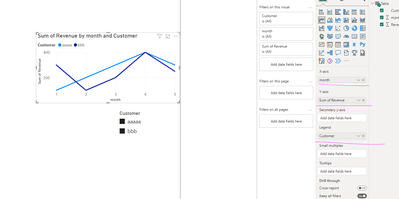
The desired result could be achieved in one graph by:
Time points on the X axis
Revenue on the Y
A customer name on the legend
As you can see in the attached pic
If this post helps, then please consider Accepting it as the solution to help the other members find it more quickly
Rita Fainshtein | Microsoft MVP
https://www.linkedin.com/in/rita-fainshtein/
Blog : https://www.madeiradata.com/profile/ritaf/profile
- Mark as New
- Bookmark
- Subscribe
- Mute
- Subscribe to RSS Feed
- Permalink
- Report Inappropriate Content
Hi,
the customer list is very large so this is showing a lot of lines in the graph.. I also want to have the slicer (that is also affecting other visuals) to insert a line in the chart
- Mark as New
- Bookmark
- Subscribe
- Mute
- Subscribe to RSS Feed
- Permalink
- Report Inappropriate Content
Hi,
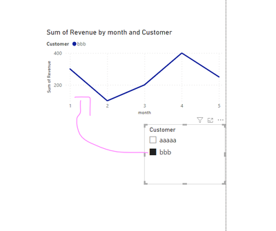
It's ok you will see only the customers you have selected on the slicer
and slicer affects all visuals on the page
Rita Fainshtein | Microsoft MVP
https://www.linkedin.com/in/rita-fainshtein/
Blog : https://www.madeiradata.com/profile/ritaf/profile
- Mark as New
- Bookmark
- Subscribe
- Mute
- Subscribe to RSS Feed
- Permalink
- Report Inappropriate Content
Hi,
aha I see, it works now but only with one slicer. When I add another slicer and select another Customer the line chart show all white. Is it possible to have 2 seperate slicers (they dont interact with eachother but only with the line chart) to have the same outcome? If not I will use your solution but preferable is 2 slicers. Thank you!
- Mark as New
- Bookmark
- Subscribe
- Mute
- Subscribe to RSS Feed
- Permalink
- Report Inappropriate Content
You can use 2 slicers, but what is the reason to do it if the user can choose all customers he needs from one slicer and show it on one graph? And what if he will need to compare between 3 and not 2 customers?
Rita Fainshtein | Microsoft MVP
https://www.linkedin.com/in/rita-fainshtein/
Blog : https://www.madeiradata.com/profile/ritaf/profile
- Mark as New
- Bookmark
- Subscribe
- Mute
- Subscribe to RSS Feed
- Permalink
- Report Inappropriate Content
Hi,
I think I did not explain enough:
on the page have 2 areas. One for the selected customer(s). So I can create a selection of customers on the left to compare them with a selection I made on the right. Untill now I had 2 seperate line charts to show the data over the months. But I thought it would be much more usable to have the left selection showing as line 1 and the right selection showing as line 2 in the same chart. I hope this explains enough!
- Mark as New
- Bookmark
- Subscribe
- Mute
- Subscribe to RSS Feed
- Permalink
- Report Inappropriate Content
Hi,
Please see this tutorial...
If I understood you correctly,
this is exactly your scenario:
https://www.youtube.com/watch?v=O0VsTLDTjss
If this post helps, then please consider Accepting it as the solution to help the other members find it more quickly
Rita Fainshtein | Microsoft MVP
https://www.linkedin.com/in/rita-fainshtein/
Blog : https://www.madeiradata.com/profile/ritaf/profile
- Mark as New
- Bookmark
- Subscribe
- Mute
- Subscribe to RSS Feed
- Permalink
- Report Inappropriate Content
Hi Friends,
I have a similar challenge, where I need to populate data from two different slicers in a single double-line chart or clustered column chart. The biggest challenge that I am facing is I cant create any new tables in the dataset. Is there a way of handling this situation without creating any new/ duplicate tables for the two slicers?
- Mark as New
- Bookmark
- Subscribe
- Mute
- Subscribe to RSS Feed
- Permalink
- Report Inappropriate Content
Thank you! It works
- Mark as New
- Bookmark
- Subscribe
- Mute
- Subscribe to RSS Feed
- Permalink
- Report Inappropriate Content
I'm glad I could help 🙂
Rita Fainshtein | Microsoft MVP
https://www.linkedin.com/in/rita-fainshtein/
Blog : https://www.madeiradata.com/profile/ritaf/profile
- Mark as New
- Bookmark
- Subscribe
- Mute
- Subscribe to RSS Feed
- Permalink
- Report Inappropriate Content
Hi @Bnjmnrod ,
In each line measure you have to check if that value is selected or not
example
ABC new = If("ABC" in allselected(Slicer[Slicer]) , [ABC], blank())
DEF new = If("DEF " in allselected(Slicer[Slicer]) , [DEF ], blank())
Thanks ,
Pratyasha Samal
Has this post solved your problem? Please Accept as Solution so that others can find it quickly and to let the community know your problem has been solved.
If you found this post helpful, please give Kudos C
Did I answer your question? Mark my post as a solution!
Proud to be a Super User!
Helpful resources

Power BI Dataviz World Championships
The Power BI Data Visualization World Championships is back! Get ahead of the game and start preparing now!

| User | Count |
|---|---|
| 39 | |
| 38 | |
| 38 | |
| 28 | |
| 27 |
| User | Count |
|---|---|
| 124 | |
| 88 | |
| 73 | |
| 66 | |
| 65 |


