A new Data Days event is coming soon!
This time we’re going bigger than ever. Fabric, Power BI, SQL, AI and more. We're covering it all. You won't want to miss it.
Learn more- Power BI forums
- Get Help with Power BI
- Desktop
- Service
- Report Server
- Power Query
- Mobile Apps
- Developer
- DAX Commands and Tips
- Custom Visuals Development Discussion
- Health and Life Sciences
- Power BI Spanish forums
- Translated Spanish Desktop
- Training and Consulting
- Instructor Led Training
- Dashboard in a Day for Women, by Women
- Galleries
- Data Stories Gallery
- Themes Gallery
- Contests Gallery
- QuickViz Gallery
- Quick Measures Gallery
- Visual Calculations Gallery
- Notebook Gallery
- Translytical Task Flow Gallery
- TMDL Gallery
- R Script Showcase
- Webinars and Video Gallery
- Ideas
- Custom Visuals Ideas (read-only)
- Issues
- Issues
- Events
- Upcoming Events
Did you hear? There's a new SQL AI Developer certification (DP-800). Start preparing now and be one of the first to get certified. Register now
- Power BI forums
- Forums
- Get Help with Power BI
- Desktop
- Re: Line chart type continuous gray out
- Subscribe to RSS Feed
- Mark Topic as New
- Mark Topic as Read
- Float this Topic for Current User
- Bookmark
- Subscribe
- Printer Friendly Page
- Mark as New
- Bookmark
- Subscribe
- Mute
- Subscribe to RSS Feed
- Permalink
- Report Inappropriate Content
Line chart type continuous gray out
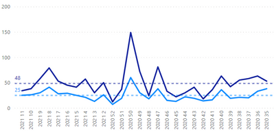
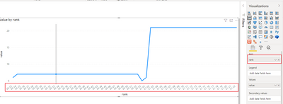
Hi look at the above graph. I use Year/WeekNum as X axis. It works ok but powerBi adds a scroll bar.
I want to see it on one page? I know that the feature "continuous" on the X axis must do the job but I can't select it.
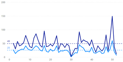
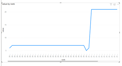
Furthermore, If I only use Week num the result is ok I see it all on one page but the week isn't in the correct order since the end is week 52, it must the actual week in 2021 and the start in 2020.
Solved! Go to Solution.
- Mark as New
- Bookmark
- Subscribe
- Mute
- Subscribe to RSS Feed
- Permalink
- Report Inappropriate Content
Hi , @vbourbeau ;
If this is the case, you could set the Minimum category width and enlarged visiual width in visualizations as well.as following picture shows:
Because if it is a number type and it is not categorical, it will be arranged in numerical order, and the missing numbers will be filled in, so I think the above method is more appropriate.
Best Regards,
Community Support Team_ Yalan Wu
If this post helps, then please consider Accept it as the solution to help the other members find it more quickly.
- Mark as New
- Bookmark
- Subscribe
- Mute
- Subscribe to RSS Feed
- Permalink
- Report Inappropriate Content
hi, @vbourbeau ;
You could new a column by the following formula:
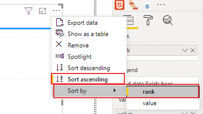
rank = RIGHT(YEAR([Date]),2)&"-"&IF(LEN(WEEKNUM([Date]))=1,"0"&WEEKNUM([Date]),""&WEEKNUM([Date]))then add it to x-axis; and sort by rank:
The final output is shown below:
Best Regards,
Community Support Team_ Yalan Wu
If this post helps, then please consider Accept it as the solution to help the other members find it more quickly.
- Mark as New
- Bookmark
- Subscribe
- Mute
- Subscribe to RSS Feed
- Permalink
- Report Inappropriate Content
Still gets the scroll bar.
I notice that if the X axis is numeric the scroll bar disapear. But Power Bi short it by numeric order where is'nt what I'm looking for.
- Mark as New
- Bookmark
- Subscribe
- Mute
- Subscribe to RSS Feed
- Permalink
- Report Inappropriate Content
hi, @vbourbeau ;
If you want the x-axis to be numeric, you can change dax to:
rank = CONVERT(YEAR([Date])&IF(LEN(WEEKNUM([Date]))=1,"0"&WEEKNUM([Date]),""&WEEKNUM([Date])),INTEGER)If it not solved, please provide me with more details about your problem or share me with your pbix file after removing sensitive data.
Best Regards,
Community Support Team_ Yalan Wu
If this post helps, then please consider Accept it as the solution to help the other members find it more quickly.
- Mark as New
- Bookmark
- Subscribe
- Mute
- Subscribe to RSS Feed
- Permalink
- Report Inappropriate Content
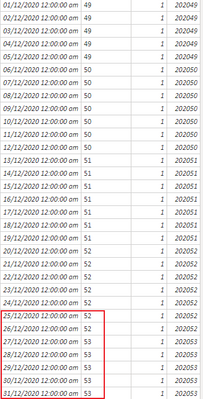
Yes it's working but we get a gap between the weeknum 53 and 1, since we pass from 202053 to 202101.
- Mark as New
- Bookmark
- Subscribe
- Mute
- Subscribe to RSS Feed
- Permalink
- Report Inappropriate Content
Hi, @vbourbeau ;
Can you share a screenshot of your data date or share me with your pbix file after removing sensitive data. Because you could see from my pbix, the largest weeknum in 2020 is 53, So I'm not sure what your problem is.
- Mark as New
- Bookmark
- Subscribe
- Mute
- Subscribe to RSS Feed
- Permalink
- Report Inappropriate Content
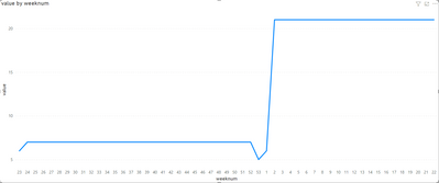
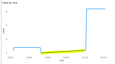
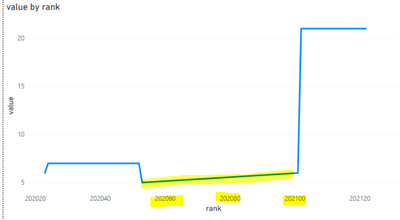
I use your pbx. Look at the graph we get 202060 202080. But the week 60 and 80 didn't exist. A year only have 52 weeks.
- Mark as New
- Bookmark
- Subscribe
- Mute
- Subscribe to RSS Feed
- Permalink
- Report Inappropriate Content
Ae you using a date table?
as regards your second issue, can you explain further (perhaps show a depiction of the expected outcome)?
thanks!
Did I answer your question? Mark my post as a solution!
In doing so, you are also helping me. Thank you!
Proud to be a Super User!
Paul on Linkedin.
- Mark as New
- Bookmark
- Subscribe
- Mute
- Subscribe to RSS Feed
- Permalink
- Report Inappropriate Content
Yes I use a date table. The second graph isn't an issue I just show that is I only use week number as X axis we can see the graph without the scroll bar as I want. But the order must be something like that.
23-24-25-26....52-1-2-3-4-5... 22. You understand. As we are the 23th weeks the graph must start with 2020 week 23 and end with 2021 week 22. It's the outcome I'm looking for.
I want to make the first graph enter in a "no scolling bar graph".
Helpful resources

Power BI Monthly Update - April 2026
Check out the April 2026 Power BI update to learn about new features.

Data Days 2026 coming soon!
Sign up to receive a private message when registration opens and key events begin.

New to Fabric Survey
If you have recently started exploring Fabric, we'd love to hear how it's going. Your feedback can help with product improvements.

| User | Count |
|---|---|
| 36 | |
| 33 | |
| 31 | |
| 21 | |
| 16 |
| User | Count |
|---|---|
| 66 | |
| 55 | |
| 31 | |
| 24 | |
| 23 |
