Get certified for free when you join Fabric Data Days 2026 and dive into Fabric, Power BI, SQL, AI, and other essential data skills.
Join nowJuly 7 - July 17 | Round 2 of the Power BI Dataviz World Championships. Don't miss your chance! Learn more
Hello,
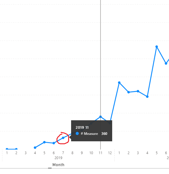
I have an issue with the line chart. Each time I want to hover over point on the plot, PBI displays not correct tooltip.
Can you please check if it is a bug or I do something wrong. Below you can find a screenshot where I select 2019-07 but PBI focuses on 2019-11.
Thanks.
That was my plan but I couldn't find any option to attach a file different than pic or video here so please find .pbix file uploaded to dropbox. The example is silly but it shows my problem.
https://www.dropbox.com/s/fa3seyqf7ay4tzv/Line_chart_issue.pbix?dl=0
Hi @luke611 ,
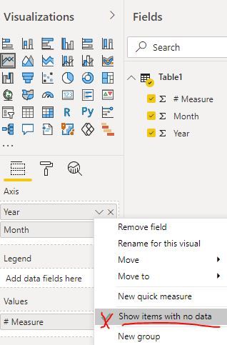
Could you please disable the feature "show items with no data" first and check whether the problem still persists... It seems the issue occurs when the data points are not continuous...
Best Regards
@Anonymous : Thanks for the answer. Indeed tooltips seem to be fine after "Show item with no data" is disabled but it changes the approach as well. I need those gaps in my chart. In my original dashboard I have "Line and stacked column chart" used and very often line is broken whereas very often there are column values what should be visualized. Unfortunately it makes tooltip/selection problem.
Hi @luke611 ,
I have reported this problem to the related team. Any progress later, I will update you shortly.
Best Regards
@Anonymous : thank you!
Join us in Barcelona for FabCon and SQLCon, the Fabric, Power BI, SQL, and AI community event. Save €200 with code FABCMTY200.
Join Data Days 2026: 60 days of free live/on-demand sessions, challenges, study groups, and certification opportunities.
| User | Count |
|---|---|
| 28 | |
| 27 | |
| 25 | |
| 23 | |
| 17 |
| User | Count |
|---|---|
| 54 | |
| 46 | |
| 38 | |
| 30 | |
| 21 |