FabCon is coming to Atlanta
Join us at FabCon Atlanta from March 16 - 20, 2026, for the ultimate Fabric, Power BI, AI and SQL community-led event. Save $200 with code FABCOMM.
Register now!- Power BI forums
- Get Help with Power BI
- Desktop
- Service
- Report Server
- Power Query
- Mobile Apps
- Developer
- DAX Commands and Tips
- Custom Visuals Development Discussion
- Health and Life Sciences
- Power BI Spanish forums
- Translated Spanish Desktop
- Training and Consulting
- Instructor Led Training
- Dashboard in a Day for Women, by Women
- Galleries
- Data Stories Gallery
- Themes Gallery
- Contests Gallery
- QuickViz Gallery
- Quick Measures Gallery
- Visual Calculations Gallery
- Notebook Gallery
- Translytical Task Flow Gallery
- TMDL Gallery
- R Script Showcase
- Webinars and Video Gallery
- Ideas
- Custom Visuals Ideas (read-only)
- Issues
- Issues
- Events
- Upcoming Events
The Power BI Data Visualization World Championships is back! Get ahead of the game and start preparing now! Learn more
- Power BI forums
- Forums
- Get Help with Power BI
- Desktop
- Re: Line chart multiple lines without legend
- Subscribe to RSS Feed
- Mark Topic as New
- Mark Topic as Read
- Float this Topic for Current User
- Bookmark
- Subscribe
- Printer Friendly Page
- Mark as New
- Bookmark
- Subscribe
- Mute
- Subscribe to RSS Feed
- Permalink
- Report Inappropriate Content
Line chart multiple lines without legend
Hello!
How are you? I would like to thank all the contributors in this community as you have been very helpful while I am learning Power BI.
However I am trying to do something and I haven't found a solution on the community.
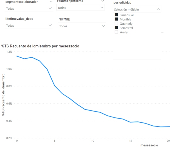
I have a line chart, X axis is period of time, Value is count of members. I have some segmentation slicers. Would it be possible that in the chart they appear as many lines selected?
For example in the image below I have selected 3 options. Can I have three lines?
I don't want to add it in the legend because then it will always be that slicer, right? I would like that the lines appear depending on the slicer selected.
Thank you!
Solved! Go to Solution.
- Mark as New
- Bookmark
- Subscribe
- Mute
- Subscribe to RSS Feed
- Permalink
- Report Inappropriate Content
@Anonymous , The best way is to have it as legend . You can hide legend box if needed.
The other way would be a measure slicer way. But these you need have that many measures and each measure have to check its value in selected value. if not there return blank
you need have measures like
if(countx(filter(allselected(slicer),slicer[value] ="Monthly"),[value])+0>0, [monthly measure], blank())
- Mark as New
- Bookmark
- Subscribe
- Mute
- Subscribe to RSS Feed
- Permalink
- Report Inappropriate Content
Hi @Anonymous ,
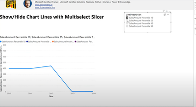
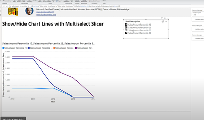
What you want is below, right?When choose different slicer,show different Line chart.
Your could read the following article,wish it could help you!
Dynamically Show/Hide Measures in Line Chart Visuals with Multiselect Slicer in Power BI
Best Regards
Lucien
- Mark as New
- Bookmark
- Subscribe
- Mute
- Subscribe to RSS Feed
- Permalink
- Report Inappropriate Content
@Anonymous , The best way is to have it as legend . You can hide legend box if needed.
The other way would be a measure slicer way. But these you need have that many measures and each measure have to check its value in selected value. if not there return blank
you need have measures like
if(countx(filter(allselected(slicer),slicer[value] ="Monthly"),[value])+0>0, [monthly measure], blank())
Helpful resources

Power BI Dataviz World Championships
The Power BI Data Visualization World Championships is back! Get ahead of the game and start preparing now!

| User | Count |
|---|---|
| 39 | |
| 35 | |
| 33 | |
| 32 | |
| 27 |
| User | Count |
|---|---|
| 136 | |
| 96 | |
| 77 | |
| 67 | |
| 65 |


