Party with Power BI’s own Guy in a Cube
Power BI is turning 10! Tune in for a special live episode on July 24 with behind-the-scenes stories, product evolution highlights, and a sneak peek at what’s in store for the future.
Save the date- Power BI forums
- Get Help with Power BI
- Desktop
- Service
- Report Server
- Power Query
- Mobile Apps
- Developer
- DAX Commands and Tips
- Custom Visuals Development Discussion
- Health and Life Sciences
- Power BI Spanish forums
- Translated Spanish Desktop
- Training and Consulting
- Instructor Led Training
- Dashboard in a Day for Women, by Women
- Galleries
- Data Stories Gallery
- Themes Gallery
- Contests Gallery
- Quick Measures Gallery
- Notebook Gallery
- Translytical Task Flow Gallery
- TMDL Gallery
- R Script Showcase
- Webinars and Video Gallery
- Ideas
- Custom Visuals Ideas (read-only)
- Issues
- Issues
- Events
- Upcoming Events
Enhance your career with this limited time 50% discount on Fabric and Power BI exams. Ends August 31st. Request your voucher.
- Power BI forums
- Forums
- Get Help with Power BI
- Desktop
- Re: Line chart hover displays categories in alphab...
- Subscribe to RSS Feed
- Mark Topic as New
- Mark Topic as Read
- Float this Topic for Current User
- Bookmark
- Subscribe
- Printer Friendly Page
- Mark as New
- Bookmark
- Subscribe
- Mute
- Subscribe to RSS Feed
- Permalink
- Report Inappropriate Content
Line chart hover displays categories in alphabetical order rather than highest value order
Hi there,
I have a line graph using suburban graffiti data over time. There are about 30 suburbs (too many I know) but when I hover over a point, instead of the hover showing what that point is (e.g. Fendalton, 204) it shows about five suburbs on that month starting with (blank), then suburbs beginning with A, none of which relate to the point I selected.
What I would like to do is adjust the hover to either show the value I am pointing at, or maybe order the suburbs by the number of graffiti calls for that month. ANy tips would be greatly appreciated.
- Mark as New
- Bookmark
- Subscribe
- Mute
- Subscribe to RSS Feed
- Permalink
- Report Inappropriate Content
Hi @Anonymous,
In your line chart, you select the month as Axis level, the Suburbs in Legend level, right? I try to reproduce your scenario using the sample data below.
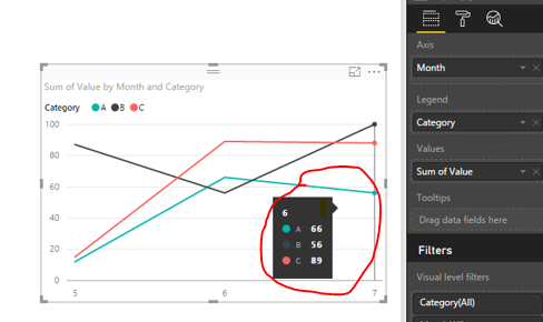
In line chart, we are not able to display only one value according to the selected point. And we can’t order the values from one month. Like the following screenshot, it will return all the three values automatically when we select one point. And the order of value is A-Z according the category automatically, we can’t change it.
If you have any question, please feel free to ask.
Best Regards,
Angelia
- Mark as New
- Bookmark
- Subscribe
- Mute
- Subscribe to RSS Feed
- Permalink
- Report Inappropriate Content
Thanks Angelia for your response. That's dissappointing, I'll have a crack at finding a way around it.
Cheers,
Chris.
- Mark as New
- Bookmark
- Subscribe
- Mute
- Subscribe to RSS Feed
- Permalink
- Report Inappropriate Content
Hi @Anonymous,
Thanks for understanding, please share your solution and mark corresponding for help more people.
Best Regards,
Angelia
Helpful resources
| User | Count |
|---|---|
| 78 | |
| 74 | |
| 42 | |
| 32 | |
| 28 |
| User | Count |
|---|---|
| 100 | |
| 93 | |
| 51 | |
| 50 | |
| 48 |


