Join us at FabCon Vienna from September 15-18, 2025
The ultimate Fabric, Power BI, SQL, and AI community-led learning event. Save €200 with code FABCOMM.
Get registered- Power BI forums
- Get Help with Power BI
- Desktop
- Service
- Report Server
- Power Query
- Mobile Apps
- Developer
- DAX Commands and Tips
- Custom Visuals Development Discussion
- Health and Life Sciences
- Power BI Spanish forums
- Translated Spanish Desktop
- Training and Consulting
- Instructor Led Training
- Dashboard in a Day for Women, by Women
- Galleries
- Data Stories Gallery
- Themes Gallery
- Contests Gallery
- Quick Measures Gallery
- Notebook Gallery
- Translytical Task Flow Gallery
- TMDL Gallery
- R Script Showcase
- Webinars and Video Gallery
- Ideas
- Custom Visuals Ideas (read-only)
- Issues
- Issues
- Events
- Upcoming Events
Enhance your career with this limited time 50% discount on Fabric and Power BI exams. Ends September 15. Request your voucher.
- Power BI forums
- Forums
- Get Help with Power BI
- Desktop
- Re: Line chart from the column with delimiter
- Subscribe to RSS Feed
- Mark Topic as New
- Mark Topic as Read
- Float this Topic for Current User
- Bookmark
- Subscribe
- Printer Friendly Page
- Mark as New
- Bookmark
- Subscribe
- Mute
- Subscribe to RSS Feed
- Permalink
- Report Inappropriate Content
Line chart from the column with delimiter
Hi Team,
I have the data in below format which i downloaded from API. I need to plot a line chart based on values in "Column1.audioIn.packetLoss" where the datapoints are having delimiter ";"
These data points are captured every min from the starttime till endtime. Can anyone help me or give me an idea how i can plot this in line chart with timestamp having 1 min increment?
Solved! Go to Solution.
- Mark as New
- Bookmark
- Subscribe
- Mute
- Subscribe to RSS Feed
- Permalink
- Report Inappropriate Content
Hi @LP2803
Please download the PBIX file with all the following data and visuals.
There are a few steps required but you can end up with this
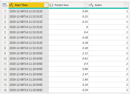
You will of course need to split the packet loss column into separate values, creating new rows for each value
and I added an Index column just as an extra identifier for each series.
Then, you need to extract the Start Time which you will use on the x-axis. I also added another Index column just in case you wanted to plot all values against an arbitrary x-axis from 1 to 16.
Now by grouping on Start Time
You can add an Index for each of the Tables for each different Start Time , you can see this Index Series column has values from 0 to 7 for both sets of readings.
By adding the values in Index Series to the Start Time we end up with a column of times differing by 1 minute increments and this can be used as the x-axis in the line chart
Please note that not all of the above columns are required for charting, I just left them in there for you in case you wanted them for something else, but columns like Start Date and Index could be removed.
With this data you could create a line chart showing all packet loss values against time like this
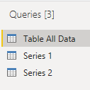
But I thought it probably made more sense to split the data into 2 series and plot them separately. To do this I duplicated the 1st query twice, and in these new queries only kept the data required to chart that series.
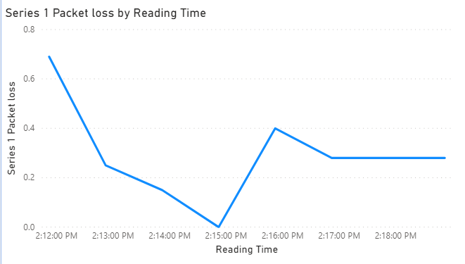
So you can now chart Series 1 (readings taken from 2:11:52pm) and Series 2 (readings taken 2:11:20pm) separately.
Please check out the PBIX file I linked to above for all the queries, data and charts shown here.
Regards
Phil
If I answered your question please mark my post as the solution.
If my answer helped solve your problem, give it a kudos by clicking on the Thumbs Up.
Did I answer your question? Then please mark my post as the solution.
If I helped you, click on the Thumbs Up to give Kudos.
Blog :: YouTube Channel :: Connect on Linkedin
Proud to be a Super User!
- Mark as New
- Bookmark
- Subscribe
- Mute
- Subscribe to RSS Feed
- Permalink
- Report Inappropriate Content
Glad to help 🙂
Did I answer your question? Then please mark my post as the solution.
If I helped you, click on the Thumbs Up to give Kudos.
Blog :: YouTube Channel :: Connect on Linkedin
Proud to be a Super User!
- Mark as New
- Bookmark
- Subscribe
- Mute
- Subscribe to RSS Feed
- Permalink
- Report Inappropriate Content
Hi @LP2803
Please download the PBIX file with all the following data and visuals.
There are a few steps required but you can end up with this
You will of course need to split the packet loss column into separate values, creating new rows for each value
and I added an Index column just as an extra identifier for each series.
Then, you need to extract the Start Time which you will use on the x-axis. I also added another Index column just in case you wanted to plot all values against an arbitrary x-axis from 1 to 16.
Now by grouping on Start Time
You can add an Index for each of the Tables for each different Start Time , you can see this Index Series column has values from 0 to 7 for both sets of readings.
By adding the values in Index Series to the Start Time we end up with a column of times differing by 1 minute increments and this can be used as the x-axis in the line chart
Please note that not all of the above columns are required for charting, I just left them in there for you in case you wanted them for something else, but columns like Start Date and Index could be removed.
With this data you could create a line chart showing all packet loss values against time like this
But I thought it probably made more sense to split the data into 2 series and plot them separately. To do this I duplicated the 1st query twice, and in these new queries only kept the data required to chart that series.
So you can now chart Series 1 (readings taken from 2:11:52pm) and Series 2 (readings taken 2:11:20pm) separately.
Please check out the PBIX file I linked to above for all the queries, data and charts shown here.
Regards
Phil
If I answered your question please mark my post as the solution.
If my answer helped solve your problem, give it a kudos by clicking on the Thumbs Up.
Did I answer your question? Then please mark my post as the solution.
If I helped you, click on the Thumbs Up to give Kudos.
Blog :: YouTube Channel :: Connect on Linkedin
Proud to be a Super User!
- Mark as New
- Bookmark
- Subscribe
- Mute
- Subscribe to RSS Feed
- Permalink
- Report Inappropriate Content
@PhilipTreacy Stunning. I didn't get any errors while applying your solutions to my requirement.
Also, I really appreciate one unique quality of yours, that is... you give complete steps to get to the solution that we are looking for. I liked it 🙂
- Mark as New
- Bookmark
- Subscribe
- Mute
- Subscribe to RSS Feed
- Permalink
- Report Inappropriate Content
@PhilipTreacy Thanks a lot Philip. I'm gonna try this solution tonight and get back to you with questions or accept your solution 🙂
I honestly say "Thank you so much". I can see how much effort you had added here. 🙂 Appreciated.
- Mark as New
- Bookmark
- Subscribe
- Mute
- Subscribe to RSS Feed
- Permalink
- Report Inappropriate Content
Hi @LP2803,
It seems like your records have compressed into one row, I'd like to suggest you split them and expand to the date range first.
BTW, power bi not able to use line chart analysis date ranges of multiple date fields, so you need to manually generate the records of the date range.
If you confused about the coding formula, please share some dummy data with table format then we can simply test with these.
How to Get Your Question Answered Quickly
Regards,
Xiaoxin Sheng
- Mark as New
- Bookmark
- Subscribe
- Mute
- Subscribe to RSS Feed
- Permalink
- Report Inappropriate Content
@Anonymous Thanks a lot for your response. I will definitely share some sample data by today. But how to attach file here?
- Mark as New
- Bookmark
- Subscribe
- Mute
- Subscribe to RSS Feed
- Permalink
- Report Inappropriate Content
Hi @LP2803,
You can upload to onedrive for business and share the link here.
Notice: Please double-check on your sample file to confirm it not attached any sensitive data.
Regards,
Xiaoxin Sheng
- Mark as New
- Bookmark
- Subscribe
- Mute
- Subscribe to RSS Feed
- Permalink
- Report Inappropriate Content
@Anonymous Thanks to you too. I will make note of it from next time uploading files. 🙂
Helpful resources
| User | Count |
|---|---|
| 71 | |
| 64 | |
| 62 | |
| 49 | |
| 28 |
| User | Count |
|---|---|
| 117 | |
| 75 | |
| 61 | |
| 54 | |
| 42 |


