Huge last-minute discounts for FabCon Vienna from September 15-18, 2025
Supplies are limited. Contact info@espc.tech right away to save your spot before the conference sells out.
Get your discount- Power BI forums
- Get Help with Power BI
- Desktop
- Service
- Report Server
- Power Query
- Mobile Apps
- Developer
- DAX Commands and Tips
- Custom Visuals Development Discussion
- Health and Life Sciences
- Power BI Spanish forums
- Translated Spanish Desktop
- Training and Consulting
- Instructor Led Training
- Dashboard in a Day for Women, by Women
- Galleries
- Data Stories Gallery
- Themes Gallery
- Contests Gallery
- Quick Measures Gallery
- Notebook Gallery
- Translytical Task Flow Gallery
- TMDL Gallery
- R Script Showcase
- Webinars and Video Gallery
- Ideas
- Custom Visuals Ideas (read-only)
- Issues
- Issues
- Events
- Upcoming Events
Score big with last-minute savings on the final tickets to FabCon Vienna. Secure your discount
- Power BI forums
- Forums
- Get Help with Power BI
- Desktop
- Re: Line and column chart: do NOT connect line poi...
- Subscribe to RSS Feed
- Mark Topic as New
- Mark Topic as Read
- Float this Topic for Current User
- Bookmark
- Subscribe
- Printer Friendly Page
- Mark as New
- Bookmark
- Subscribe
- Mute
- Subscribe to RSS Feed
- Permalink
- Report Inappropriate Content
Line and column chart: do NOT connect line points?
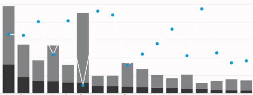
Is there anyway to format a line chart or rather a combo line chart so that the lines themselves are not shown just the dots?
See how some are independent dots and others are connected.
It just looks REALLY odd since some of those do not have any datapoints shown in red. It would be better to be able to choose a single dot with no join lines, and in a perfect world even pick a shape like triangle, circle, square, etc....
- Mark as New
- Bookmark
- Subscribe
- Mute
- Subscribe to RSS Feed
- Permalink
- Report Inappropriate Content
Does anyone know if this has been resolved or if there is an Idea to track this? My client requests this every week, as we have a very similar scenario where the "dots" are reference points, and have no relevancy to other points to the right and left of them. It is very confusing that they connect.
- Mark as New
- Bookmark
- Subscribe
- Mute
- Subscribe to RSS Feed
- Permalink
- Report Inappropriate Content
Please vote for this feature here:
- Mark as New
- Bookmark
- Subscribe
- Mute
- Subscribe to RSS Feed
- Permalink
- Report Inappropriate Content
Hi @OneWithQuestion,
In a line chart, we are not allowed to remove the lines to just show dots. If we need to see data dots in a chart, we should choose scatter chart, however, there is no such a scatter and column combination chart to achieve your requirement.
As Phil_Seamark said, the only workaround to remove lines is to putthe unconnected groups into their own series and add the series value to the Legend.
Thanks,
Yuliana Gu
If this post helps, then please consider Accept it as the solution to help the other members find it more quickly.
- Mark as New
- Bookmark
- Subscribe
- Mute
- Subscribe to RSS Feed
- Permalink
- Report Inappropriate Content
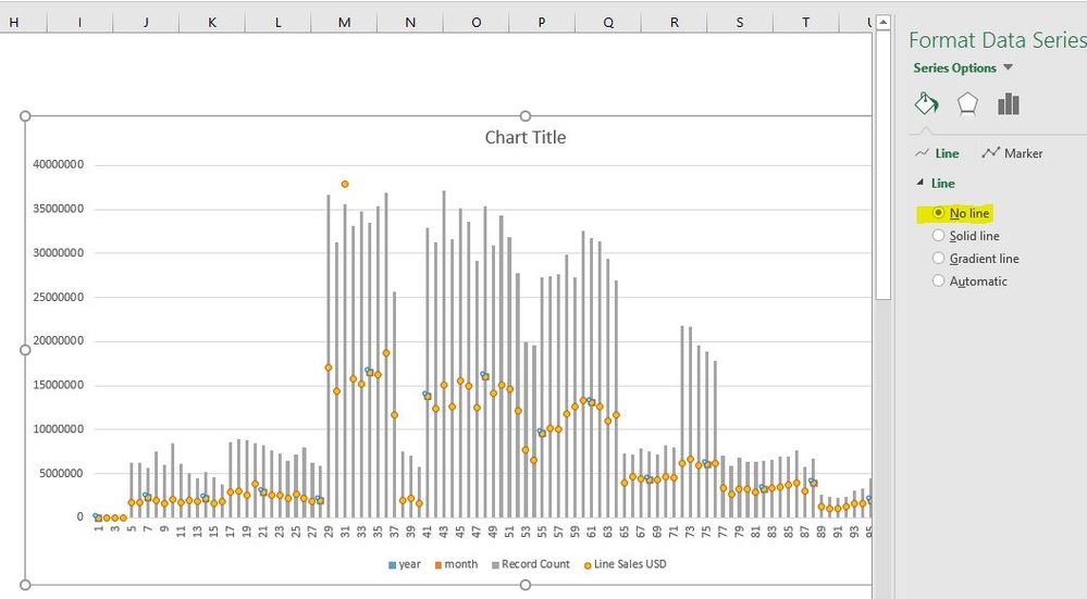
Excel supports this so we are just asking for feature parity.
- Mark as New
- Bookmark
- Subscribe
- Mute
- Subscribe to RSS Feed
- Permalink
- Report Inappropriate Content
With the latest release of PBI Desktop this is ALMOST achievable...if only we could make the line color transaparant, or set the Stroke Width to 0.
Using a white line on a white background works as long as the line does not cross any of the bars. Sooooo close... please take us the last mile, Microsoft.
- Mark as New
- Bookmark
- Subscribe
- Mute
- Subscribe to RSS Feed
- Permalink
- Report Inappropriate Content
How are you changing the line color seperate from the join marker color?
- Mark as New
- Bookmark
- Subscribe
- Mute
- Subscribe to RSS Feed
- Permalink
- Report Inappropriate Content
Line Color (under Data Colors) vs. Marker Color (under Shapes). However this feature has been fixed and this should be marked as "done" because you can now set the Line Stroke Width to 0. Thanks Microsoft. 🙂
- Mark as New
- Bookmark
- Subscribe
- Mute
- Subscribe to RSS Feed
- Permalink
- Report Inappropriate Content
white lines distract my users still... if there was just a "transparent" color option that would sort the issue!
- Mark as New
- Bookmark
- Subscribe
- Mute
- Subscribe to RSS Feed
- Permalink
- Report Inappropriate Content
With putting unconnected groups in their own series, that would just cluster them together right?
In the case of my example those bars are showing people, and then the height of the bar is showing types of work assigned to them.
X of these task types, Y of another task type, Z of yet a third.
Then the line is showing how many tasks are overdue.
Basically, NO ONE wants a red dot/line indicating they have late work. (Project contract not returned, or some customer response deadline missed etc...)
But, I don't see any other way to indicate that with Power BI.
Grouping the people together wouldn't make sense as there isn't any trend from Jason Smith to Joan Berkley, etc... just Jason had 2 overdue and Joan has 1, while Sally Robinson has zero (she's keeping up on her work kudos to her!) etc...
- Mark as New
- Bookmark
- Subscribe
- Mute
- Subscribe to RSS Feed
- Permalink
- Report Inappropriate Content
One option if you want to remove joins is to look at putting the unconnected groups into their own series and add the series value to the Legend. This might give you lots of colours depending on how many groups you have.


