- Power BI forums
- Updates
- News & Announcements
- Get Help with Power BI
- Desktop
- Service
- Report Server
- Power Query
- Mobile Apps
- Developer
- DAX Commands and Tips
- Custom Visuals Development Discussion
- Health and Life Sciences
- Power BI Spanish forums
- Translated Spanish Desktop
- Power Platform Integration - Better Together!
- Power Platform Integrations (Read-only)
- Power Platform and Dynamics 365 Integrations (Read-only)
- Training and Consulting
- Instructor Led Training
- Dashboard in a Day for Women, by Women
- Galleries
- Community Connections & How-To Videos
- COVID-19 Data Stories Gallery
- Themes Gallery
- Data Stories Gallery
- R Script Showcase
- Webinars and Video Gallery
- Quick Measures Gallery
- 2021 MSBizAppsSummit Gallery
- 2020 MSBizAppsSummit Gallery
- 2019 MSBizAppsSummit Gallery
- Events
- Ideas
- Custom Visuals Ideas
- Issues
- Issues
- Events
- Upcoming Events
- Community Blog
- Power BI Community Blog
- Custom Visuals Community Blog
- Community Support
- Community Accounts & Registration
- Using the Community
- Community Feedback
Register now to learn Fabric in free live sessions led by the best Microsoft experts. From Apr 16 to May 9, in English and Spanish.
- Power BI forums
- Forums
- Get Help with Power BI
- Desktop
- Line and clustered column chart with three differe...
- Subscribe to RSS Feed
- Mark Topic as New
- Mark Topic as Read
- Float this Topic for Current User
- Bookmark
- Subscribe
- Printer Friendly Page
- Mark as New
- Bookmark
- Subscribe
- Mute
- Subscribe to RSS Feed
- Permalink
- Report Inappropriate Content
Line and clustered column chart with three different years
I have volume data for different years (and months/periods will represented by columns).
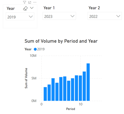
I have 3 slicers and I would like to create a "line and clustered column chart" where the first 2 slicers indicate the years that will appear in columns and the third slicer will be the line.
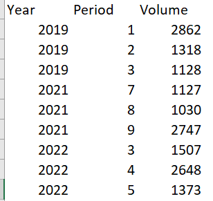
My raw data has this format:
And the output I want is like below, but having also columns for one more year plus the line.
- Mark as New
- Bookmark
- Subscribe
- Mute
- Subscribe to RSS Feed
- Permalink
- Report Inappropriate Content
First off, this is a horrible idea. The proper way to do this is to have the measure you want, Sum of volume, target volume, etc. Add them to the line & Clustered column chart. Add 1 filter that is year. Choose the year Display the actuals with the target.
If you won't or can't put your foot down.....
- Create a measure for each year (example: Amount2022 = calculate(sum(amount), year = 2022), etc. )
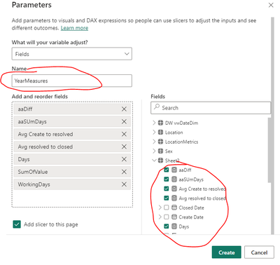
Create a field parameter.
2. Add all the measures to the field parameter.
(note: using random measures already created for demo purposes)
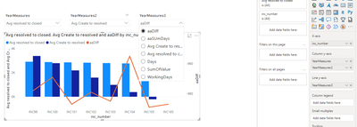
3. repeat step 1-2 two more times so you have 3 field params.
4. Add the field params to the chart. (And add the slicers to the page if it wasn't done automatically)
5. Bask in the glory of a rigid and hard to maintian report page that is sure to bring you hours of depression as you scale it manually year after year, measure after measure.
I hope you can appreciate a little humor, I know we often have our hands tied in situations like this. But if the consumers give you any leeway to implement it a different way... take it.
If this post helps, then please consider Accept it as the solution to help the other members find it more quickly.
- Mark as New
- Bookmark
- Subscribe
- Mute
- Subscribe to RSS Feed
- Permalink
- Report Inappropriate Content
Lots of questions: First, most importantly... what are you try to communicate the end user here?
My guess is you want a way to show previous two years volume by period compared to the current year.
Will people decide which year will be the line for any purpose? Or is the line always the current year and you want previous two years to be the columns?
- Mark as New
- Bookmark
- Subscribe
- Mute
- Subscribe to RSS Feed
- Permalink
- Report Inappropriate Content
The user will choose any combination. But most probably will be that the columns will be past years (ie. 2020 vs 2022) and the line some forecast scenario. But ideally they should be able to play with the 3 slicers to decide what year appears in bars or line.
Helpful resources

Microsoft Fabric Learn Together
Covering the world! 9:00-10:30 AM Sydney, 4:00-5:30 PM CET (Paris/Berlin), 7:00-8:30 PM Mexico City

Power BI Monthly Update - April 2024
Check out the April 2024 Power BI update to learn about new features.

| User | Count |
|---|---|
| 108 | |
| 106 | |
| 86 | |
| 77 | |
| 69 |
| User | Count |
|---|---|
| 120 | |
| 112 | |
| 94 | |
| 84 | |
| 75 |


