Join the #PBI10 DataViz contest
Power BI is turning 10, and we’re marking the occasion with a special community challenge. Use your creativity to tell a story, uncover trends, or highlight something unexpected.
Get started- Power BI forums
- Get Help with Power BI
- Desktop
- Service
- Report Server
- Power Query
- Mobile Apps
- Developer
- DAX Commands and Tips
- Custom Visuals Development Discussion
- Health and Life Sciences
- Power BI Spanish forums
- Translated Spanish Desktop
- Training and Consulting
- Instructor Led Training
- Dashboard in a Day for Women, by Women
- Galleries
- Webinars and Video Gallery
- Data Stories Gallery
- Themes Gallery
- Contests Gallery
- Quick Measures Gallery
- Notebook Gallery
- Translytical Task Flow Gallery
- R Script Showcase
- Ideas
- Custom Visuals Ideas (read-only)
- Issues
- Issues
- Events
- Upcoming Events
Join us for an expert-led overview of the tools and concepts you'll need to become a Certified Power BI Data Analyst and pass exam PL-300. Register now.
- Power BI forums
- Forums
- Get Help with Power BI
- Desktop
- Re: Line and clustered column chart - dynamic colo...
- Subscribe to RSS Feed
- Mark Topic as New
- Mark Topic as Read
- Float this Topic for Current User
- Bookmark
- Subscribe
- Printer Friendly Page
- Mark as New
- Bookmark
- Subscribe
- Mute
- Subscribe to RSS Feed
- Permalink
- Report Inappropriate Content
Line and clustered column chart - dynamic color change for column
Hi all,
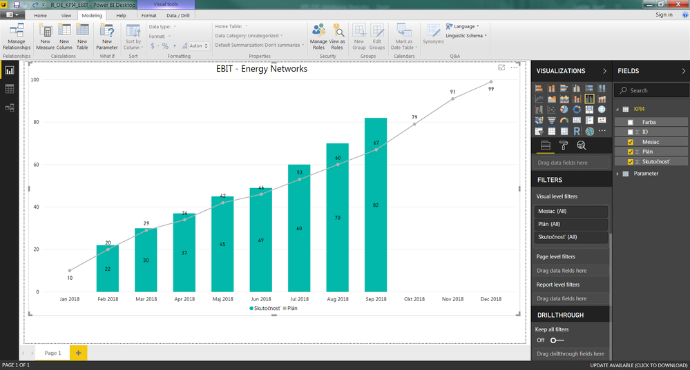
I have Line and clustered column chart - it shows several columns (January, February etc...) with some specific value/amount. I have also visible a Line, which shows expected plan for each month.
Source of data is excel.
What I want to achieve is, to set up dynamic functionality - if amount value in specific month is more than XY, display this column for example in red and if it is less than value XY, show this column in green collor.
Conditional formating is not available for this type of chart + mentioned XY values are stored in separated column (they are read from the source data - excel, it is the first column on the picture with name Farba which means color) which is hidden (or not displayed). But these XY data/ conditions can be changed or each added as time go for upcoming month (manually changed in source excel).
Can anyone give any advice please?
Many thanx in advance.
Dodo
Solved! Go to Solution.
- Mark as New
- Bookmark
- Subscribe
- Mute
- Subscribe to RSS Feed
- Permalink
- Report Inappropriate Content
Hi Dodo,
There is a workaround for this scenario. Please refer to the description below and the demo in the attachment.
1. Add a custom column, "Legend".
Legend = if([Skutocnost]>[Farba], 1, 0)
2. Add the "Legend" to the legend field.
Best Regards,
Dale
If this post helps, then please consider Accept it as the solution to help the other members find it more quickly.
- Mark as New
- Bookmark
- Subscribe
- Mute
- Subscribe to RSS Feed
- Permalink
- Report Inappropriate Content
Hi @Anonymous
The reason for the difference in the formula could be that @v-jiascu-msft added his column as a DAX calculated column and you added yours using Power Query with the M formula language.
- Mark as New
- Bookmark
- Subscribe
- Mute
- Subscribe to RSS Feed
- Permalink
- Report Inappropriate Content
Hi Dodo,
There is a workaround for this scenario. Please refer to the description below and the demo in the attachment.
1. Add a custom column, "Legend".
Legend = if([Skutocnost]>[Farba], 1, 0)
2. Add the "Legend" to the legend field.
Best Regards,
Dale
If this post helps, then please consider Accept it as the solution to help the other members find it more quickly.
- Mark as New
- Bookmark
- Subscribe
- Mute
- Subscribe to RSS Feed
- Permalink
- Report Inappropriate Content
Hi Dale,
thank you very much. It works.
I've just change a bit your formula
if([Skutocnost]>[Farba], 1, 0)
to
if [Skutocnost]>[Farba] then 1 else 0
because power BI didn't accepted your one. But funny is that I was able to open your pbix file with your syntax, but I was not able to copy it without error to my new pbix document.
Anyway, you helped me a lot. Thank you.
Best regards
Dodo
- Mark as New
- Bookmark
- Subscribe
- Mute
- Subscribe to RSS Feed
- Permalink
- Report Inappropriate Content
Hi @Anonymous
The reason for the difference in the formula could be that @v-jiascu-msft added his column as a DAX calculated column and you added yours using Power Query with the M formula language.
Helpful resources

Join our Fabric User Panel
This is your chance to engage directly with the engineering team behind Fabric and Power BI. Share your experiences and shape the future.

Power BI Monthly Update - June 2025
Check out the June 2025 Power BI update to learn about new features.

| User | Count |
|---|---|
| 64 | |
| 56 | |
| 54 | |
| 36 | |
| 34 |
| User | Count |
|---|---|
| 85 | |
| 73 | |
| 55 | |
| 45 | |
| 43 |

