Join us at FabCon Vienna from September 15-18, 2025
The ultimate Fabric, Power BI, SQL, and AI community-led learning event. Save €200 with code FABCOMM.
Get registered- Power BI forums
- Get Help with Power BI
- Desktop
- Service
- Report Server
- Power Query
- Mobile Apps
- Developer
- DAX Commands and Tips
- Custom Visuals Development Discussion
- Health and Life Sciences
- Power BI Spanish forums
- Translated Spanish Desktop
- Training and Consulting
- Instructor Led Training
- Dashboard in a Day for Women, by Women
- Galleries
- Data Stories Gallery
- Themes Gallery
- Contests Gallery
- Quick Measures Gallery
- Notebook Gallery
- Translytical Task Flow Gallery
- TMDL Gallery
- R Script Showcase
- Webinars and Video Gallery
- Ideas
- Custom Visuals Ideas (read-only)
- Issues
- Issues
- Events
- Upcoming Events
Enhance your career with this limited time 50% discount on Fabric and Power BI exams. Ends August 31st. Request your voucher.
- Power BI forums
- Forums
- Get Help with Power BI
- Desktop
- Re: Line and bar chart y-axis mis-aligned
- Subscribe to RSS Feed
- Mark Topic as New
- Mark Topic as Read
- Float this Topic for Current User
- Bookmark
- Subscribe
- Printer Friendly Page
- Mark as New
- Bookmark
- Subscribe
- Mute
- Subscribe to RSS Feed
- Permalink
- Report Inappropriate Content
Line and bar chart y-axis mis-aligned
Hi,
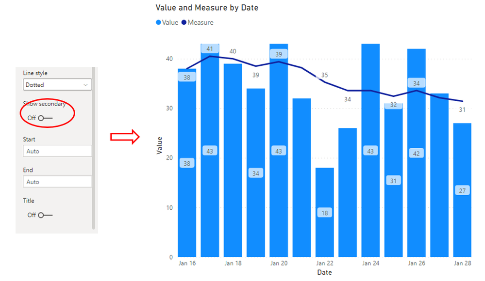
I've got a line and bar chart showing enquiries per day and then a rolling 7 day average, but despite turning off the secondary axis, the line still appears to be using this "hidden" axis. On the example below you can see that for date shown the number of enquiries was 43 and the 7 day average was 40, but the line is higher up than the bar, when it should be below it. I found one idea which was to show secondary axis, then align 0s and then turn off secondary axis, but this hasn't resolved this issue. Any suggestions would be appreciated. Thanks
- Mark as New
- Bookmark
- Subscribe
- Mute
- Subscribe to RSS Feed
- Permalink
- Report Inappropriate Content
Hi @LaurenceSD ,
To my knowledge, the Show Secondary option is disable by default and based on my test,everything works fine. So I agree with @amitchandak ,it is a little strange...
But If re-create visuals could not make sense, and the Desktop version has been the latest,
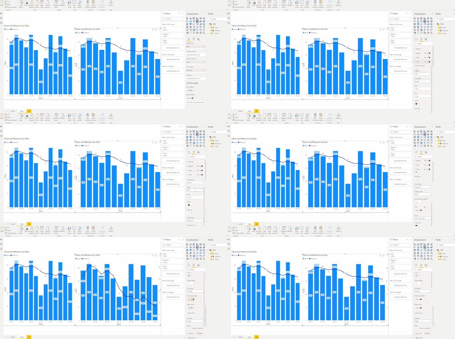
you could input Start and End of Y-axis by yourself and enable "Show Secondary" and "Align zeros" options like this:
Here is the pbix file.
Best Regards,
Eyelyn Qin
If this post helps, then please consider Accept it as the solution to help the other members find it more quickly.
- Mark as New
- Bookmark
- Subscribe
- Mute
- Subscribe to RSS Feed
- Permalink
- Report Inappropriate Content
thanks @Anonymous that's what i ended up doing was fixing the axis and using zoom slider to assist as well. It does seem as thought something is up to my end, because on the bugs forum @amitchandak directed me to my post on there also got a response that it worked fine for others, but thanks.
- Mark as New
- Bookmark
- Subscribe
- Mute
- Subscribe to RSS Feed
- Permalink
- Report Inappropriate Content
@LaurenceSD , Seems strange. Show secondary show move both of them on the same axis. Remove line; add once again and switch off secondary axis.
If did work try on a new visual, if your version is Feb 2021 and this does not work after these two steps, report an issue - https://community.powerbi.com/t5/Issues/idb-p/Issues
- Mark as New
- Bookmark
- Subscribe
- Mute
- Subscribe to RSS Feed
- Permalink
- Report Inappropriate Content
@amitchandak thanks for the suggestion, i've given that a go but no joy I've confirmed I'm on Feb 2021 and I've tested by putting them on the same axis in a clustered chart and it's working fine, but just the visual I want. Thanks for your help
Helpful resources
| User | Count |
|---|---|
| 80 | |
| 73 | |
| 39 | |
| 30 | |
| 28 |
| User | Count |
|---|---|
| 107 | |
| 99 | |
| 55 | |
| 49 | |
| 46 |


