- Power BI forums
- Get Help with Power BI
- Desktop
- Service
- Report Server
- Power Query
- Mobile Apps
- Developer
- DAX Commands and Tips
- Custom Visuals Development Discussion
- Health and Life Sciences
- Power BI Spanish forums
- Translated Spanish Desktop
- Training and Consulting
- Instructor Led Training
- Dashboard in a Day for Women, by Women
- Galleries
- Data Stories Gallery
- Themes Gallery
- Contests Gallery
- Quick Measures Gallery
- Notebook Gallery
- Translytical Task Flow Gallery
- TMDL Gallery
- R Script Showcase
- Webinars and Video Gallery
- Ideas
- Custom Visuals Ideas (read-only)
- Issues
- Issues
- Events
- Upcoming Events
To celebrate FabCon Vienna, we are offering 50% off select exams. Ends October 3rd. Request your discount now.
- Power BI forums
- Forums
- Get Help with Power BI
- Desktop
- Re: Line and Stacked Column Chart - Need help to d...
- Subscribe to RSS Feed
- Mark Topic as New
- Mark Topic as Read
- Float this Topic for Current User
- Bookmark
- Subscribe
- Printer Friendly Page
- Mark as New
- Bookmark
- Subscribe
- Mute
- Subscribe to RSS Feed
- Permalink
- Report Inappropriate Content
Line and Stacked Column Chart - Need help to display lower value on top.
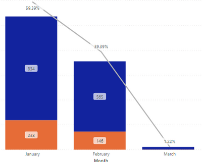
I'm trying to build a chart with line and stacked column chart. I'm creating a measure based on userid of employees and based on filters I derive the count I desire.
However When I try to plot it in to line and stacked column chart the Higher value shows up first and lower value below that. I want it the other way around for my needs. Can this be done? Here are some screen shots attached. I want the 238 on top and 834 below and similarly 146 on top and 565 below. That total is based on just one measure and I'm driving off of that to produce my desired view.
- Mark as New
- Bookmark
- Subscribe
- Mute
- Subscribe to RSS Feed
- Permalink
- Report Inappropriate Content
@gvenkat55
With my research and test, I am afraid you cannot achieve your requirement. Power bi doesn't support sort by the value in a singe bar.
Paul Zheng _ Community Support Team
- Mark as New
- Bookmark
- Subscribe
- Mute
- Subscribe to RSS Feed
- Permalink
- Report Inappropriate Content
If you have multiple measures, then I think reordering them in the Values field might do the trick.
If you are using the Legend field, then you might need to create an index column (and then sort by that column) to sort how you'd like.
- Mark as New
- Bookmark
- Subscribe
- Mute
- Subscribe to RSS Feed
- Permalink
- Report Inappropriate Content
I do not have multiple measures and don't need to. This is the only measure I have and those numbers are based on filtering them on a certain criteria
// Total ID = count(DataTab[ID]) //
// If you are using the Legend field, then you might need to create an index column (and then sort by that column) to sort how you'd like. //
How do I do this?


