Join us at FabCon Vienna from September 15-18, 2025
The ultimate Fabric, Power BI, SQL, and AI community-led learning event. Save €200 with code FABCOMM.
Get registered- Power BI forums
- Get Help with Power BI
- Desktop
- Service
- Report Server
- Power Query
- Mobile Apps
- Developer
- DAX Commands and Tips
- Custom Visuals Development Discussion
- Health and Life Sciences
- Power BI Spanish forums
- Translated Spanish Desktop
- Training and Consulting
- Instructor Led Training
- Dashboard in a Day for Women, by Women
- Galleries
- Data Stories Gallery
- Themes Gallery
- Contests Gallery
- Quick Measures Gallery
- Notebook Gallery
- Translytical Task Flow Gallery
- TMDL Gallery
- R Script Showcase
- Webinars and Video Gallery
- Ideas
- Custom Visuals Ideas (read-only)
- Issues
- Issues
- Events
- Upcoming Events
Compete to become Power BI Data Viz World Champion! First round ends August 18th. Get started.
- Power BI forums
- Forums
- Get Help with Power BI
- Desktop
- Line and Stacked Column Chart - Line doesn't show ...
- Subscribe to RSS Feed
- Mark Topic as New
- Mark Topic as Read
- Float this Topic for Current User
- Bookmark
- Subscribe
- Printer Friendly Page
- Mark as New
- Bookmark
- Subscribe
- Mute
- Subscribe to RSS Feed
- Permalink
- Report Inappropriate Content
Line and Stacked Column Chart - Line doesn't show all the way
Hi,
I'm building a Line and Stacked Column Chart, in which the X-Axis represents months in 2022. Whereas the Line Y-Axis represents Total Employee Capacity (i.e. Work hours x Number of working days in each month), and the Column Y-Axis represents the Actual Timesheet Hours reported.
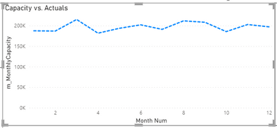
At first, when I added just the Capacity Line, everything looks fine:
Then, after I added the Actual Timesheet Hours reported, the Capacity line shows up just to March. (Because we only have Actuals data just up to March).
I want to keep the Capacity line showing all the way until December.
Please kindly advice how to enable this. Thank you very much.
Regards,
Nichanal
Solved! Go to Solution.
- Mark as New
- Bookmark
- Subscribe
- Mute
- Subscribe to RSS Feed
- Permalink
- Report Inappropriate Content
Yes I do have a separate table that contains just month number and month name.
Then the Capacity table and the Actuals table both relate to this month table.
But I just got it solved now! I need to click the arrow next to the X Axis field and click "Show items with no data"
Thank you for your help Allurean.
Regards,
Nichanal
- Mark as New
- Bookmark
- Subscribe
- Mute
- Subscribe to RSS Feed
- Permalink
- Report Inappropriate Content
Hi @nichanallseg ,
here is Stacked Column chart with Non Continuous Line Chart which will help you to get the stacked chart with all the values of line chart


Download link for the custom visual file in this page,
https://pbivizedit.com/gallery/stacked-column-chart-with-non-continuous-lines
This was made with our Custom Visual creator tool PBIVizEdit.com. With this tool,
- anyone, irrespective of technical skills, can create their own visuals
- 15 minutes to create a visual from scratch
- opens up many additional attributes to edit (for e.g. labels, tooltips, legends position, etc)
Give this a shot and let us know if you face any problem/errors.
You can use the editor to modify your visual further (some modifications cannot be done in Power BI window and have to be in editor).
Thanks,
Team PBIVizEdit
- Mark as New
- Bookmark
- Subscribe
- Mute
- Subscribe to RSS Feed
- Permalink
- Report Inappropriate Content
Hi, @nichanallseg
Is Capacity coming from different table than Actuals? You can check this if you use common date dimension (calendar table) i.e. your X-Axis for start / end dates there and extend Max date to come from Capacity table.
Did I answer your question? Mark my post as a solution!
https://allure-analytics.com/
https://www.youtube.com/channel/UCndD_QZVNB_JWYLEmP6KrpA
https://www.linkedin.com/company/77757292/
Proud to be a Super User!
- Mark as New
- Bookmark
- Subscribe
- Mute
- Subscribe to RSS Feed
- Permalink
- Report Inappropriate Content
Yes I do have a separate table that contains just month number and month name.
Then the Capacity table and the Actuals table both relate to this month table.
But I just got it solved now! I need to click the arrow next to the X Axis field and click "Show items with no data"
Thank you for your help Allurean.
Regards,
Nichanal
- Mark as New
- Bookmark
- Subscribe
- Mute
- Subscribe to RSS Feed
- Permalink
- Report Inappropriate Content
- Mark as New
- Bookmark
- Subscribe
- Mute
- Subscribe to RSS Feed
- Permalink
- Report Inappropriate Content
Yes I have the Capacity data up until December. You can see the first image I attached that it showed all the way.
Regards,
Nichanal


