A new Data Days event is coming soon!
This time we’re going bigger than ever. Fabric, Power BI, SQL, AI and more. We're covering it all. You won't want to miss it.
Learn more- Power BI forums
- Get Help with Power BI
- Desktop
- Service
- Report Server
- Power Query
- Mobile Apps
- Developer
- DAX Commands and Tips
- Custom Visuals Development Discussion
- Health and Life Sciences
- Power BI Spanish forums
- Translated Spanish Desktop
- Training and Consulting
- Instructor Led Training
- Dashboard in a Day for Women, by Women
- Galleries
- Data Stories Gallery
- Themes Gallery
- Contests Gallery
- QuickViz Gallery
- Quick Measures Gallery
- Visual Calculations Gallery
- Notebook Gallery
- Translytical Task Flow Gallery
- TMDL Gallery
- R Script Showcase
- Webinars and Video Gallery
- Ideas
- Custom Visuals Ideas (read-only)
- Issues
- Issues
- Events
- Upcoming Events
Level up your Power BI skills this month - build one visual each week and tell better stories with data! Get started
- Power BI forums
- Forums
- Get Help with Power BI
- Desktop
- Line and Stacked Column Chart Issue?
- Subscribe to RSS Feed
- Mark Topic as New
- Mark Topic as Read
- Float this Topic for Current User
- Bookmark
- Subscribe
- Printer Friendly Page
- Mark as New
- Bookmark
- Subscribe
- Mute
- Subscribe to RSS Feed
- Permalink
- Report Inappropriate Content
Line and Stacked Column Chart Issue?
I'm using a line and stacked column chart where the X-axis is a Week Ending Date value, the Column Y-axis is EHTC in hours and Line Y-axis is Actuals in hours.
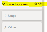
The Secondary Y-axis property is turned Off:
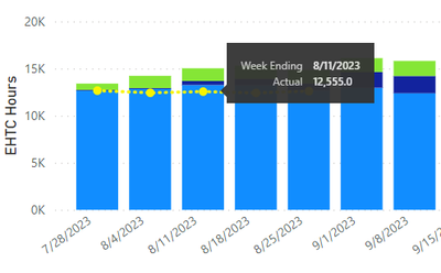
An issue is happening where if the count of Week Ending Dates is less than 23 weeks, the Secondary Y-axis turns on for some reason.
Example A (correct): Greater than 23 weeks, this is working as expected with Secondary Y-axis off:
Example B (not correct): Less than 23 weeks, but Secondary Y-axis turns on (see highlighted yellow):
So in Example B, not only did the Secondary Y-axis turn on for Actual, but the scale between the hours in EHTC vs Actual are completely different now, which is causing issues with users viewing this visual to think there is something wrong with the data being presented.
Bottom line questions: Why is the Secondary Y-axis turning on when this is turned of in the settings? Why is the scaling so different between EHTC and Actuals when it does this?
Edit: When I say the Secondary Y-axis turns on, I'm referring to the visual itself when someone is viewing the report. The setting is still set to off even though the visual is showing it.
Solved! Go to Solution.
- Mark as New
- Bookmark
- Subscribe
- Mute
- Subscribe to RSS Feed
- Permalink
- Report Inappropriate Content
Simply turning the Secondary Y-Axis property On and then Off again solved the issue. Don't understand why this fixed it.
- Mark as New
- Bookmark
- Subscribe
- Mute
- Subscribe to RSS Feed
- Permalink
- Report Inappropriate Content
Simply turning the Secondary Y-Axis property On and then Off again solved the issue. Don't understand why this fixed it.
- Mark as New
- Bookmark
- Subscribe
- Mute
- Subscribe to RSS Feed
- Permalink
- Report Inappropriate Content
I may have found a solution through trial and error. I first turned the Secondary Y-axis on:
Next I turned Logarithmic scale on and Align zeros on, which disabled Logarithmic scale but kept it on:
Then I went back and turned off Secondary y-axis to off:
This “magically” realigned the EHTC and Actual hours to the same scale and doesn’t show the Actual scale on the right:
What am I missing here?
- Mark as New
- Bookmark
- Subscribe
- Mute
- Subscribe to RSS Feed
- Permalink
- Report Inappropriate Content
Hi @arock-well
Can you please provide some file with example to work with?
Rita Fainshtein | Microsoft MVP
https://www.linkedin.com/in/rita-fainshtein/
Blog : https://www.madeiradata.com/profile/ritaf/profile
- Mark as New
- Bookmark
- Subscribe
- Mute
- Subscribe to RSS Feed
- Permalink
- Report Inappropriate Content
@Ritaf1983 I'll have to look into this as the associated data is proprietary to my company.
- Mark as New
- Bookmark
- Subscribe
- Mute
- Subscribe to RSS Feed
- Permalink
- Report Inappropriate Content
@arock-well
You can prepare some dummy data, i need something to work with...
Rita Fainshtein | Microsoft MVP
https://www.linkedin.com/in/rita-fainshtein/
Blog : https://www.madeiradata.com/profile/ritaf/profile
Helpful resources

Power BI Monthly Update - April 2026
Check out the April 2026 Power BI update to learn about new features.

Data Days 2026 coming soon!
Sign up to receive a private message when registration opens and key events begin.

New to Fabric Survey
If you have recently started exploring Fabric, we'd love to hear how it's going. Your feedback can help with product improvements.

| User | Count |
|---|---|
| 36 | |
| 28 | |
| 28 | |
| 20 | |
| 18 |
| User | Count |
|---|---|
| 65 | |
| 35 | |
| 33 | |
| 25 | |
| 24 |


