Get Fabric certified for FREE!
Don't miss your chance to take the Fabric Data Engineer (DP-600) exam for FREE! Find out how by attending the DP-600 session on April 23rd (pacific time), live or on-demand.
Learn more- Power BI forums
- Get Help with Power BI
- Desktop
- Service
- Report Server
- Power Query
- Mobile Apps
- Developer
- DAX Commands and Tips
- Custom Visuals Development Discussion
- Health and Life Sciences
- Power BI Spanish forums
- Translated Spanish Desktop
- Training and Consulting
- Instructor Led Training
- Dashboard in a Day for Women, by Women
- Galleries
- Data Stories Gallery
- Themes Gallery
- Contests Gallery
- QuickViz Gallery
- Quick Measures Gallery
- Visual Calculations Gallery
- Notebook Gallery
- Translytical Task Flow Gallery
- TMDL Gallery
- R Script Showcase
- Webinars and Video Gallery
- Ideas
- Custom Visuals Ideas (read-only)
- Issues
- Issues
- Events
- Upcoming Events
Next up in the FabCon + SQLCon recap series: The roadmap for Microsoft SQL and Maximizing Developer experiences in Fabric. All sessions are available on-demand after the live show. Register now
- Power BI forums
- Forums
- Get Help with Power BI
- Desktop
- Re: Line and Stacked Column Chart - Individual Dat...
- Subscribe to RSS Feed
- Mark Topic as New
- Mark Topic as Read
- Float this Topic for Current User
- Bookmark
- Subscribe
- Printer Friendly Page
- Mark as New
- Bookmark
- Subscribe
- Mute
- Subscribe to RSS Feed
- Permalink
- Report Inappropriate Content
Line and Stacked Column Chart - Individual Data Label Control Not working in March 2023 PBI Desktop
Line and Stacked Column Chart - Individual Data Label control seems to have stopped working properly in the March 2023 version of PBI Desktop.
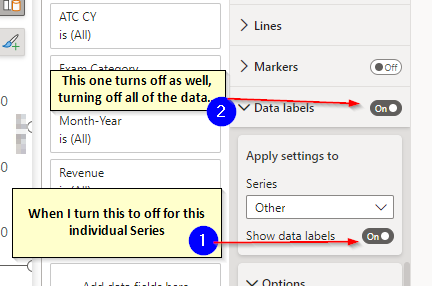
On a Line and Stacked Column Chart, when I got to Format->Data labels->Show data labels (On)->Apply settings to->Series dropdown (Individual Series-level control)
Then I select an individual Series (the Line) and turn Show data labels off, it turns off ALL of the data labes for all Series at the "Data Label" level, not just the one I selected in the series dropdown. (See image below):
- Mark as New
- Bookmark
- Subscribe
- Mute
- Subscribe to RSS Feed
- Permalink
- Report Inappropriate Content
September 2023 version still experiencing issues with data labels in 'Line and Stacked Column Chart'. If I turn off Data Labels it is automatically turned off. I can turn off data labels for either line or bars but turning off both turns both of them back on again.
- Mark as New
- Bookmark
- Subscribe
- Mute
- Subscribe to RSS Feed
- Permalink
- Report Inappropriate Content
I am running into this same issue. I would like to only show data labels for the line. The ability to disable the bars en masse not working in any manner I've tried. Seems very buggy.
- Mark as New
- Bookmark
- Subscribe
- Mute
- Subscribe to RSS Feed
- Permalink
- Report Inappropriate Content
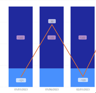
This is interesting, but I also have March 23 version and am not experiencing the same. I am able to control which series has labels, and even the colours of each
I have the line and stacked column chart, the same as you.
I did notice that if I have too many bars on screen, some of the labels stop showing. Does that affect you too?
Pi
- Mark as New
- Bookmark
- Subscribe
- Mute
- Subscribe to RSS Feed
- Permalink
- Report Inappropriate Content
Yes. If I have to many categories to slice by they stop showing as well.
- Mark as New
- Bookmark
- Subscribe
- Mute
- Subscribe to RSS Feed
- Permalink
- Report Inappropriate Content
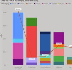
with your example, what would happen if you only want labels on the line?
I ran into a similar problem when I wanted to select labels for the line but not categories OR subcategories of the columns, but when I wanted to select Line OR Column the only options were the various subcategories.
I hope that makes sense.
sample pbix: Contoso - test chart.pbix
- Mark as New
- Bookmark
- Subscribe
- Mute
- Subscribe to RSS Feed
- Permalink
- Report Inappropriate Content
Hi Grantsamborn,
Wow! Thank you for the example I see what you mean now.
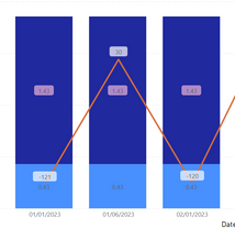
So we can only make it work by going into every individual category and changing the option for each single one.
I'm wondering why Microsoft took the decision to design it like that - I'm guessing they went for configurability. But it's not a very efficient way to do it, and what if the categories change??
Workaround / solution....
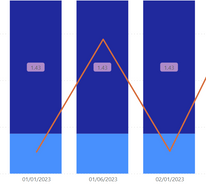
I have managed to find a workaround. Basically, I set the format to the bar measure [Sales] to format as "nothing"
To do this, go into the data model, select the measure you need to remove and change to a custom format, which is blank
This will remove the number from displaying in the chart. NB the measure will also disappear from anything else you are using, so it is probably a good idea to duplicate it first:
Pi
Helpful resources

Power BI Monthly Update - April 2026
Check out the April 2026 Power BI update to learn about new features.

New to Fabric Survey
If you have recently started exploring Fabric, we'd love to hear how it's going. Your feedback can help with product improvements.

Power BI DataViz World Championships - June 2026
A new Power BI DataViz World Championship is coming this June! Don't miss out on submitting your entry.

| User | Count |
|---|---|
| 48 | |
| 46 | |
| 41 | |
| 20 | |
| 17 |
| User | Count |
|---|---|
| 70 | |
| 69 | |
| 32 | |
| 27 | |
| 26 |
