FabCon is coming to Atlanta
Join us at FabCon Atlanta from March 16 - 20, 2026, for the ultimate Fabric, Power BI, AI and SQL community-led event. Save $200 with code FABCOMM.
Register now!- Power BI forums
- Get Help with Power BI
- Desktop
- Service
- Report Server
- Power Query
- Mobile Apps
- Developer
- DAX Commands and Tips
- Custom Visuals Development Discussion
- Health and Life Sciences
- Power BI Spanish forums
- Translated Spanish Desktop
- Training and Consulting
- Instructor Led Training
- Dashboard in a Day for Women, by Women
- Galleries
- Data Stories Gallery
- Themes Gallery
- Contests Gallery
- QuickViz Gallery
- Quick Measures Gallery
- Visual Calculations Gallery
- Notebook Gallery
- Translytical Task Flow Gallery
- TMDL Gallery
- R Script Showcase
- Webinars and Video Gallery
- Ideas
- Custom Visuals Ideas (read-only)
- Issues
- Issues
- Events
- Upcoming Events
The Power BI Data Visualization World Championships is back! Get ahead of the game and start preparing now! Learn more
- Power BI forums
- Forums
- Get Help with Power BI
- Desktop
- Line and Column Chart - Current Year and PY Proble...
- Subscribe to RSS Feed
- Mark Topic as New
- Mark Topic as Read
- Float this Topic for Current User
- Bookmark
- Subscribe
- Printer Friendly Page
- Mark as New
- Bookmark
- Subscribe
- Mute
- Subscribe to RSS Feed
- Permalink
- Report Inappropriate Content
Line and Column Chart - Current Year and PY Problem with end-of-month transition to first-of-month
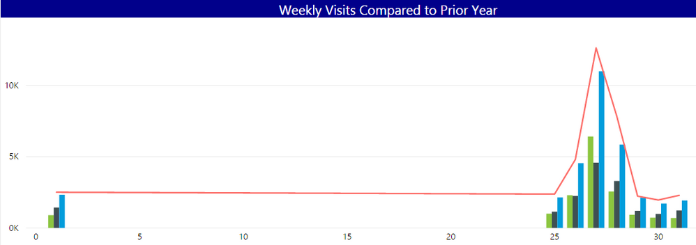
I have a Line and Column Chart visual on my report. The column data show's current year visits for the last week and the line chart shows prior year visits during the same time period last year. On the x-axis I have Day-Of-Month and the y-axis is the sum of total visits. During the middle of the month the visual looks great. But at the start of the month the visual doesn't work(see image below). Any ideas on how to avoid this? Do i need to do something with the sort order or is it a configuration thing?
In my date table I have the following measures created to pull last weeks data and PY last week:
Last_Week = Dim_Date[Date] >= Today()-8
PY_Last_Week = DIM_DATE[DATE] >= TODAY()-373 && DIM_DATE[DATE] <= TODAY()-366
And then in my visits table I have these measures created:
Week_TotaL_Visits = CALCULATE(SUM(VW_VISITS[TOTAL_VISITS]),DIM_DATE[Last_Week] = TRUE())
PY_Week_Visits = CALCULATE(SUM(PY_VISITS[TOTAL_VISITS]),DIM_DATE[PY_Last_Week] = TRUE())
This is how the visual should look when working:

This is how the visual looks at the beginning of the month:
- Mark as New
- Bookmark
- Subscribe
- Mute
- Subscribe to RSS Feed
- Permalink
- Report Inappropriate Content
Instead of calculating the py week try to use the SAMEPERIODLASTYEAR.
Not on computer right now to simulte the measure.
Regards
MFelix
Regards
Miguel Félix
Did I answer your question? Mark my post as a solution!
Proud to be a Super User!
Check out my blog: Power BI em PortuguêsHelpful resources

Power BI Dataviz World Championships
The Power BI Data Visualization World Championships is back! Get ahead of the game and start preparing now!

| User | Count |
|---|---|
| 38 | |
| 38 | |
| 36 | |
| 28 | |
| 28 |
| User | Count |
|---|---|
| 124 | |
| 89 | |
| 73 | |
| 66 | |
| 65 |


