FabCon is coming to Atlanta
Join us at FabCon Atlanta from March 16 - 20, 2026, for the ultimate Fabric, Power BI, AI and SQL community-led event. Save $200 with code FABCOMM.
Register now!- Power BI forums
- Get Help with Power BI
- Desktop
- Service
- Report Server
- Power Query
- Mobile Apps
- Developer
- DAX Commands and Tips
- Custom Visuals Development Discussion
- Health and Life Sciences
- Power BI Spanish forums
- Translated Spanish Desktop
- Training and Consulting
- Instructor Led Training
- Dashboard in a Day for Women, by Women
- Galleries
- Data Stories Gallery
- Themes Gallery
- Contests Gallery
- Quick Measures Gallery
- Notebook Gallery
- Translytical Task Flow Gallery
- TMDL Gallery
- R Script Showcase
- Webinars and Video Gallery
- Ideas
- Custom Visuals Ideas (read-only)
- Issues
- Issues
- Events
- Upcoming Events
Calling all Data Engineers! Fabric Data Engineer (Exam DP-700) live sessions are back! Starting October 16th. Sign up.
- Power BI forums
- Forums
- Get Help with Power BI
- Desktop
- Re: Line and Clustered column chart – two Y axis
- Subscribe to RSS Feed
- Mark Topic as New
- Mark Topic as Read
- Float this Topic for Current User
- Bookmark
- Subscribe
- Printer Friendly Page
- Mark as New
- Bookmark
- Subscribe
- Mute
- Subscribe to RSS Feed
- Permalink
- Report Inappropriate Content
Line and Clustered column chart – two Y axis
Hi,
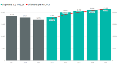
I have a Line and Clustered column chart and using the two Y axis BUT the line is too close to the column! and I don´t know how can I separate them!
I know how to change the scales, but if I do this the start and end numbers will gonna be fixed, impacting the view of the others categories of the slicer!
(I tried Label Density but it didn't work, it's not enough)
Carol
Can you help me please?
Thanks,
Solved! Go to Solution.
- Mark as New
- Bookmark
- Subscribe
- Mute
- Subscribe to RSS Feed
- Permalink
- Report Inappropriate Content
Based on my research, currently there is no available way to separate the Line and the column in addition to specify the Start and end of the Y-Axis, , if the data on both Y-Axis stay on the same data type and data range.
It's recommended to add the two shipments both under the column values, so that this would make it much more clear based on the same Y-Axis.
To better use the second Y-axis, it is recommended to add extra data which can’t be rightly calculated by the current Y-Axis.
If you would like to analyze the ratio of shipments, then opening the second Y-Axis and put the ratio value under the line value. Which would make the chart much more efficient.
In addition, check the article below for more reference regarding X-axis and Y-axis:
Tutorial: Customize X-axis and Y-axis properties
Regards,
Charlie Liao
- Mark as New
- Bookmark
- Subscribe
- Mute
- Subscribe to RSS Feed
- Permalink
- Report Inappropriate Content
Thank you so much!
I´ll try another graph
Hugs,
Carol
Helpful resources

FabCon Global Hackathon
Join the Fabric FabCon Global Hackathon—running virtually through Nov 3. Open to all skill levels. $10,000 in prizes!

Power BI Monthly Update - October 2025
Check out the October 2025 Power BI update to learn about new features.


