This is best Fabric, Power BI, SQL and AI community event. How do we know? The last event sold out! Save €200 with code FABCMTY200.
Register nowJuly 28 - August 9 | Final Round of the Power BI Dataviz World Championships. This is your chance. Learn more
I would like a way to customize the labels on charts, specifically the Line and Clustered Column Chart. The line in my chart is a custom column that displays a target value, and the label is repeated across seven categories. I am requesting the ability to display labels for each axis seperately (i.e. disable labels on secondary axis, and show labels on primary axis).
Solved! Go to Solution.
Under the data label feature of the chart, select customize series. Turn it on and then select the variable in the chart to customize.
for example I have a target line in my line and clustered chart and want to remove the data label for that field alone which is quite possible.
Hi,
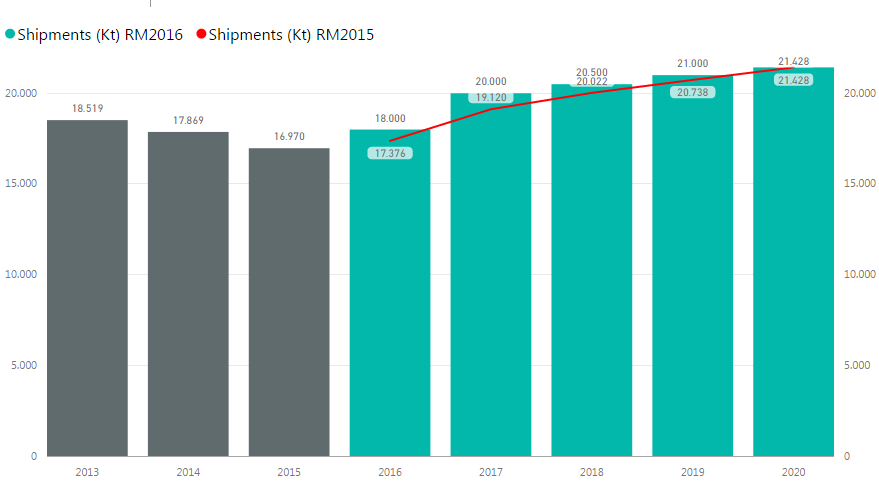
How can I separate the line from the bar?
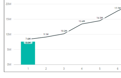
The numbers are too close!
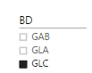
I know change the secondary axis scale BUT if I do this the axis will be the same for all categories at the roller bar on the right, that I called "BD"
PLEASE! Anybody can help me!???
or It´s possible to highlight the numbers of the line???
Thanks!!
I have the same issue and data labels around the wrong way in some instances:
Join us in Barcelona for FabCon and SQLCon, the Fabric, Power BI, SQL, and AI community event. Save €200 with code FABCMTY200.
| User | Count |
|---|---|
| 26 | |
| 22 | |
| 20 | |
| 18 | |
| 14 |
| User | Count |
|---|---|
| 22 | |
| 20 | |
| 20 | |
| 20 | |
| 20 |