Get certified for free when you join Fabric Data Days 2026 and dive into Fabric, Power BI, SQL, AI, and other essential data skills.
Join nowJuly 7 - July 17 | Round 2 of the Power BI Dataviz World Championships. Don't miss your chance! Learn more
Hi,
I have a line chart with future values. Is there anything I can do to change a colour of the line from blue to orange where the date is greater than today?
X-axis : month_year
Y-axis : sum app_amt
Solved! Go to Solution.
Hi @M_SBS_6
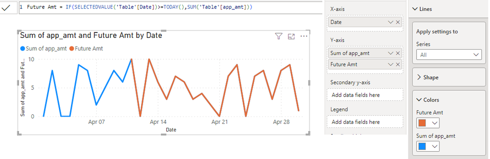
If your line chart doesn't have a legend field, you can create a measure for the sum of future values. Just like below. Add it to Y-axis. You will have two Y-axis fields now. Then you can format their colors separately.
Future Amt = IF(SELECTEDVALUE('Table'[Date])>=TODAY(),SUM('Table'[app_amt]))
Best Regards,
Jing
If this post helps, please Accept it as Solution to help other members find it. Appreciate your Kudos!
Hi @M_SBS_6
If your line chart doesn't have a legend field, you can create a measure for the sum of future values. Just like below. Add it to Y-axis. You will have two Y-axis fields now. Then you can format their colors separately.
Future Amt = IF(SELECTEDVALUE('Table'[Date])>=TODAY(),SUM('Table'[app_amt]))
Best Regards,
Jing
If this post helps, please Accept it as Solution to help other members find it. Appreciate your Kudos!
Join us in Barcelona for FabCon and SQLCon, the Fabric, Power BI, SQL, and AI community event. Save €200 with code FABCMTY200.
Join Data Days 2026: 60 days of free live/on-demand sessions, challenges, study groups, and certification opportunities.
| User | Count |
|---|---|
| 27 | |
| 23 | |
| 18 | |
| 18 | |
| 15 |
| User | Count |
|---|---|
| 54 | |
| 44 | |
| 42 | |
| 39 | |
| 36 |