FabCon is coming to Atlanta
Join us at FabCon Atlanta from March 16 - 20, 2026, for the ultimate Fabric, Power BI, AI and SQL community-led event. Save $200 with code FABCOMM.
Register now!- Power BI forums
- Get Help with Power BI
- Desktop
- Service
- Report Server
- Power Query
- Mobile Apps
- Developer
- DAX Commands and Tips
- Custom Visuals Development Discussion
- Health and Life Sciences
- Power BI Spanish forums
- Translated Spanish Desktop
- Training and Consulting
- Instructor Led Training
- Dashboard in a Day for Women, by Women
- Galleries
- Data Stories Gallery
- Themes Gallery
- Contests Gallery
- Quick Measures Gallery
- Visual Calculations Gallery
- Notebook Gallery
- Translytical Task Flow Gallery
- TMDL Gallery
- R Script Showcase
- Webinars and Video Gallery
- Ideas
- Custom Visuals Ideas (read-only)
- Issues
- Issues
- Events
- Upcoming Events
Calling all Data Engineers! Fabric Data Engineer (Exam DP-700) live sessions are back! Starting October 16th. Sign up.
- Power BI forums
- Forums
- Get Help with Power BI
- Desktop
- Line Chart
- Subscribe to RSS Feed
- Mark Topic as New
- Mark Topic as Read
- Float this Topic for Current User
- Bookmark
- Subscribe
- Printer Friendly Page
- Mark as New
- Bookmark
- Subscribe
- Mute
- Subscribe to RSS Feed
- Permalink
- Report Inappropriate Content
Line Chart
Hi,
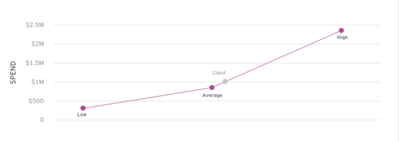
is it possible to get a line chart in power-bi which looks like this?
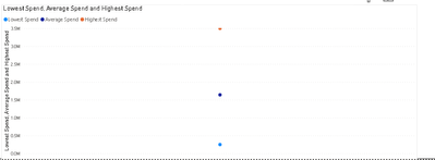
I just want to display 4 values, minimum, maximum, average and the actual value. I tried and got this output.
Should I add anything for the X-axis? Any help is appreciated.
Solved! Go to Solution.
- Mark as New
- Bookmark
- Subscribe
- Mute
- Subscribe to RSS Feed
- Permalink
- Report Inappropriate Content
Hi @Anonymous ,
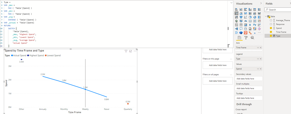
I created a sample pbix file(see attachment), please check whether that is what you want.
1. Create a calculated column as below
Type =
VAR _max =
    MAX ( 'Table'[Spend] )
VAR _min =
    MIN ( 'Table'[Spend] )
VAR _avg =
    AVERAGE ( 'Table'[Spend] )
VAR _actual = 'Table'[Spend]
RETURN
    SWITCH (
        'Table'[Spend],
        _max, "Highest Spend",
        _min, "Lowest Spend",
        _avg, "Average Spend",
        "Actual Spend"
    )
2. Create a line chart(Axis: Time Frame Legend: Type Values: Spend)
Best Regards
- Mark as New
- Bookmark
- Subscribe
- Mute
- Subscribe to RSS Feed
- Permalink
- Report Inappropriate Content
Hi @Anonymous ,
Could you please provide some sample data(exclude sensitive) which refer in the line chart? And the legend value Lowest Spend, Average Spend and Highest Spend are from the fact field or some measures? If they are from measures, could you please provide the related formula? Thank you.
By the way, the label of the line chart changes according to the value and cannot be customized...
Best Regards
- Mark as New
- Bookmark
- Subscribe
- Mute
- Subscribe to RSS Feed
- Permalink
- Report Inappropriate Content
Hi, thanks for replying.
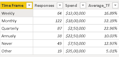
Please, find the dummy data. The maximum is calulcated as Max(Spend), same for min and average. They are all calculated based on the spend column.
- Mark as New
- Bookmark
- Subscribe
- Mute
- Subscribe to RSS Feed
- Permalink
- Report Inappropriate Content
Hi @Anonymous ,
I created a sample pbix file(see attachment), please check whether that is what you want.
1. Create a calculated column as below
Type =
VAR _max =
    MAX ( 'Table'[Spend] )
VAR _min =
    MIN ( 'Table'[Spend] )
VAR _avg =
    AVERAGE ( 'Table'[Spend] )
VAR _actual = 'Table'[Spend]
RETURN
    SWITCH (
        'Table'[Spend],
        _max, "Highest Spend",
        _min, "Lowest Spend",
        _avg, "Average Spend",
        "Actual Spend"
    )
2. Create a line chart(Axis: Time Frame Legend: Type Values: Spend)
Best Regards
- Mark as New
- Bookmark
- Subscribe
- Mute
- Subscribe to RSS Feed
- Permalink
- Report Inappropriate Content
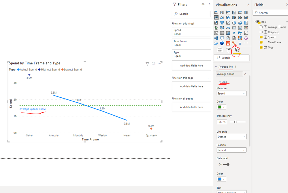
Hi, I noticed that if the value obtained by the expression for average is not in the present in the column Spend, it wont be displayed. Is there any way to fix this? 😥
- Mark as New
- Bookmark
- Subscribe
- Mute
- Subscribe to RSS Feed
- Permalink
- Report Inappropriate Content
Hi @Anonymous ,
Since there is no corresponding average value in the table, the value "Average Spend" will not appear in Type field. We can go to Analytics pane and add an average line to the line chart as a workaround just as shown in below screenshot.
Use the Analytics pane in Power BI Desktop
Best Regards
- Mark as New
- Bookmark
- Subscribe
- Mute
- Subscribe to RSS Feed
- Permalink
- Report Inappropriate Content
Ok, Thank you very much.
- Mark as New
- Bookmark
- Subscribe
- Mute
- Subscribe to RSS Feed
- Permalink
- Report Inappropriate Content
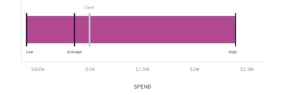
Hi, is there any way to achieve the below visual with the same dataset as above? Thanks again
- Mark as New
- Bookmark
- Subscribe
- Mute
- Subscribe to RSS Feed
- Permalink
- Report Inappropriate Content
You should not use a line chart for this purpose. Line charts suggest relationships between the data points. Your data points do not satisfy these criteria. Use a different, less misleading representation.
- Mark as New
- Bookmark
- Subscribe
- Mute
- Subscribe to RSS Feed
- Permalink
- Report Inappropriate Content
I understand that but Im not in a position to propose or use another visual
Helpful resources

FabCon Global Hackathon
Join the Fabric FabCon Global Hackathon—running virtually through Nov 3. Open to all skill levels. $10,000 in prizes!

Power BI Monthly Update - October 2025
Check out the October 2025 Power BI update to learn about new features.

