FabCon is coming to Atlanta
Join us at FabCon Atlanta from March 16 - 20, 2026, for the ultimate Fabric, Power BI, AI and SQL community-led event. Save $200 with code FABCOMM.
Register now!- Power BI forums
- Get Help with Power BI
- Desktop
- Service
- Report Server
- Power Query
- Mobile Apps
- Developer
- DAX Commands and Tips
- Custom Visuals Development Discussion
- Health and Life Sciences
- Power BI Spanish forums
- Translated Spanish Desktop
- Training and Consulting
- Instructor Led Training
- Dashboard in a Day for Women, by Women
- Galleries
- Data Stories Gallery
- Themes Gallery
- Contests Gallery
- QuickViz Gallery
- Quick Measures Gallery
- Visual Calculations Gallery
- Notebook Gallery
- Translytical Task Flow Gallery
- TMDL Gallery
- R Script Showcase
- Webinars and Video Gallery
- Ideas
- Custom Visuals Ideas (read-only)
- Issues
- Issues
- Events
- Upcoming Events
The Power BI Data Visualization World Championships is back! Get ahead of the game and start preparing now! Learn more
- Power BI forums
- Forums
- Get Help with Power BI
- Desktop
- Line Chart with two lines with different values an...
- Subscribe to RSS Feed
- Mark Topic as New
- Mark Topic as Read
- Float this Topic for Current User
- Bookmark
- Subscribe
- Printer Friendly Page
- Mark as New
- Bookmark
- Subscribe
- Mute
- Subscribe to RSS Feed
- Permalink
- Report Inappropriate Content
Line Chart with two lines with different values and dates using a unique X axis
Hi, I'm trying to display 2 lines of values based on different dates. The data is as shown as below.
| StartDate | EndDate | StartValue | EndValue |
| 01 Jan 2021 | 15 Jan 2021 | 5 | 6 |
| 01 May 2021 | 25 Jun 2021 | 15 | 21 |
| 01 Aug 2021 | 01 Sep2021 | 24 | 26 |
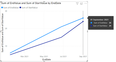
now I want to put in the same line chart both lines. However, if I use StartDate in the X Axis, the EndValue won't be correctly displayed and the same will happend with the Start Value. For example, in the image below the 01/Sep/2021 it is displaying 24 and 26 when it should be only 26. Image below for reference.
I'm getting this
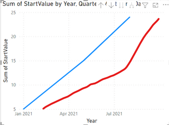
and I want to get something like this
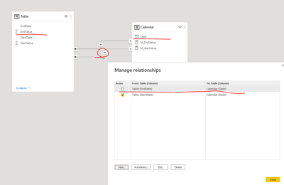
I believe I need a DateTable from the dates I am interested in and make a relationship with my dates table but I've tried relationship with Start and End Date and It doesn't work.
Any idea is more than welcome
Thanks!
Solved! Go to Solution.
- Mark as New
- Bookmark
- Subscribe
- Mute
- Subscribe to RSS Feed
- Permalink
- Report Inappropriate Content
Hi, @derekma19
If you have a calendar table, you can try add another inactive relationship between ‘Table’[EndDate] and 'Calendar'[Date].
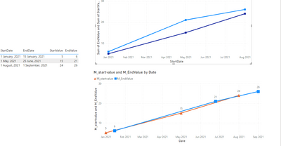
Then put 'Calendar'[Date] to the x-axis of line chart , and put the following two measure to the y-axis of line chart.
M_startvalue = SUM('Table'[StartValue])M_EndValue = CALCULATE(SUM('Table'[EndValue]),USERELATIONSHIP('Table'[EndDate],'Calendar'[Date]))
Please check attached pbix for more details.
Best Regards,
Community Support Team _ Eason
- Mark as New
- Bookmark
- Subscribe
- Mute
- Subscribe to RSS Feed
- Permalink
- Report Inappropriate Content
@derekma19 , refer if these approaches can help
Measure way
Power BI Dax Measure- Allocate data between Range: https://youtu.be/O653vwLTUzM
https://community.powerbi.com/t5/Community-Blog/How-to-divide-distribute-values-between-start-date-o...
Tables way
https://amitchandak.medium.com/dax-get-all-dates-between-the-start-and-end-date-8f3dac4ff90b
https://amitchandak.medium.com/power-query-get-all-dates-between-the-start-and-end-date-9ad6a84cf5f2
Helpful resources

Power BI Monthly Update - November 2025
Check out the November 2025 Power BI update to learn about new features.

Fabric Data Days
Advance your Data & AI career with 50 days of live learning, contests, hands-on challenges, study groups & certifications and more!

| User | Count |
|---|---|
| 57 | |
| 43 | |
| 41 | |
| 21 | |
| 17 |
| User | Count |
|---|---|
| 183 | |
| 114 | |
| 93 | |
| 62 | |
| 45 |


