FabCon is coming to Atlanta
Join us at FabCon Atlanta from March 16 - 20, 2026, for the ultimate Fabric, Power BI, AI and SQL community-led event. Save $200 with code FABCOMM.
Register now!- Power BI forums
- Get Help with Power BI
- Desktop
- Service
- Report Server
- Power Query
- Mobile Apps
- Developer
- DAX Commands and Tips
- Custom Visuals Development Discussion
- Health and Life Sciences
- Power BI Spanish forums
- Translated Spanish Desktop
- Training and Consulting
- Instructor Led Training
- Dashboard in a Day for Women, by Women
- Galleries
- Data Stories Gallery
- Themes Gallery
- Contests Gallery
- QuickViz Gallery
- Quick Measures Gallery
- Visual Calculations Gallery
- Notebook Gallery
- Translytical Task Flow Gallery
- TMDL Gallery
- R Script Showcase
- Webinars and Video Gallery
- Ideas
- Custom Visuals Ideas (read-only)
- Issues
- Issues
- Events
- Upcoming Events
Get Fabric Certified for FREE during Fabric Data Days. Don't miss your chance! Request now
- Power BI forums
- Forums
- Get Help with Power BI
- Desktop
- Line Chart with Multiple Values Starting from $100...
- Subscribe to RSS Feed
- Mark Topic as New
- Mark Topic as Read
- Float this Topic for Current User
- Bookmark
- Subscribe
- Printer Friendly Page
- Mark as New
- Bookmark
- Subscribe
- Mute
- Subscribe to RSS Feed
- Permalink
- Report Inappropriate Content
Line Chart with Multiple Values Starting from $100 USD (Calculated from portfolio's Start Month)
Hi everyone,
I have some monthly portfolio performance data on hand, along with the starting month for each portfolio.
Additionally, I have historical monthly performance data for 3 benchmarks from a long time ago until latest Month (Today).
I would like to create a line chart with the following specifications, which I've serach & tried so many DAX, but all fail:
* Total returns on $100 USD: Set the starting point for each portfolio as 100 from one month before each portfolio's start month.
* Select one Porfolio at a time the line chart should display that portfolio and all 3 benchmarks, all starting from 100.
* The next month's number for each line should be calculated as
- 2nd Mth (Profolio Start Month)#A = 100 * (1 + 2nd Mth portfolio return rate / 100).
- 3rd Mth #B = A * (1 + 3rd Mth portfolio return rate / 100).
- 4th Mth #C = B * (1 + 4th Mth portfolio return rate / 100).
- etc....
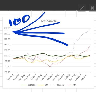
The line chart should resemble an umbrella.
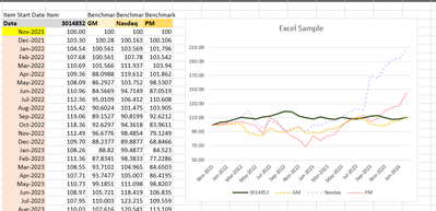
I have attached a sample PBIX file for your reference, along with an explanation of what this line chart exactly achieves for your reference.
Sample: Sample Power Bi & Raw Data
Thank you very much
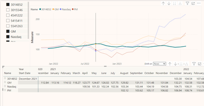
----------------
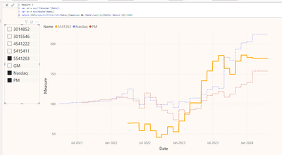
Current Fail DAX:
Measure =
VAR first_date = CALCULATE(MIN('Data'[Date]),ALLSELECTED('Data'))
VAR last_date = MAX('Data'[Date])
VAR mandate = MAX('Data'[Name])
VAR FilteredTable =
FILTER(
ALL('Data'),
'Data'[Date] <= last_date &&
MONTH('Data'[Date]) = MONTH(last_date) &&
'Data'[Name] = mandate
)
VAR FilteredTable_2 =
FILTER(
ALL('Data'),
'Data'[Date] <= last_date &&
'Data'[Date]> first_date &&
'Data'[Name] = mandate
)
VAR HasData = NOT(ISBLANK(SUMX(FilteredTable, 'Data'[Mothly Return (%)])))
RETURN
IF(HasData,
IF(MIN('Data'[Date])=first_date,100,
100*PRODUCTX(FilteredTable_2,1+[Mothly Return (%)]/100)
)
,BLANK()
)
Solved! Go to Solution.
- Mark as New
- Bookmark
- Subscribe
- Mute
- Subscribe to RSS Feed
- Permalink
- Report Inappropriate Content
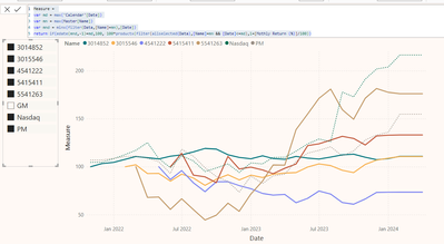
Then you will need to use a disconnected Calendar table and modify the measure slightly.
Measure =
var md = max('Calendar'[Date])
var mn = max(Master[Name])
var mnd = minx(filter(Data,[Name]=mn),[Date])
return if(edate(mnd,-1)=md,100, 100*productx(filter(allselected(Data),[Name]=mn && [Date]<=md),1+[Mothly Return (%)]/100))
- Mark as New
- Bookmark
- Subscribe
- Mute
- Subscribe to RSS Feed
- Permalink
- Report Inappropriate Content
Please provide sample data that covers your issue or question completely, in a usable format (not as a screenshot).
Do not include sensitive information or anything not related to the issue or question.
If you are unsure how to upload data please refer to https://community.fabric.microsoft.com/t5/Community-Blog/How-to-provide-sample-data-in-the-Power-BI-...
Please show the expected outcome based on the sample data you provided.
Want faster answers? https://community.fabric.microsoft.com/t5/Desktop/How-to-Get-Your-Question-Answered-Quickly/m-p/1447...
- Mark as New
- Bookmark
- Subscribe
- Mute
- Subscribe to RSS Feed
- Permalink
- Report Inappropriate Content
Hi lbendlin
Thanks for looking at the question!
Wondering if the sample has been provided is not enough, or is it not able to be accessed?
Sample: Sample Power Bi & Raw Data
- Mark as New
- Bookmark
- Subscribe
- Mute
- Subscribe to RSS Feed
- Permalink
- Report Inappropriate Content
- Mark as New
- Bookmark
- Subscribe
- Mute
- Subscribe to RSS Feed
- Permalink
- Report Inappropriate Content
Hi lbendlin,
Sorry for confusing you, the umbrella represents the outcome's look.
We like to have them all start from 100, to analysis and compare the performance of them, and for people easily understand how it is, sometimes, will use Usd 1,000 instead.
Here are some application examples.
- Mark as New
- Bookmark
- Subscribe
- Mute
- Subscribe to RSS Feed
- Permalink
- Report Inappropriate Content
Then you will need to use a disconnected Calendar table and modify the measure slightly.
Measure =
var md = max('Calendar'[Date])
var mn = max(Master[Name])
var mnd = minx(filter(Data,[Name]=mn),[Date])
return if(edate(mnd,-1)=md,100, 100*productx(filter(allselected(Data),[Name]=mn && [Date]<=md),1+[Mothly Return (%)]/100))
Helpful resources

Power BI Monthly Update - November 2025
Check out the November 2025 Power BI update to learn about new features.

Fabric Data Days
Advance your Data & AI career with 50 days of live learning, contests, hands-on challenges, study groups & certifications and more!

