Become a Certified Power BI Data Analyst!
Join us for an expert-led overview of the tools and concepts you'll need to pass exam PL-300. The first session starts on June 11th. See you there!
Get registered- Power BI forums
- Get Help with Power BI
- Desktop
- Service
- Report Server
- Power Query
- Mobile Apps
- Developer
- DAX Commands and Tips
- Custom Visuals Development Discussion
- Health and Life Sciences
- Power BI Spanish forums
- Translated Spanish Desktop
- Training and Consulting
- Instructor Led Training
- Dashboard in a Day for Women, by Women
- Galleries
- Webinars and Video Gallery
- Data Stories Gallery
- Themes Gallery
- Contests Gallery
- Quick Measures Gallery
- Notebook Gallery
- Translytical Task Flow Gallery
- R Script Showcase
- Ideas
- Custom Visuals Ideas (read-only)
- Issues
- Issues
- Events
- Upcoming Events
Power BI is turning 10! Let’s celebrate together with dataviz contests, interactive sessions, and giveaways. Register now.
- Power BI forums
- Forums
- Get Help with Power BI
- Desktop
- Line Chart with Months per Column
- Subscribe to RSS Feed
- Mark Topic as New
- Mark Topic as Read
- Float this Topic for Current User
- Bookmark
- Subscribe
- Printer Friendly Page
- Mark as New
- Bookmark
- Subscribe
- Mute
- Subscribe to RSS Feed
- Permalink
- Report Inappropriate Content
Line Chart with Months per Column
HI all,
I am a beginner user on Power BI and would really appreciate some help.
I have inherited some excel reports and need to create some dashboards off the back of them.
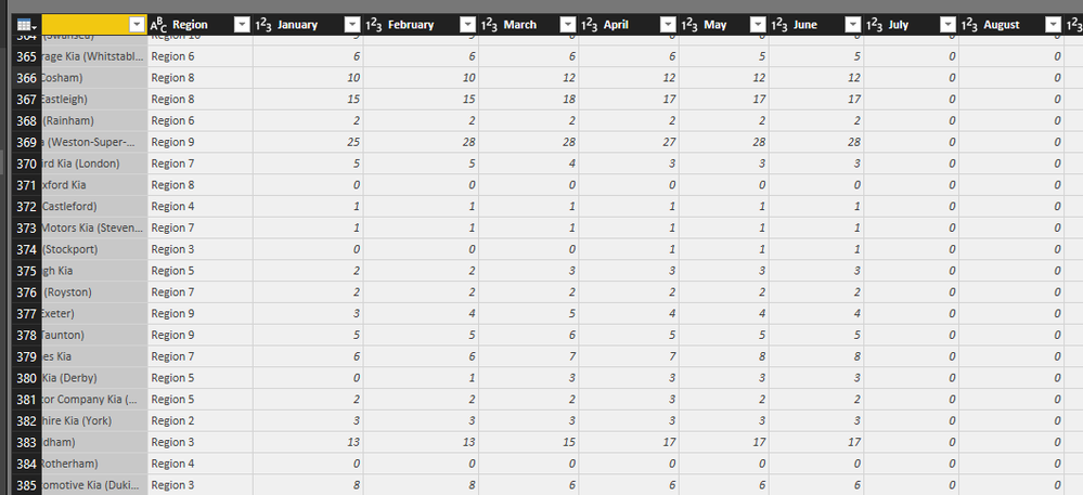
The columns are:
Client name (unique),
Region (each client is in a preset region of 1-10, with multiple clients in each),
There is then a column for each month of the current year with the sales figure in each.
I would like to create a line chart with the months along the x axis, and a line for each different regions but, because each month has its own column, I cannot get it to do this.
Can anyone help??
Thanks
Solved! Go to Solution.
- Mark as New
- Bookmark
- Subscribe
- Mute
- Subscribe to RSS Feed
- Permalink
- Report Inappropriate Content
Hi @KatieH,
As sokg said, you can simple to unpivot column function to achieve your requirement.
Steps:
1. Select these month column.
2. Click "unpivot columns" button to convert these columns to "Attribute" and "Value" columns.
3. Create line chart adn drag "Attribute" to Axis, "Region" to legend, "Value" to Values fileds.
Regards,
Xiaoxin Sheng
- Mark as New
- Bookmark
- Subscribe
- Mute
- Subscribe to RSS Feed
- Permalink
- Report Inappropriate Content
It works.
And how to sort data month wise in this chart? e.g. Jan, Feb, March way rather than alphabetical sort?
- Mark as New
- Bookmark
- Subscribe
- Mute
- Subscribe to RSS Feed
- Permalink
- Report Inappropriate Content
Did you manage to get the sorting working?
I'm looking for a solution!
Thank you
- Mark as New
- Bookmark
- Subscribe
- Mute
- Subscribe to RSS Feed
- Permalink
- Report Inappropriate Content
This is brilliant!
Thank you so much to both of you for your help:)
- Mark as New
- Bookmark
- Subscribe
- Mute
- Subscribe to RSS Feed
- Permalink
- Report Inappropriate Content
Try unpivot columns in power query.
Helpful resources
| User | Count |
|---|---|
| 84 | |
| 79 | |
| 69 | |
| 46 | |
| 43 |
| User | Count |
|---|---|
| 106 | |
| 50 | |
| 49 | |
| 40 | |
| 39 |


