- Power BI forums
- Updates
- News & Announcements
- Get Help with Power BI
- Desktop
- Service
- Report Server
- Power Query
- Mobile Apps
- Developer
- DAX Commands and Tips
- Custom Visuals Development Discussion
- Health and Life Sciences
- Power BI Spanish forums
- Translated Spanish Desktop
- Power Platform Integration - Better Together!
- Power Platform Integrations (Read-only)
- Power Platform and Dynamics 365 Integrations (Read-only)
- Training and Consulting
- Instructor Led Training
- Dashboard in a Day for Women, by Women
- Galleries
- Community Connections & How-To Videos
- COVID-19 Data Stories Gallery
- Themes Gallery
- Data Stories Gallery
- R Script Showcase
- Webinars and Video Gallery
- Quick Measures Gallery
- 2021 MSBizAppsSummit Gallery
- 2020 MSBizAppsSummit Gallery
- 2019 MSBizAppsSummit Gallery
- Events
- Ideas
- Custom Visuals Ideas
- Issues
- Issues
- Events
- Upcoming Events
- Community Blog
- Power BI Community Blog
- Custom Visuals Community Blog
- Community Support
- Community Accounts & Registration
- Using the Community
- Community Feedback
Register now to learn Fabric in free live sessions led by the best Microsoft experts. From Apr 16 to May 9, in English and Spanish.
- Power BI forums
- Forums
- Get Help with Power BI
- Desktop
- Re: Line Chart changing to dots
- Subscribe to RSS Feed
- Mark Topic as New
- Mark Topic as Read
- Float this Topic for Current User
- Bookmark
- Subscribe
- Printer Friendly Page
- Mark as New
- Bookmark
- Subscribe
- Mute
- Subscribe to RSS Feed
- Permalink
- Report Inappropriate Content
Line Chart changing to dots
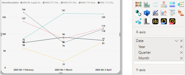
I have this line chart that shows the trend of the top 5 descriptions (Top N, of the count of description) within the span of past 3months, which I set the date filter to Relative date -> 3 calendar months. The date hierachy is Year, Quarter and Month. It looks something like this.
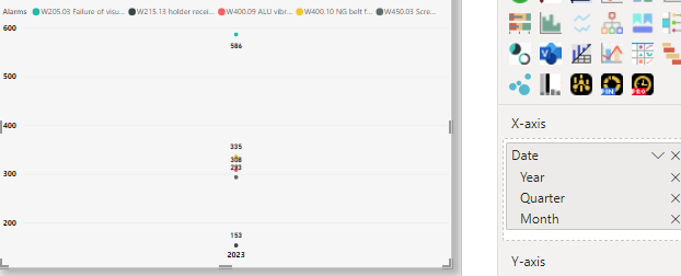
However, on the following day, it will automatically change back to vertical dots unless, I change the date to date, then change back to date hierarchy, and remove Day as I wanted. Then it'll go back to the lines. It has been this way for a few days. I'm not sure what the problem is.
Any help is appreciated. Thanks.
Solved! Go to Solution.
- Mark as New
- Bookmark
- Subscribe
- Mute
- Subscribe to RSS Feed
- Permalink
- Report Inappropriate Content
Hi @katto16
I would recommend you to use a custom dates table and create relationship with other tables.
You can use below DAX to create a custom calendar table
Calendar=
ADDCOLUMNS(
    CALENDARAUTO(),
    "Month No", MONTH([Date]),
    "Month Name", FORMAT([Date], "mmm"),
    "Year", YEAR([Date]),
    "Date Sort", FORMAT([Date],"YYYYMM")
)
Dont forget to sort the month name with month number. otherwise it will sort by alphabatically.
Hope this solve your issue
- Mark as New
- Bookmark
- Subscribe
- Mute
- Subscribe to RSS Feed
- Permalink
- Report Inappropriate Content
in the first visual the x axis showing quarter and in the second one x axis is year
This is due to the use of date hierarchy in the x axis. Avoid using heirarchy instead use the required value alone in the x axis. to get rid of auto time intelligence
file -> options and settings-> options -> current file - > DAta load -> time intelligence (uncheck)
Try using date dimension instead of using native date columns from the data
Did I answer your question? Mark my post as a solution! Appreciate your Kudos!!
MY Blog || My YouTube Channel || Connect with me on Linkedin || My Latest Data Story - Ageing Analysis
Proud to be a Super User!
- Mark as New
- Bookmark
- Subscribe
- Mute
- Subscribe to RSS Feed
- Permalink
- Report Inappropriate Content
Hi @VijayP Thanks for the input.
When I unchecked the time intelligence, the date hierarchy isn't available anymore. I need the hierarchy as I need to see the data by months instead of dates. I have two other pages that have the same settings with this and they don't seem to have this problem, meaning they stay as lines permanantly.
- Mark as New
- Bookmark
- Subscribe
- Mute
- Subscribe to RSS Feed
- Permalink
- Report Inappropriate Content
@katto16 As suggested by @vk_pbi you must have date dimension which is connected to your data model and then you need to use that table for date hierarchy!
Did I answer your question? Mark my post as a solution! Appreciate your Kudos!!
MY Blog || My YouTube Channel || Connect with me on Linkedin || My Latest Data Story - Ageing Analysis
Proud to be a Super User!
- Mark as New
- Bookmark
- Subscribe
- Mute
- Subscribe to RSS Feed
- Permalink
- Report Inappropriate Content
Hi @katto16
I would recommend you to use a custom dates table and create relationship with other tables.
You can use below DAX to create a custom calendar table
Calendar=
ADDCOLUMNS(
    CALENDARAUTO(),
    "Month No", MONTH([Date]),
    "Month Name", FORMAT([Date], "mmm"),
    "Year", YEAR([Date]),
    "Date Sort", FORMAT([Date],"YYYYMM")
)
Dont forget to sort the month name with month number. otherwise it will sort by alphabatically.
Hope this solve your issue
- Mark as New
- Bookmark
- Subscribe
- Mute
- Subscribe to RSS Feed
- Permalink
- Report Inappropriate Content
I managed to create the date table smoothly. Thanks for the code. I will just wait and see if the problem persists tomorrow. Thanks for the help!
Helpful resources

Microsoft Fabric Learn Together
Covering the world! 9:00-10:30 AM Sydney, 4:00-5:30 PM CET (Paris/Berlin), 7:00-8:30 PM Mexico City

Power BI Monthly Update - April 2024
Check out the April 2024 Power BI update to learn about new features.

| User | Count |
|---|---|
| 105 | |
| 94 | |
| 75 | |
| 63 | |
| 62 |
| User | Count |
|---|---|
| 137 | |
| 105 | |
| 104 | |
| 80 | |
| 63 |


