FabCon is coming to Atlanta
Join us at FabCon Atlanta from March 16 - 20, 2026, for the ultimate Fabric, Power BI, AI and SQL community-led event. Save $200 with code FABCOMM.
Register now!- Power BI forums
- Get Help with Power BI
- Desktop
- Service
- Report Server
- Power Query
- Mobile Apps
- Developer
- DAX Commands and Tips
- Custom Visuals Development Discussion
- Health and Life Sciences
- Power BI Spanish forums
- Translated Spanish Desktop
- Training and Consulting
- Instructor Led Training
- Dashboard in a Day for Women, by Women
- Galleries
- Data Stories Gallery
- Themes Gallery
- Contests Gallery
- QuickViz Gallery
- Quick Measures Gallery
- Visual Calculations Gallery
- Notebook Gallery
- Translytical Task Flow Gallery
- TMDL Gallery
- R Script Showcase
- Webinars and Video Gallery
- Ideas
- Custom Visuals Ideas (read-only)
- Issues
- Issues
- Events
- Upcoming Events
The Power BI Data Visualization World Championships is back! Get ahead of the game and start preparing now! Learn more
- Power BI forums
- Forums
- Get Help with Power BI
- Desktop
- Re: Line Chart X-axis - More Labels on Continuous
- Subscribe to RSS Feed
- Mark Topic as New
- Mark Topic as Read
- Float this Topic for Current User
- Bookmark
- Subscribe
- Printer Friendly Page
- Mark as New
- Bookmark
- Subscribe
- Mute
- Subscribe to RSS Feed
- Permalink
- Report Inappropriate Content
Line Chart X-axis - More Labels on Continuous
| Datetime | Metric |
| 12/31/2020 11:00:00 PM | 100 |
| 12/31/2020 10:00:00 PM | 200 |
| 12/31/2020 9:00:00 PM | 300 |
| 12/31/2020 8:00:00 PM | 200 |
| 12/31/2020 7:00:00 PM | 150 |
| 12/31/2020 6:00:00 PM | 250 |
| 12/31/2020 5:00:00 PM | 50 |
| 12/31/2020 4:00:00 PM | 375 |
| 12/31/2020 3:00:00 PM | 200 |
My data looks something like this (scope covering 1 month). The idea is to make a scatter plot with Datetime as the X-axis and Metric as the Y-axis. I was able to make the desired graph using the line chart, setting Datetime and Metric as the axes, and setting X-Axis options it to Continuous.
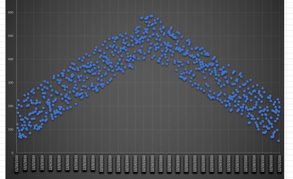
My problem is I want to show more X-Axis tick labels beyond the 5 days it automatically chooses. Ideally, I wanna show each day as its own tick (see below for a graph made in Excel). Is that possible?
TL;DR: I need my Line Chart in Continuous so it acts like a scatterplot the way I need it to work, but it only shows 5 days as as tick labels. I need all 28-31 days in a month to have their own.
- Mark as New
- Bookmark
- Subscribe
- Mute
- Subscribe to RSS Feed
- Permalink
- Report Inappropriate Content
Hi @BobtheBI_lder ,
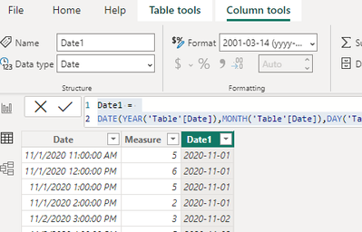
You can create a computed column and set it to Data type – Date Formate – yyyy-mm-dd in Column tools:
Date1 =
DATE(YEAR('Table'[Date]),MONTH('Table'[Date]),DAY('Table'[Date]))
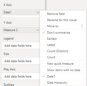
Set to Date in X-axis, not Date Hierarchy
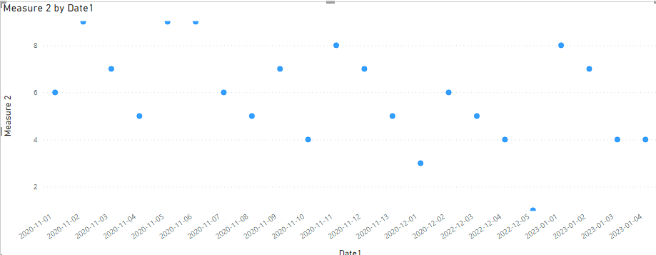
The calculation and display are then aggregated based on specific dates
Best Regards,
Liu Yang
If this post helps, then please consider Accept it as the solution to help the other members find it more quickly
- Mark as New
- Bookmark
- Subscribe
- Mute
- Subscribe to RSS Feed
- Permalink
- Report Inappropriate Content
Change X-axis type to Categorical. Then you have you adjust size of visual to display all the dates without scrolling. As long as you filter data by month it shoudn't be that bad.
I don't think that there's any other way.
Helpful resources

Power BI Dataviz World Championships
The Power BI Data Visualization World Championships is back! Get ahead of the game and start preparing now!

| User | Count |
|---|---|
| 40 | |
| 35 | |
| 34 | |
| 31 | |
| 27 |
| User | Count |
|---|---|
| 135 | |
| 102 | |
| 67 | |
| 65 | |
| 56 |


