FabCon is coming to Atlanta
Join us at FabCon Atlanta from March 16 - 20, 2026, for the ultimate Fabric, Power BI, AI and SQL community-led event. Save $200 with code FABCOMM.
Register now!- Power BI forums
- Get Help with Power BI
- Desktop
- Service
- Report Server
- Power Query
- Mobile Apps
- Developer
- DAX Commands and Tips
- Custom Visuals Development Discussion
- Health and Life Sciences
- Power BI Spanish forums
- Translated Spanish Desktop
- Training and Consulting
- Instructor Led Training
- Dashboard in a Day for Women, by Women
- Galleries
- Data Stories Gallery
- Themes Gallery
- Contests Gallery
- QuickViz Gallery
- Quick Measures Gallery
- Visual Calculations Gallery
- Notebook Gallery
- Translytical Task Flow Gallery
- TMDL Gallery
- R Script Showcase
- Webinars and Video Gallery
- Ideas
- Custom Visuals Ideas (read-only)
- Issues
- Issues
- Events
- Upcoming Events
Get Fabric Certified for FREE during Fabric Data Days. Don't miss your chance! Request now
- Power BI forums
- Forums
- Get Help with Power BI
- Desktop
- Re: Line Chart X-Axis Dates
- Subscribe to RSS Feed
- Mark Topic as New
- Mark Topic as Read
- Float this Topic for Current User
- Bookmark
- Subscribe
- Printer Friendly Page
- Mark as New
- Bookmark
- Subscribe
- Mute
- Subscribe to RSS Feed
- Permalink
- Report Inappropriate Content
Line Chart X-Axis Dates
Hi Everyone,
I'm relatively new to Power BI and am struggling to find an answer to a question I have - although it's possible I'm not asking the question in the right way.
I'm working on visualising datasets that I receive from external organisations, and have got about 80% of what I need sorted, except for the following.
The headings in my files (in Excel) come in roughly the format shown at the bottom of the post. where we have 2 descriptive columns (Participant Name & Channel) which get populated with text information, and the monthly columns afterwards get populated with volumes (just numbers ranging between 1-3 digits - no other formatting etc.)
What i need to be able to do, is have the month columns (Apr-18 onwards) as the horizontal axis on a line and stacked column chart so that I can regularly update the volumes each month and have a running set of colums / lines to compare volumes month by month.
Obviously in Excel I'd just manually choose the month parts of the header row as my axis and then link the volumes to the relevant columns in the table, but this is too manual so any assistance would be greatly appreciated.
Apologies if there is already a solution posted to this query or if i'm missing something obvious.
Thanks
| Participant Name | Channel | Apr-18 | May-18 | Jun-18 | Jul-18 | Aug-18 | Sep-18 | Oct-18 | Nov-18 | Dec-18 | Jan-19 | Feb-19 | Mar-19 |
Solved! Go to Solution.
- Mark as New
- Bookmark
- Subscribe
- Mute
- Subscribe to RSS Feed
- Permalink
- Report Inappropriate Content
Hi @Anonymous
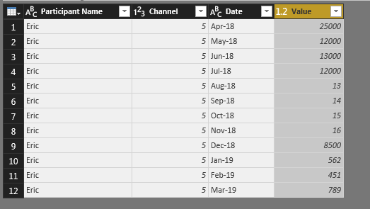
For what you want you will have to pivot your table to have one line for one value. -> http://radacad.com/pivot-and-unpivot-with-power-bi
I've made an example with Eric.
With that you will be able to make what you want
- Quentin
- Mark as New
- Bookmark
- Subscribe
- Mute
- Subscribe to RSS Feed
- Permalink
- Report Inappropriate Content
Hi Quentin,
Ah I see, that makes sense. So in order to assign a date axis it has to be in the dataset vertically and cannot be selected manually in same manner as excel.
One more Q - If I have a dataset that only has one months data (in this case Apr-2018,) whereas other datasets being used for comparison contain a full year - such as forecast for 18/19 and volumes for the previous year - is that likely to result in a conflict?
Many thanks for your assistance. Greatly appreciated.
D
- Mark as New
- Bookmark
- Subscribe
- Mute
- Subscribe to RSS Feed
- Permalink
- Report Inappropriate Content
@Anonymous
It shouldn't create conflict. If I understand well, it this happen, PowerBI will sum or make regroupement, depending on what you have. But you will not have any conflict
You're welcome,
Have a good day
- Quentin
Helpful resources

Power BI Monthly Update - November 2025
Check out the November 2025 Power BI update to learn about new features.

Fabric Data Days
Advance your Data & AI career with 50 days of live learning, contests, hands-on challenges, study groups & certifications and more!


