Get Fabric certified for FREE!
Don't miss your chance to take the Fabric Data Engineer (DP-600) exam for FREE! Find out how by watching the DP-600 session on-demand now through April 28th.
Learn more- Power BI forums
- Get Help with Power BI
- Desktop
- Service
- Report Server
- Power Query
- Mobile Apps
- Developer
- DAX Commands and Tips
- Custom Visuals Development Discussion
- Health and Life Sciences
- Power BI Spanish forums
- Translated Spanish Desktop
- Training and Consulting
- Instructor Led Training
- Dashboard in a Day for Women, by Women
- Galleries
- Data Stories Gallery
- Themes Gallery
- Contests Gallery
- QuickViz Gallery
- Quick Measures Gallery
- Visual Calculations Gallery
- Notebook Gallery
- Translytical Task Flow Gallery
- TMDL Gallery
- R Script Showcase
- Webinars and Video Gallery
- Ideas
- Custom Visuals Ideas (read-only)
- Issues
- Issues
- Events
- Upcoming Events
Join the FabCon + SQLCon recap series. Up next: Power BI, Real-Time Intelligence, IQ and AI, and Data Factory take center stage. All sessions are available on-demand after the live show. Register now
- Power BI forums
- Forums
- Get Help with Power BI
- Desktop
- Line Chart Tooltips Issue
- Subscribe to RSS Feed
- Mark Topic as New
- Mark Topic as Read
- Float this Topic for Current User
- Bookmark
- Subscribe
- Printer Friendly Page
- Mark as New
- Bookmark
- Subscribe
- Mute
- Subscribe to RSS Feed
- Permalink
- Report Inappropriate Content
Line Chart Tooltips Issue
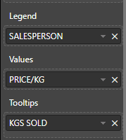
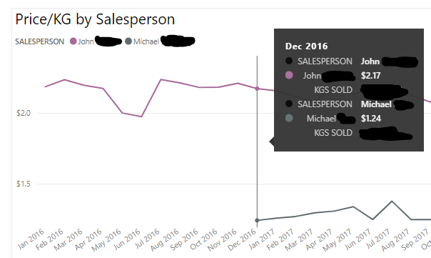
I'm getting redundant details on the tooltips of my line chart. The salesperson name is showing up twice. Once associated with the legend and once associated with the value. Why is it doing this? Is there a way to remove the "SALESPERSON" item from my tooltip? It looks bad to have the person's name show up twice the way it does.
Thanks!
Solved! Go to Solution.
- Mark as New
- Bookmark
- Subscribe
- Mute
- Subscribe to RSS Feed
- Permalink
- Report Inappropriate Content
Hi @Trudgeon
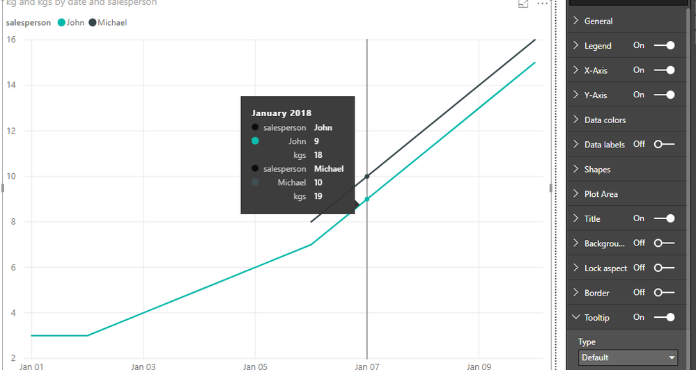
When i add columns and measures to "Value" and "Tooltips" field and set the "Tooltip" as "Default", it shows the same as you.
As tested and reseraching, i'm afraid it is the default design in Power BI currently.
you may add your idea here to let more people know and vate for your idea, finally it may be accepted by Product team.
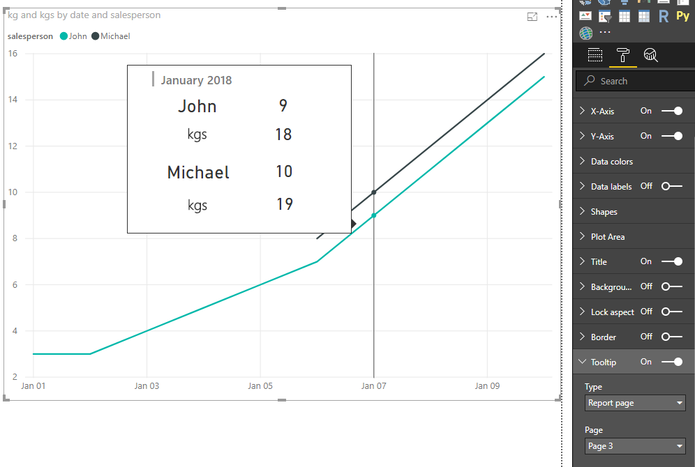
As a workaround, i change the Tooltip setting from "Default" to "Report Page".
I try two methods.
One is to use Card visual and Text Box, also create new measures to show each person's value.
create measures
Michael = "Michael"

value-John = CALCULATE(SUM(Sheet6[kg]),FILTER(Sheet6,[salesperson]="John"))

tootip-John = CALCULATE([kgs],FILTER(Sheet6,[salesperson]="John"))

value-Michael = IF(CALCULATE(SUM(Sheet6[kg]),FILTER(Sheet6,[salesperson]="Michael"))<>BLANK(),
                    CALCULATE(SUM(Sheet6[kg]),FILTER(Sheet6,[salesperson]="Michael")),0)

tootip-Michael = IF([value-Michael]=0,0,CALCULATE([kgs],FILTER(Sheet6,[salesperson]="Michael")))
in another page, called Page3, add [date] column, these measures in the Card visual, also create two Text Box and write "KGS SOLD" in it.
Then set this page as "Tooltip" by turning on "tooltip" button under the Page information and selecting "tooltip" under Page size.
for the Line chart, select "Report Page"-> Page3.
The second method please see my pbix->Page2
Reference: Report tooltip
Best Regards
Maggie
- Mark as New
- Bookmark
- Subscribe
- Mute
- Subscribe to RSS Feed
- Permalink
- Report Inappropriate Content
Hi @v-juanli-msft , is it possible to send to the tooltip info which item is hovered on the line chart? For example, if I hover on the first line (Michael), is it possible to display info related to Michael only?
- Mark as New
- Bookmark
- Subscribe
- Mute
- Subscribe to RSS Feed
- Permalink
- Report Inappropriate Content
Helpful resources

Power BI Monthly Update - April 2026
Check out the April 2026 Power BI update to learn about new features.

New to Fabric Survey
If you have recently started exploring Fabric, we'd love to hear how it's going. Your feedback can help with product improvements.

Power BI DataViz World Championships - June 2026
A new Power BI DataViz World Championship is coming this June! Don't miss out on submitting your entry.

| User | Count |
|---|---|
| 43 | |
| 37 | |
| 35 | |
| 22 | |
| 15 |
| User | Count |
|---|---|
| 65 | |
| 58 | |
| 29 | |
| 27 | |
| 25 |


